
McBRIDE & SHIELDS - www.mcbrideshields.com
Logo & Identity Design — Case Study
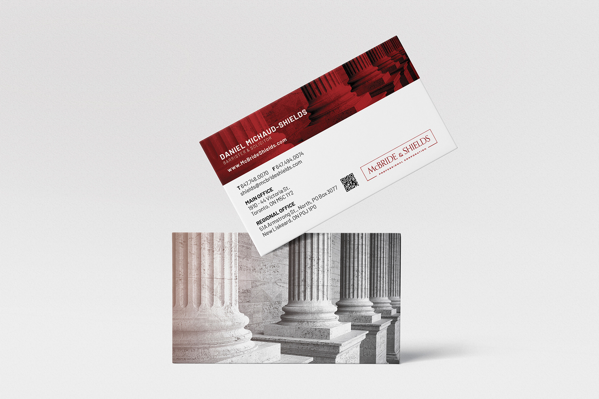
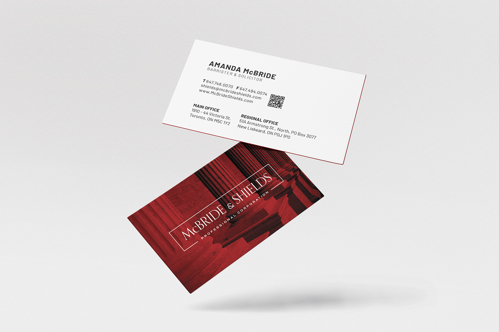
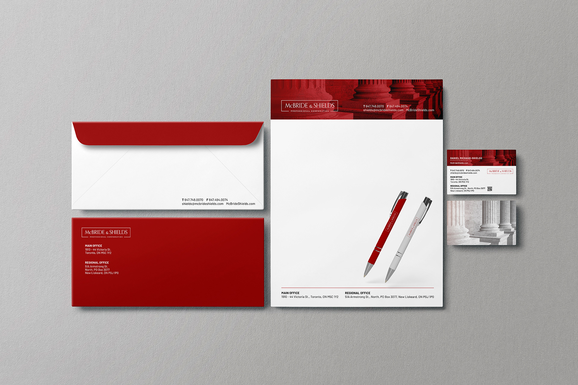
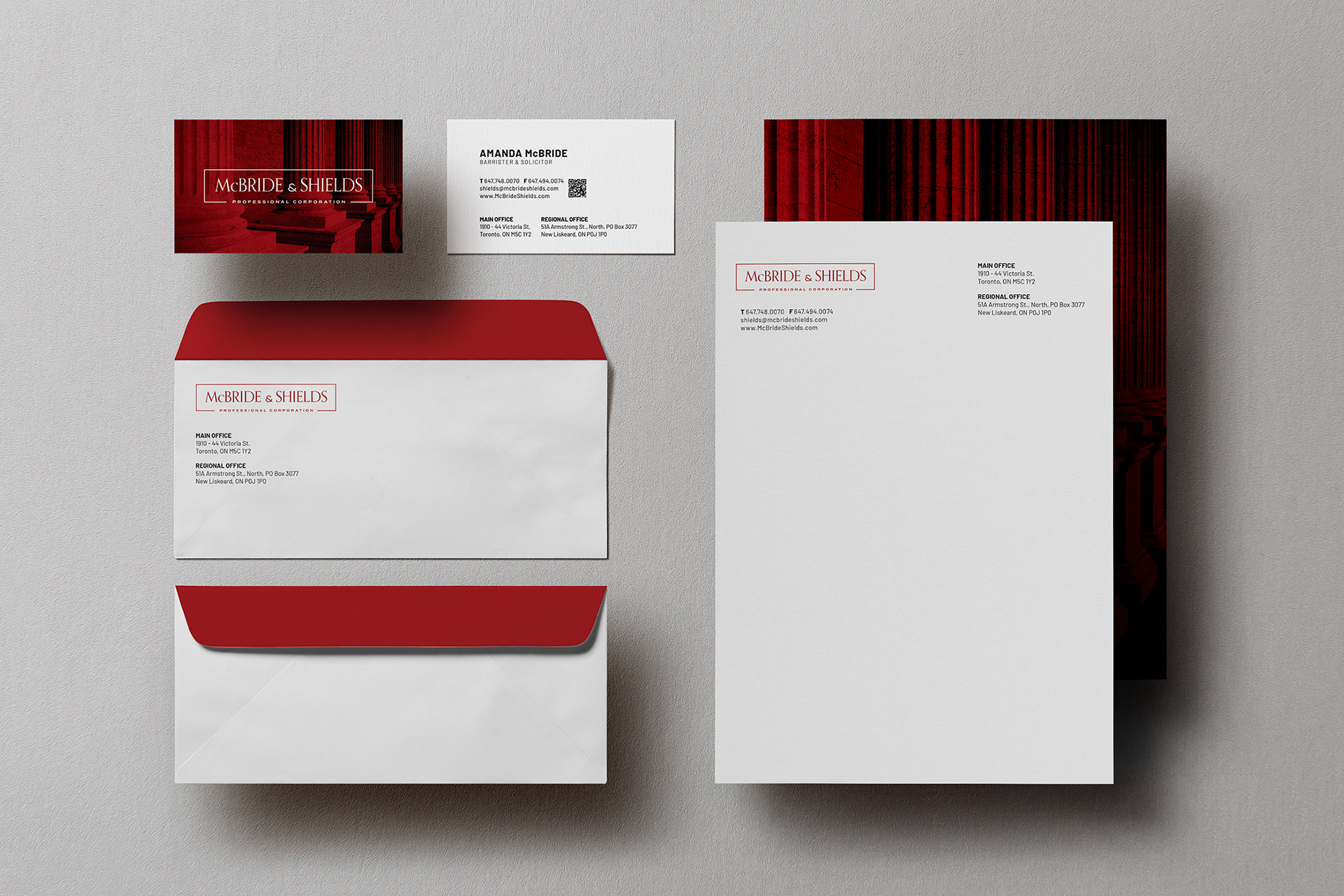
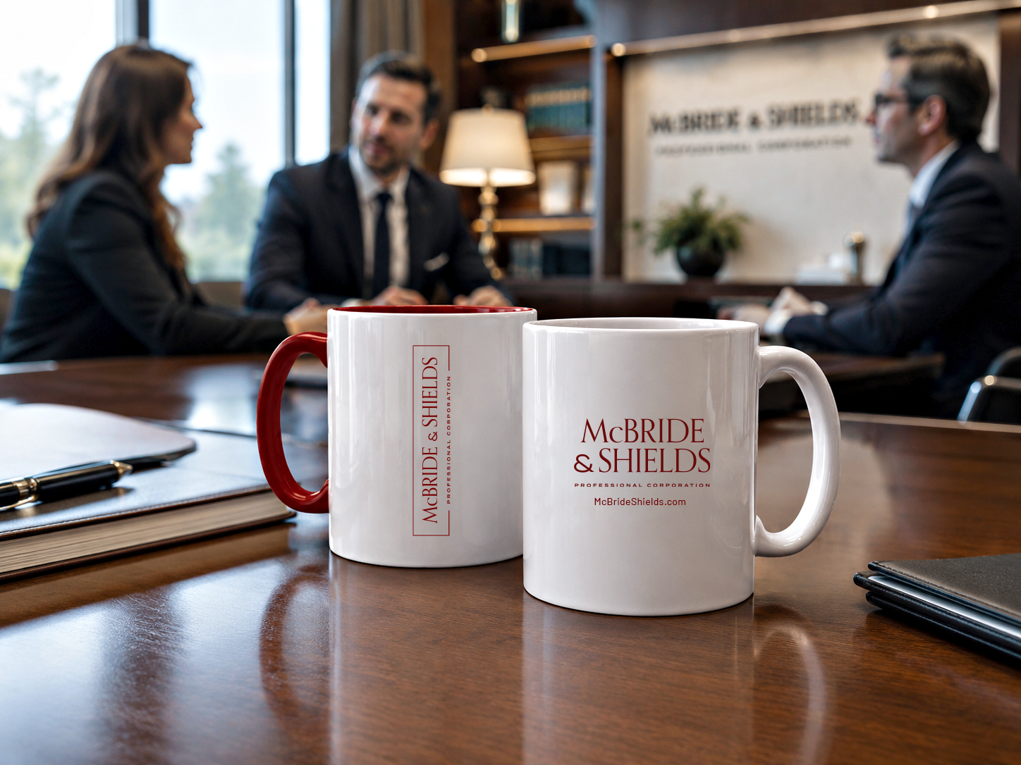
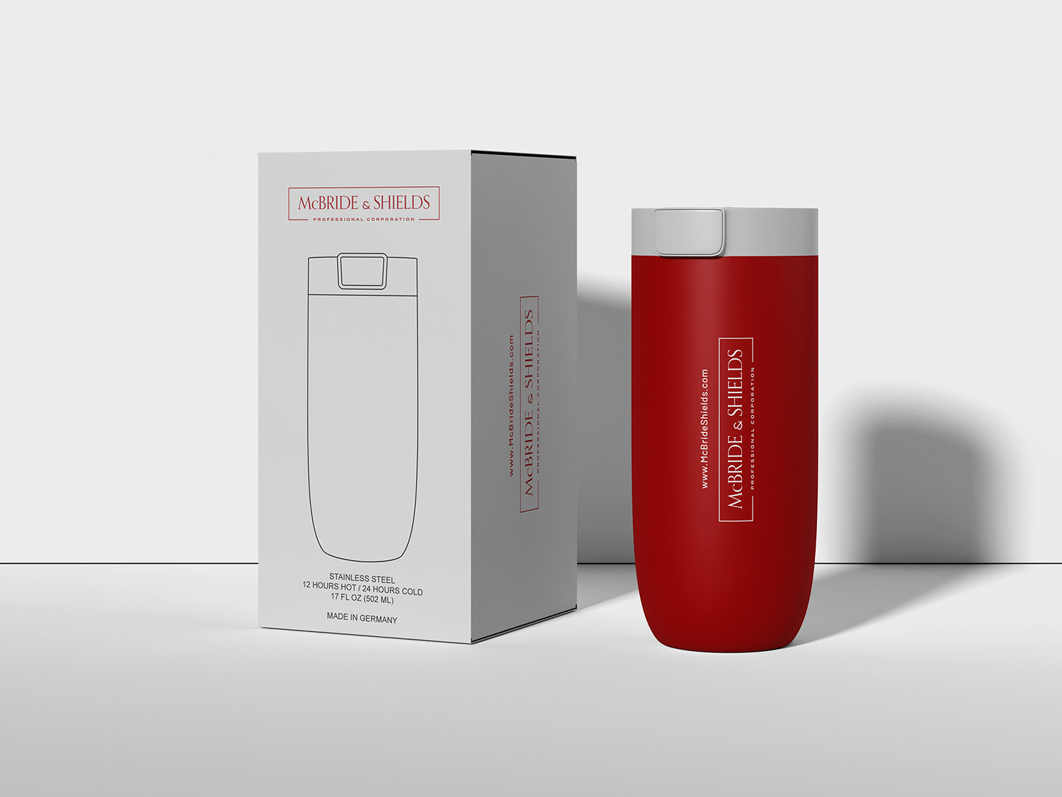
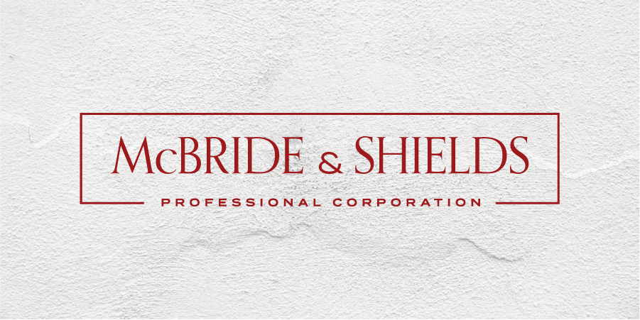
A bespoke logo and business card system developed for a Toronto-based client. Situated in the heart of Toronto, McBride & Shields Professional Corporation is a distinguished law firm defined by its commitment to excellence and a highly personalized, client-centric approach.
Following an in-depth consultation with Daniel, Barrister and Solicitor – Managing Partner, a need was identified to establish a refined visual identity. The scope included the design of a new logo and a cohesive set of business cards for both partners, Daniel Michaud-Shields and Amanda McBride. The firm’s name, derived from the fusion of their surnames, serves as a direct expression of their unified practice and shared vision.
LOGO DESIGN


Primary Logo


Secondary Logo


Environmental Design


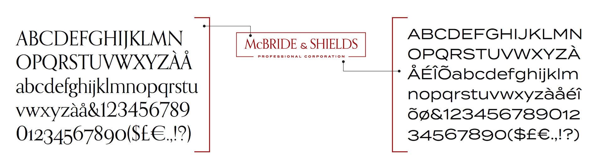
TYPOGRAPHY — ORPHEUS PRO.
The typographic direction sought a balance between authority and longevity—something that reflects the firm’s values without leaning into convention. Orpheus Pro, rooted in the late 1920s work of Walter Tiemann, offers a sense of heritage without feeling dated. Its classical proportions and subtle Art Deco influence create a refined dialogue between tradition and modernity.
Used with restraint, the typography conveys clarity, confidence, and quiet sophistication. Paired with Termina, it achieves a complementary balance, where Orpheus Pro establishes tone and presence, and Termina supports with a clean, contemporary contrast across applications.
BUSINESS CARD DESIGN stationery