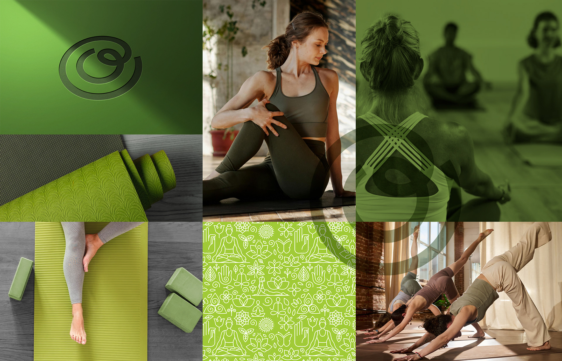
Oryn Yoga Place – Brand Identity & Creative Direction
A modern wellness brand rooted in clarity, balance, and mindful living.
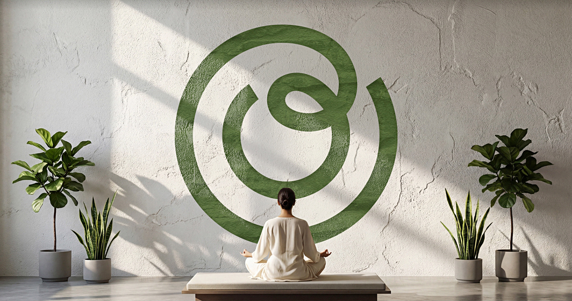
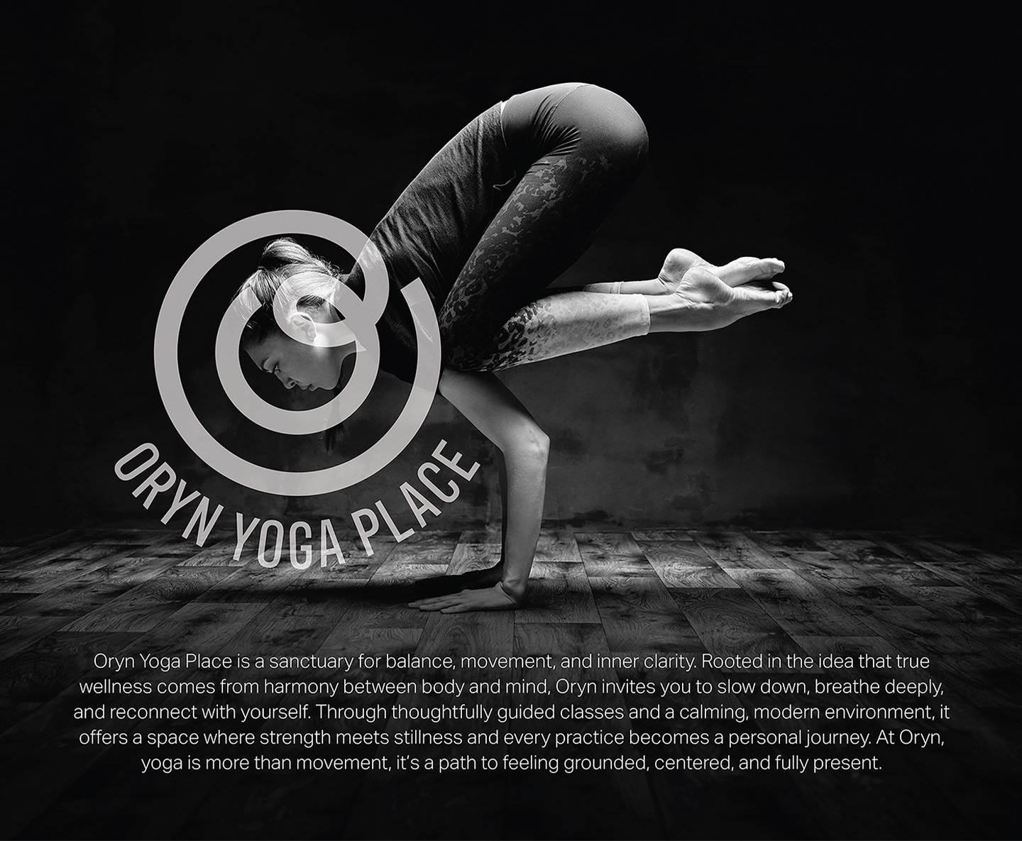
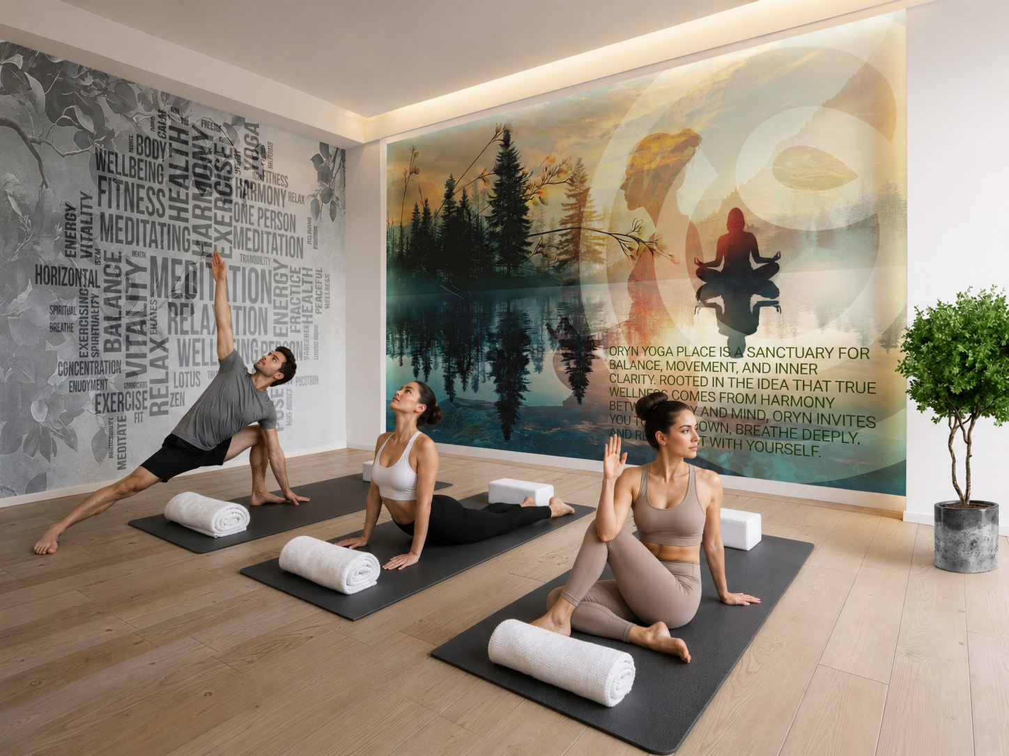
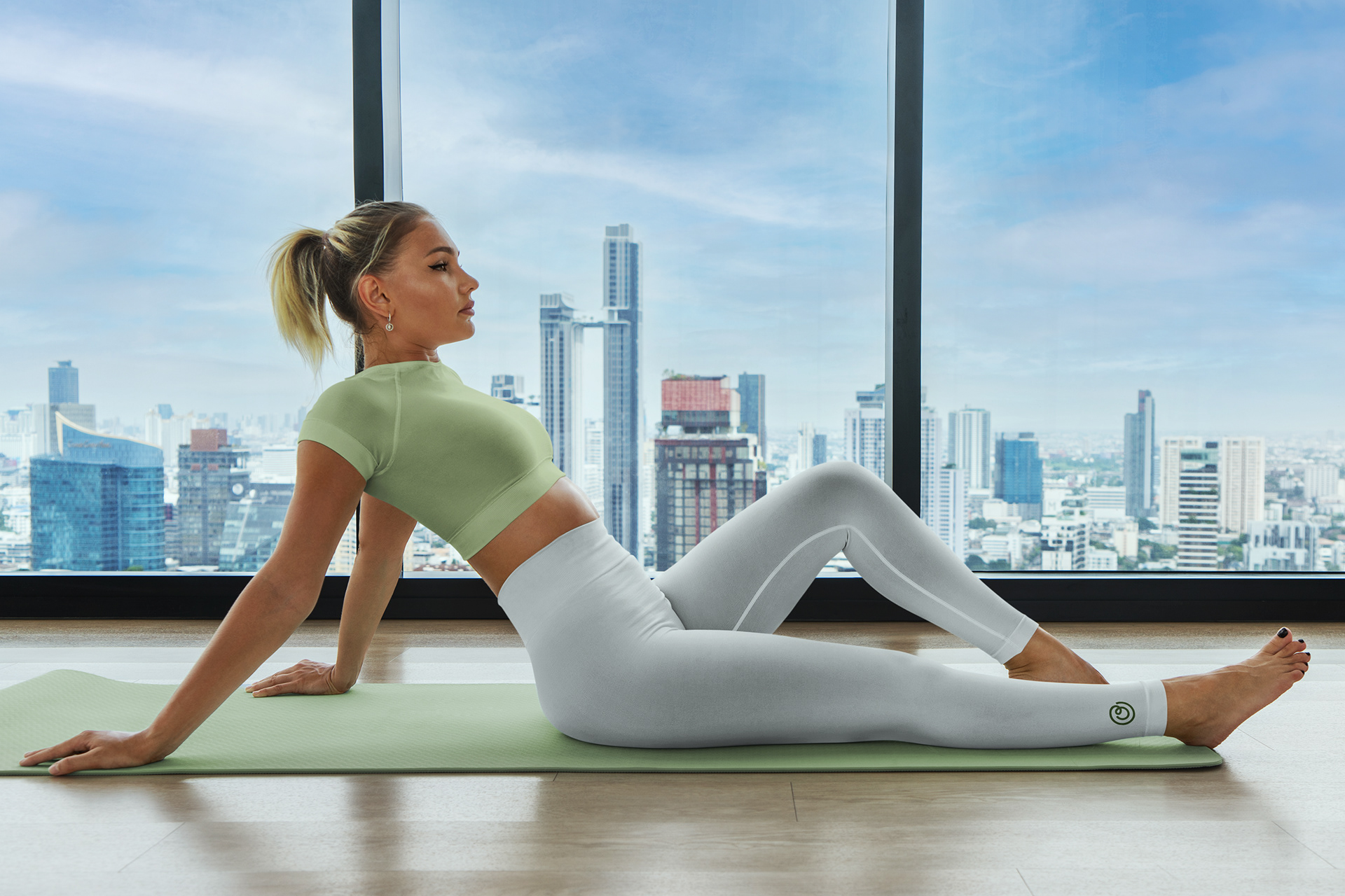
ORYN Yoga Place was developed as a conceptual branding project exploring how visual identity can embody the emotional and philosophical foundations of yoga. The goal was to create a brand that feels calm yet contemporary—something that resonates equally with seasoned practitioners and those new to mindfulness.
The challenge
In a saturated wellness market, many yoga brands rely heavily on predictable visual cues—overly ornamental symbols, spiritual clichés, or muted neutrality. The challenge was to strip the identity back and build something more refined:
+ Modern without feeling cold
+ Minimal without losing meaning
+ Distinct while remaining calming
+ Modern without feeling cold
+ Minimal without losing meaning
+ Distinct while remaining calming
Design Thinking
At the core of this project was a simple question:
How can a brand visually communicate stillness, balance, and inner clarity?
How can a brand visually communicate stillness, balance, and inner clarity?
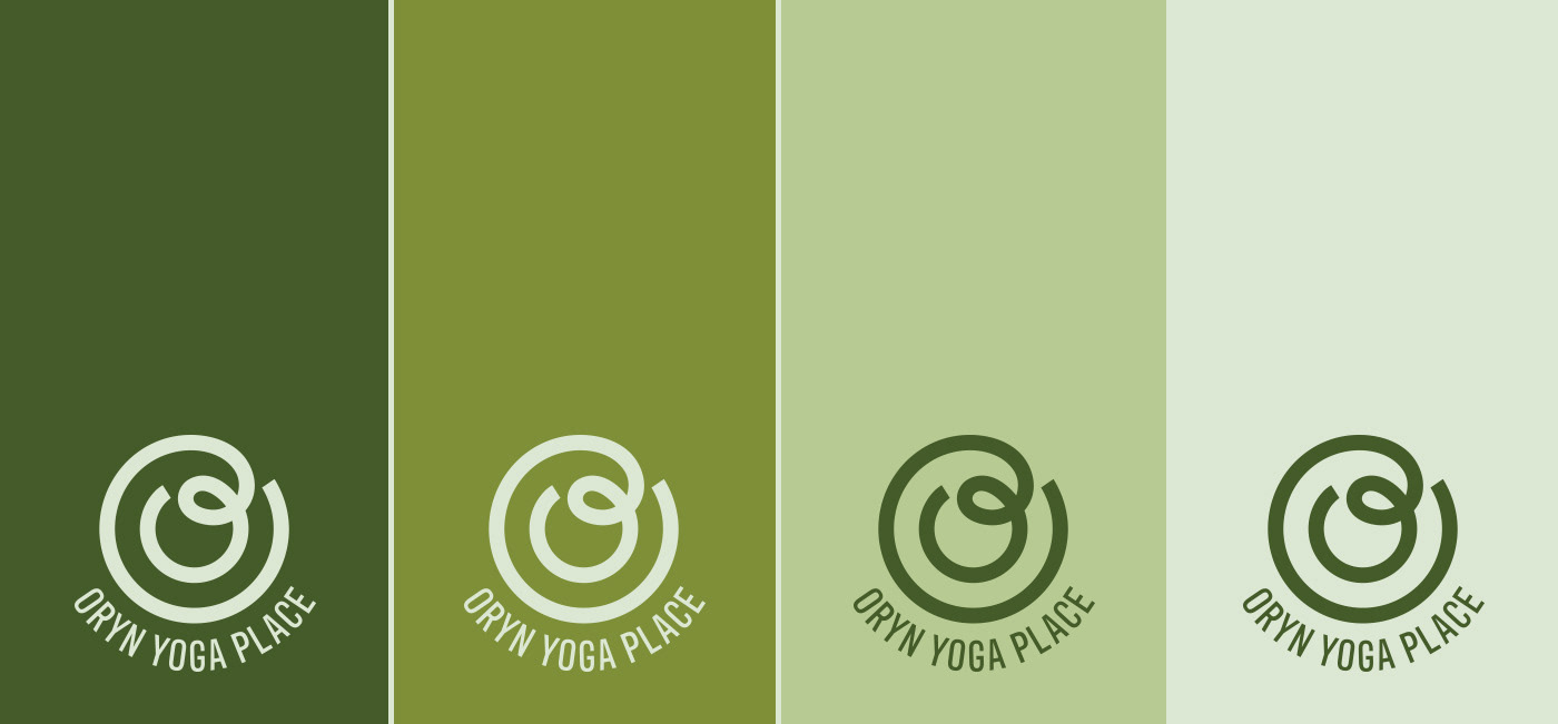
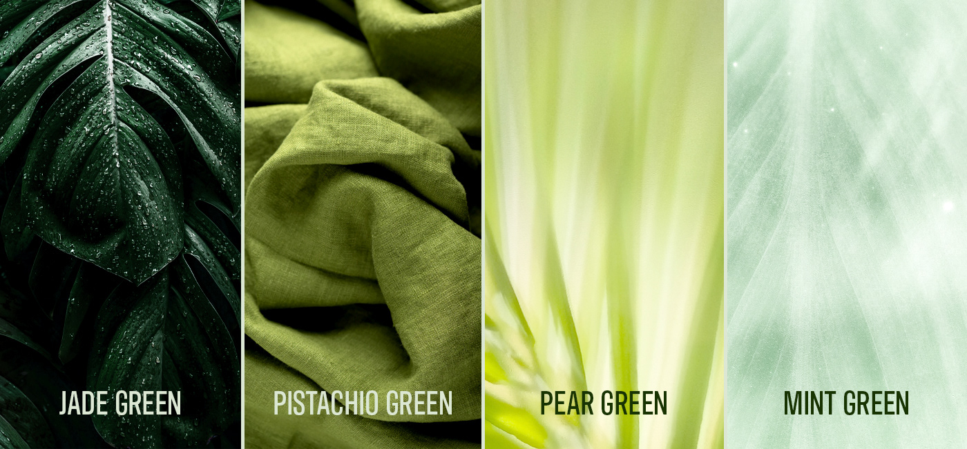
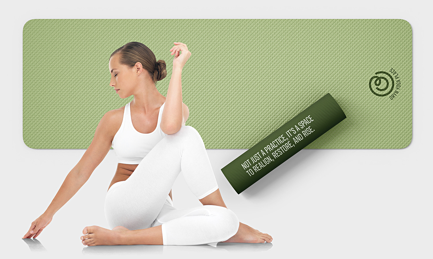
1. Colour as Emotion
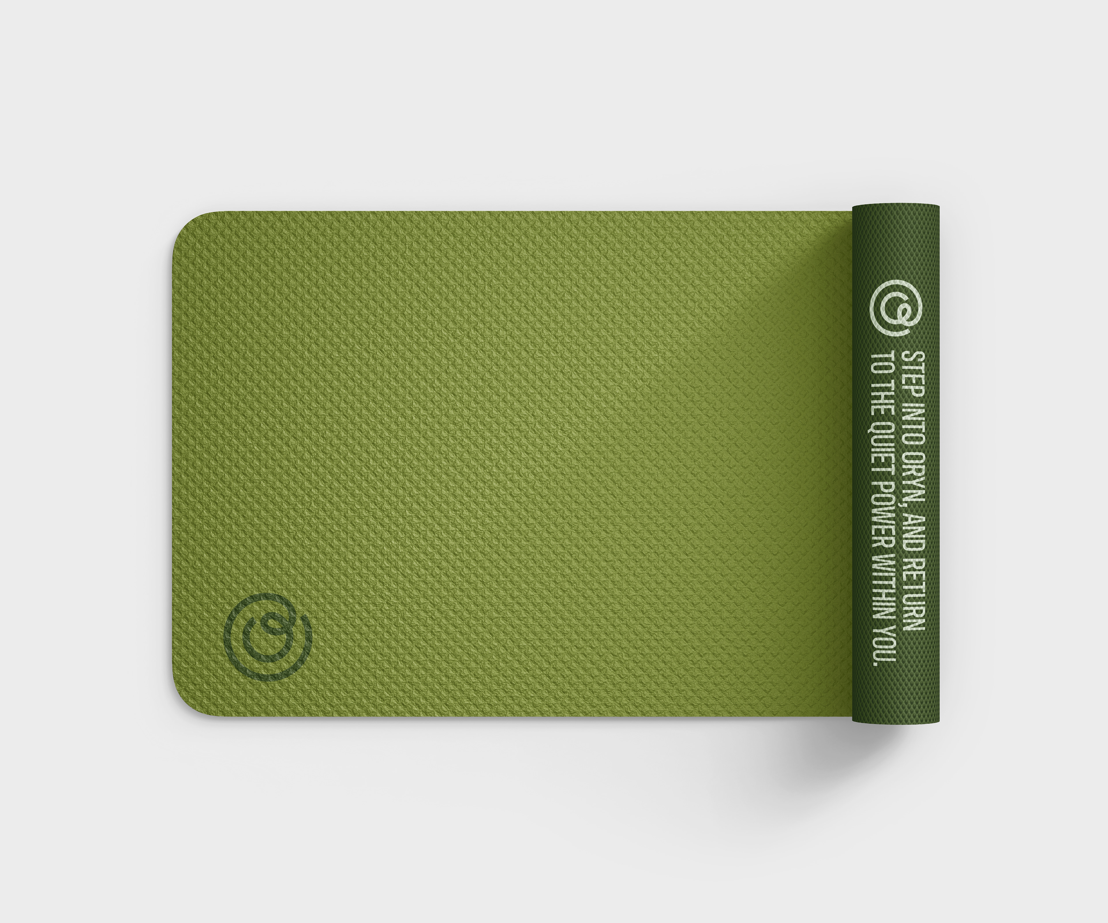
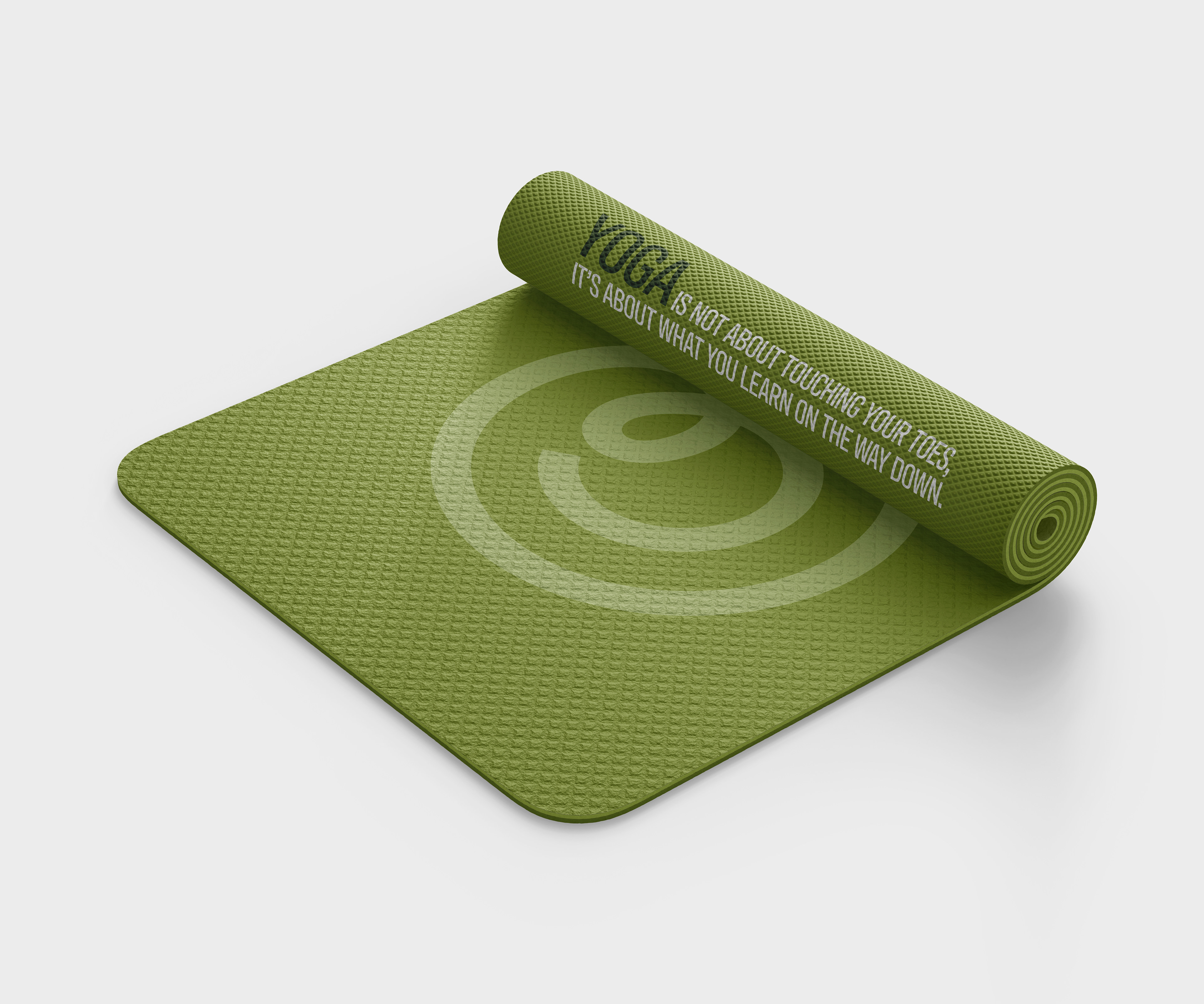
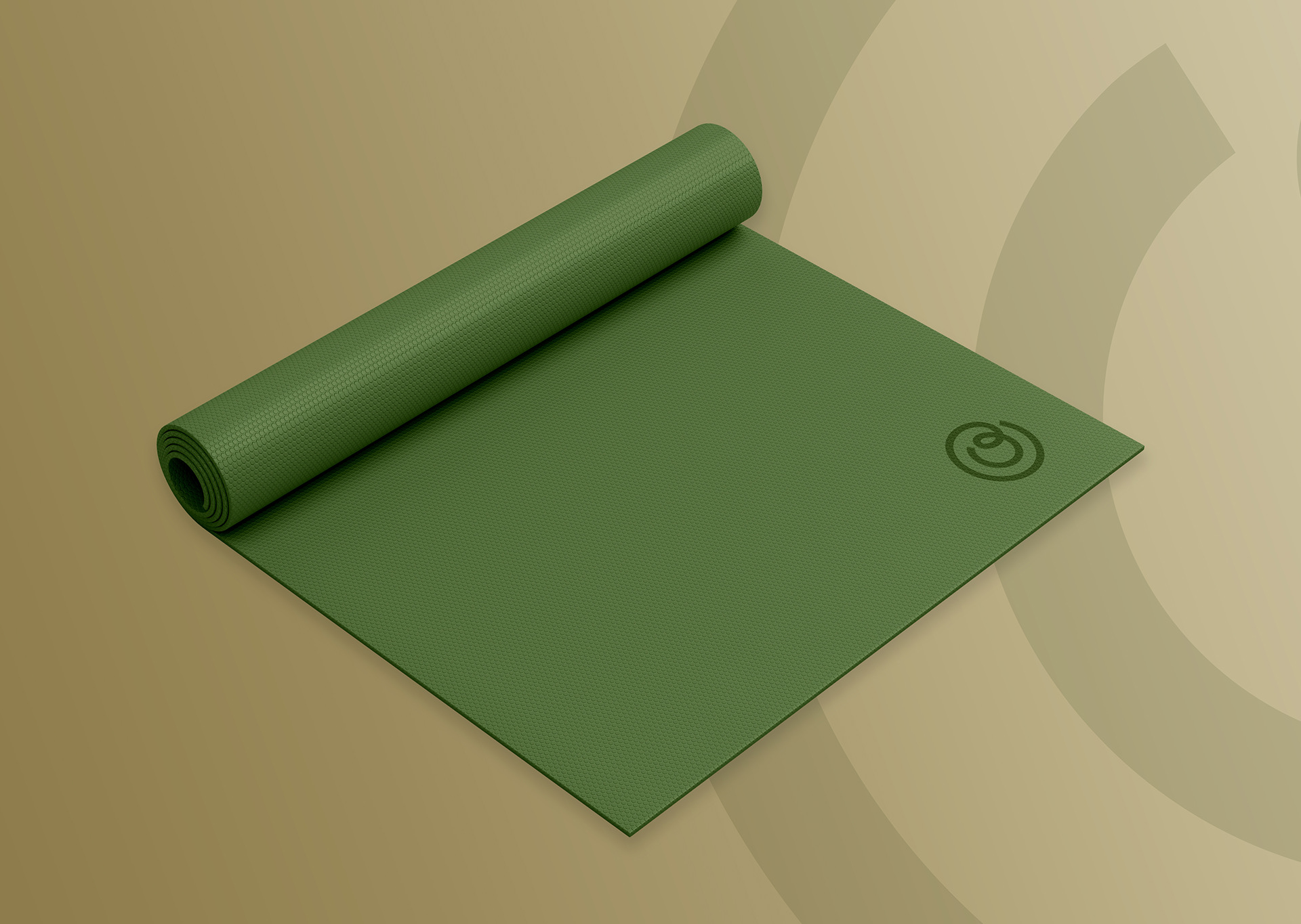
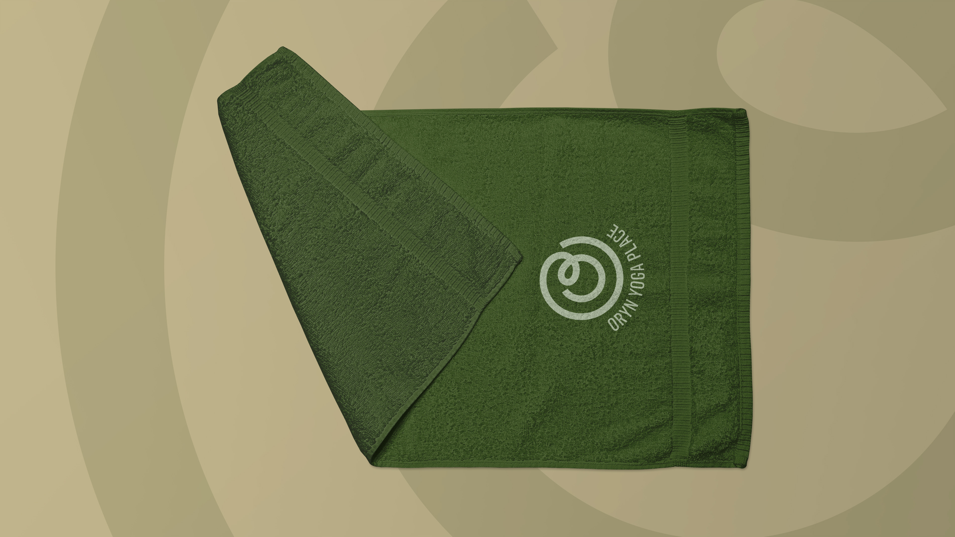
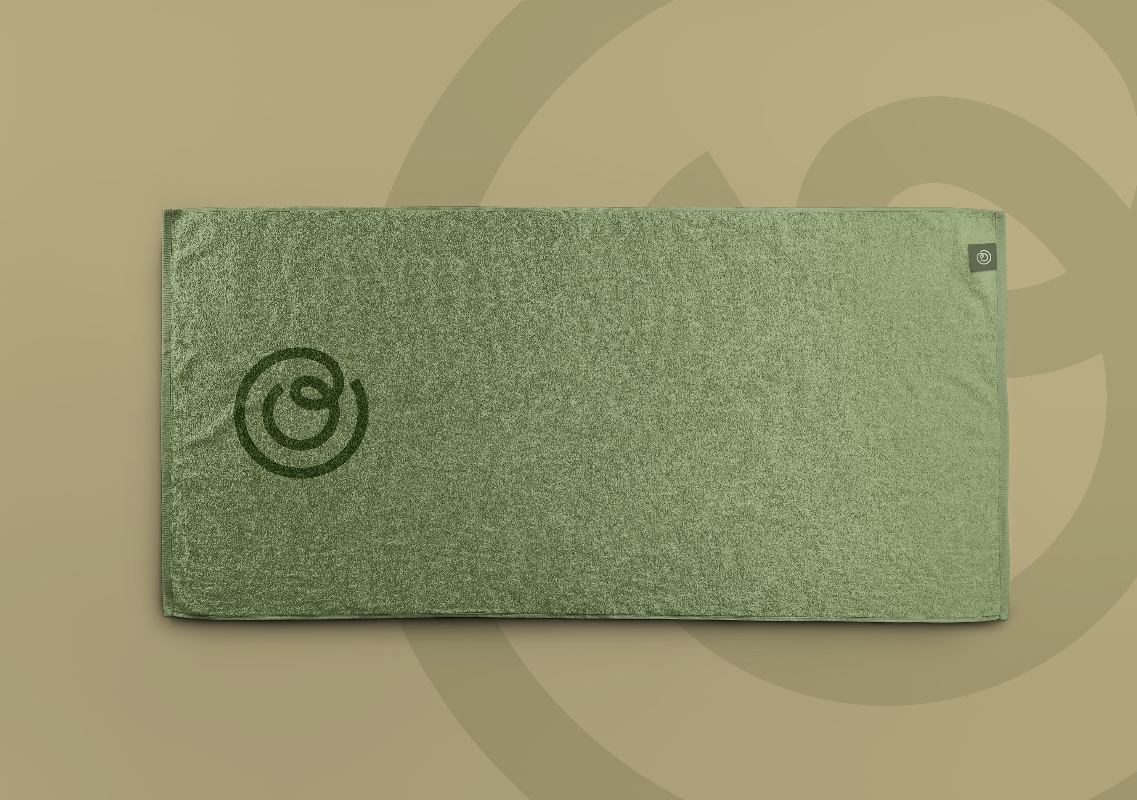
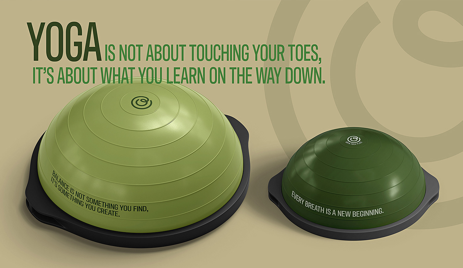
Green became the foundation of the identity—not as a trend, but as a deliberate psychological choice. Positioned at the centre of the visible spectrum, green is widely regarded as the most restful colour for the human eye. It naturally evokes:
+ Balance and equilibrium
+ Growth and renewal
+ A connection to nature
+ Balance and equilibrium
+ Growth and renewal
+ A connection to nature
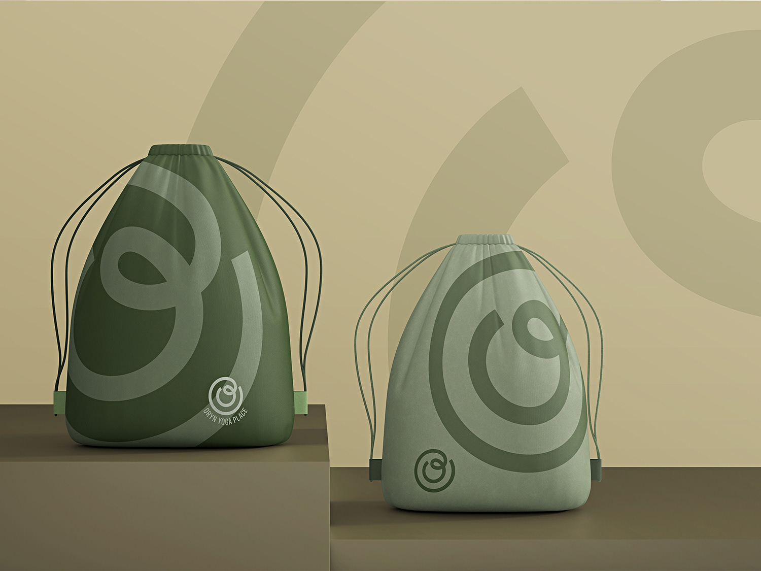
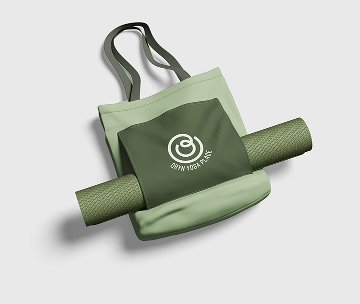
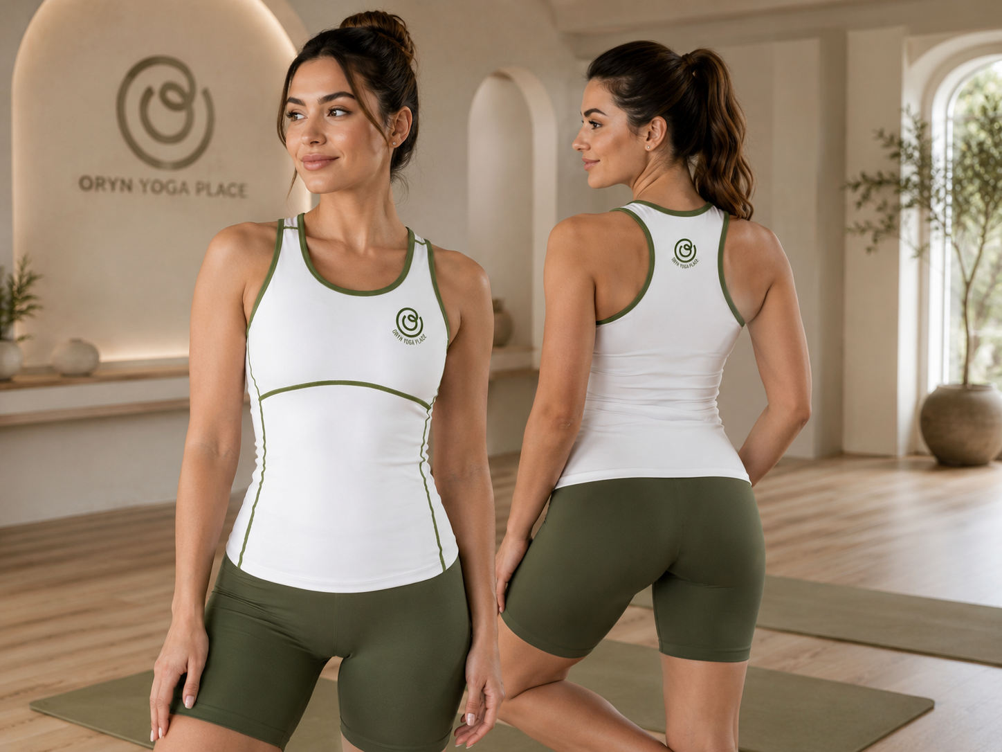
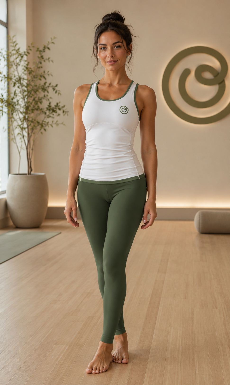
Rather than using green decoratively, it was treated as an emotional anchor—a constant throughout the brand experience that reinforces calmness
and stability.
and stability.
2. Naming as Atmosphere
The name ORYN was intentionally designed to feel open, minimal, and interpretive. Phonetically soft and balanced, it reflects the rhythm and flow of
breath, an essential element of yoga practice. While abstract, the name subtly suggests:
+ Origin
+ Alignment
+ Inner awareness
breath, an essential element of yoga practice. While abstract, the name subtly suggests:
+ Origin
+ Alignment
+ Inner awareness
This ambiguity allows the brand to feel personal and expansive, rather than prescriptive.
3. Minimalism with Purpose
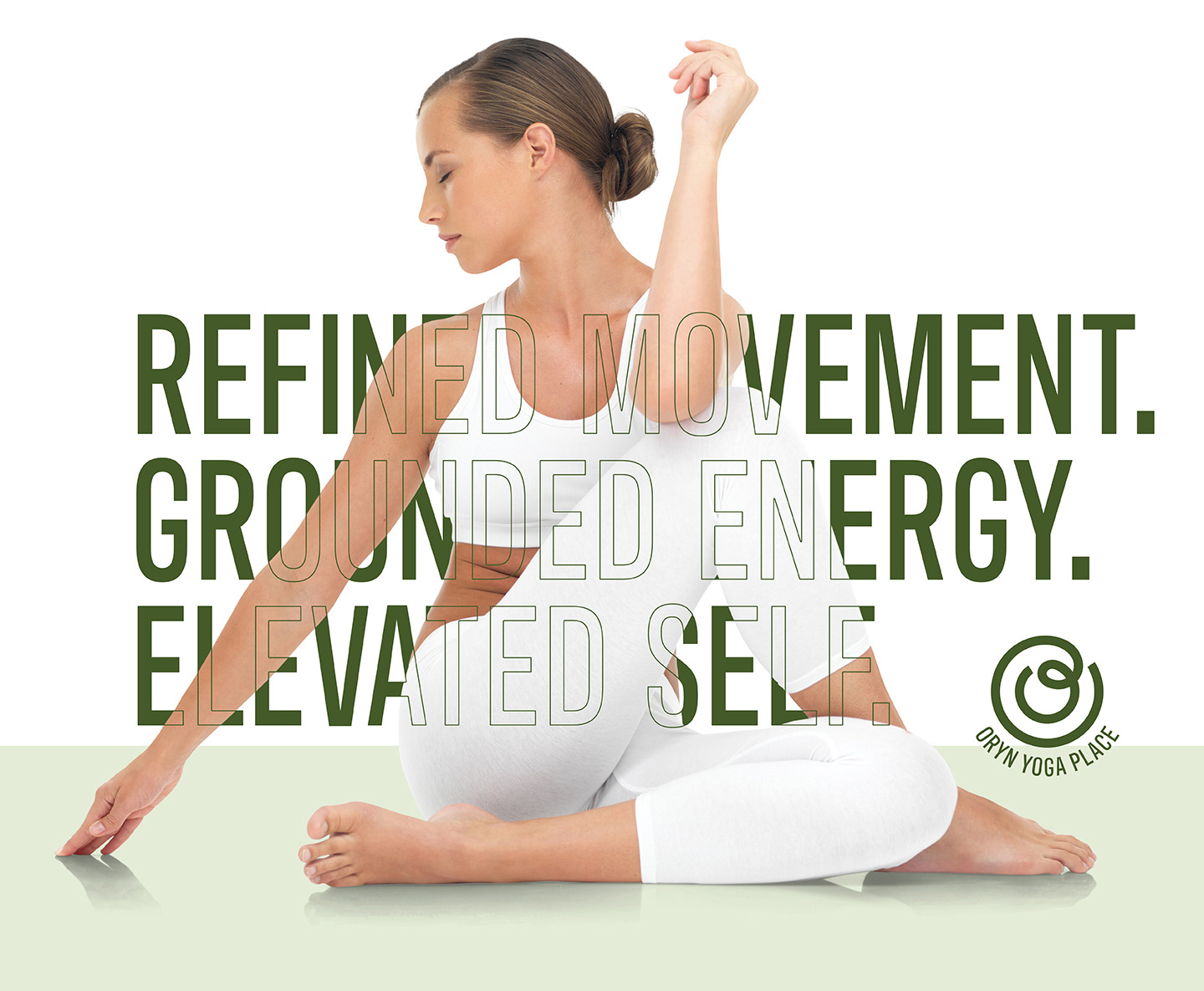
Every design decision was guided by restraint. Instead of adding elements, the process focused on removing anything unnecessary, allowing space, typography, and colour to carry meaning. The result is an identity that feels:
+ Quiet but confident
+ Simple but intentional
+ Contemporary yet grounded
+ Quiet but confident
+ Simple but intentional
+ Contemporary yet grounded
Workflow
1. Research & Positioning
The process began with an exploration of the wellness and yoga landscape—identifying common visual patterns and opportunities for differentiation.
This phase focused on defining:
+ Brand tone (calm, elevated, modern)
+ Audience perception (approachable yet refined)
+ Visual gaps within the category
This phase focused on defining:
+ Brand tone (calm, elevated, modern)
+ Audience perception (approachable yet refined)
+ Visual gaps within the category
2. Concept Development
Early directions explored how minimalism could express mindfulness without feeling empty.
This included:
+ Name exploration and phonetic testing
+ Colour psychology studies
+ Initial typographic mood directions
The concept of “calm through clarity” emerged as the guiding principle.
This included:
+ Name exploration and phonetic testing
+ Colour psychology studies
+ Initial typographic mood directions
The concept of “calm through clarity” emerged as the guiding principle.
3. Identity Design
With a clear direction established, the visual system was refined through:
+ Typography: Clean, balanced forms that emphasize readability and flow
+ Colour System: A restrained green palette supported by neutral tones
+ Composition: Generous spacing to create a sense of breath and openness
+ Typography: Clean, balanced forms that emphasize readability and flow
+ Colour System: A restrained green palette supported by neutral tones
+ Composition: Generous spacing to create a sense of breath and openness
Every element was designed to feel intentional and uncluttered.
4. Refinement & Application
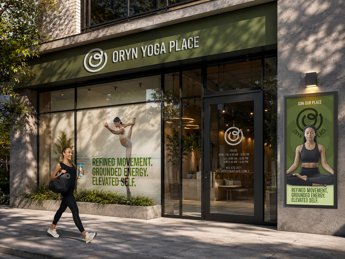
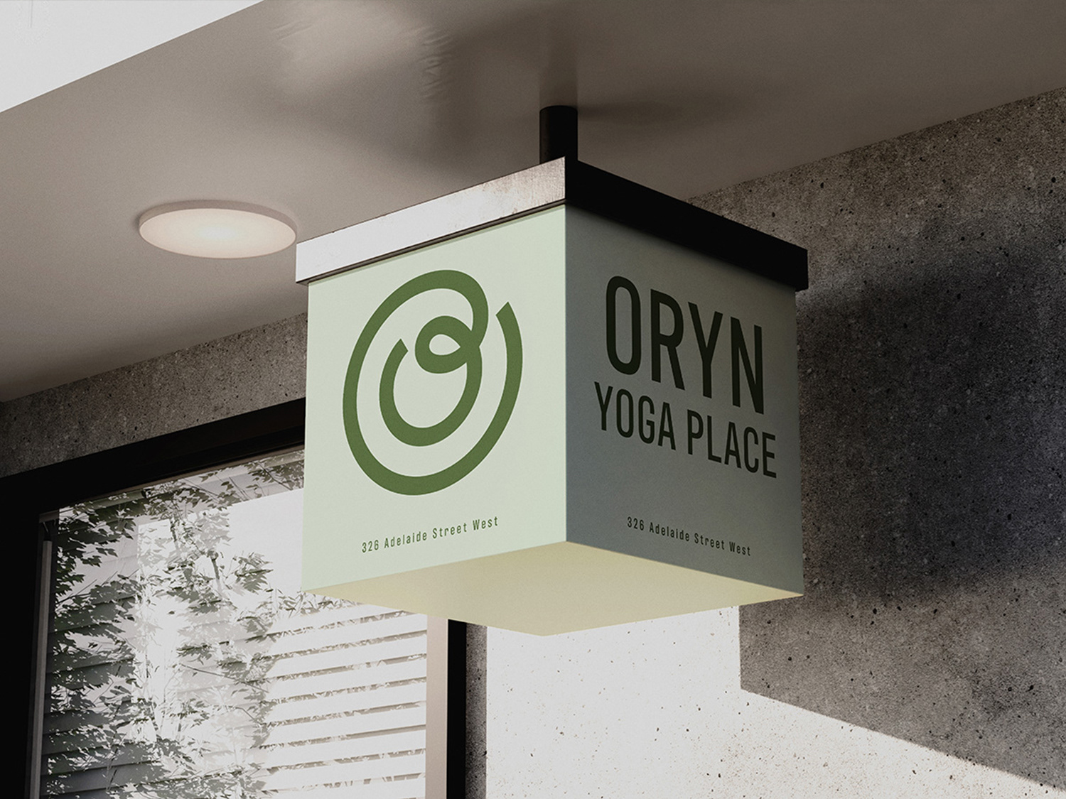
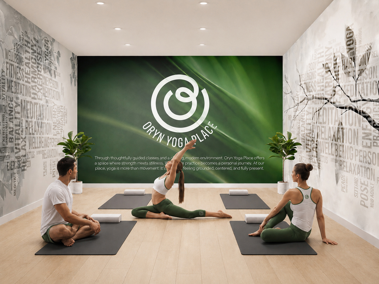
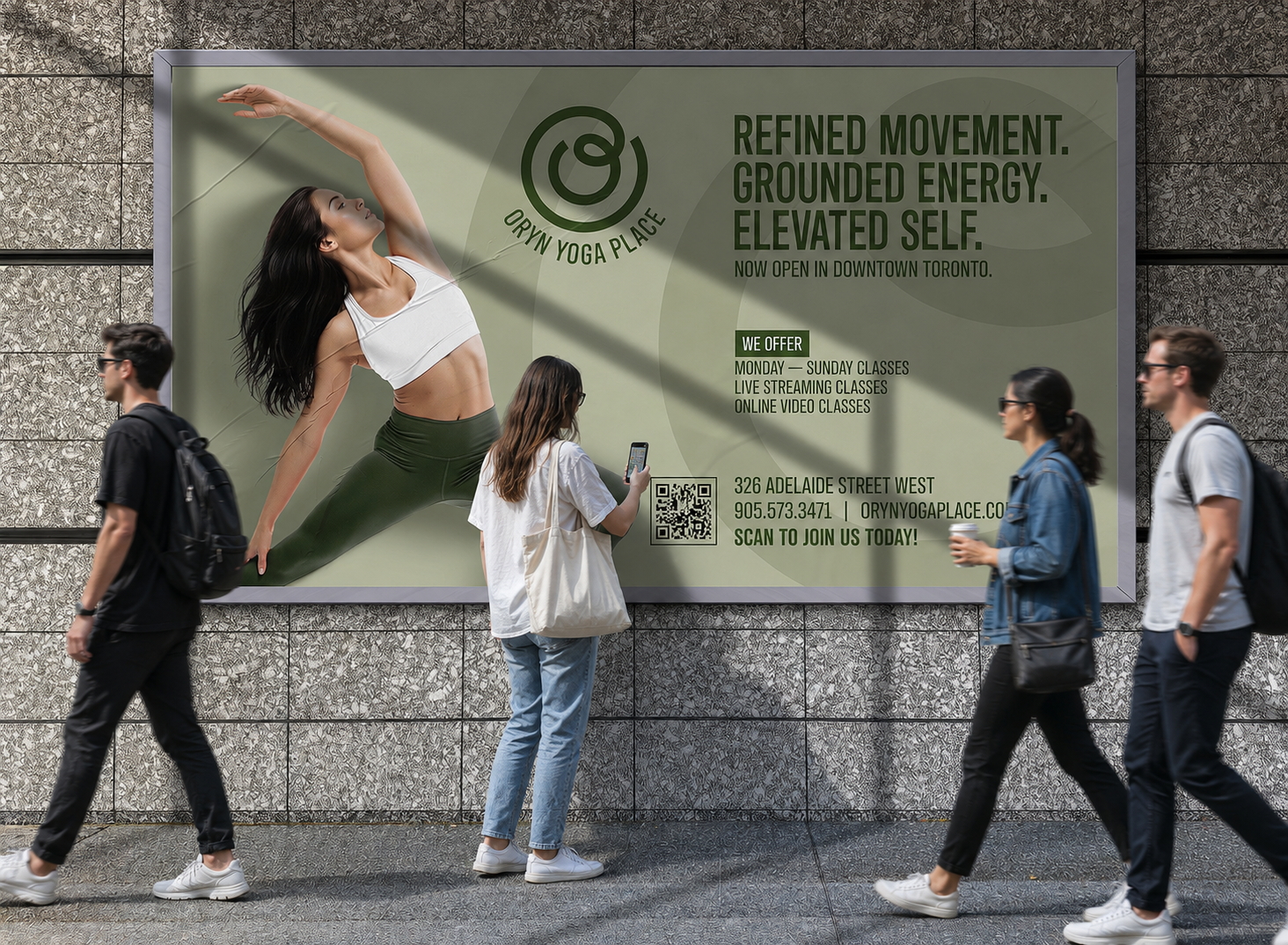
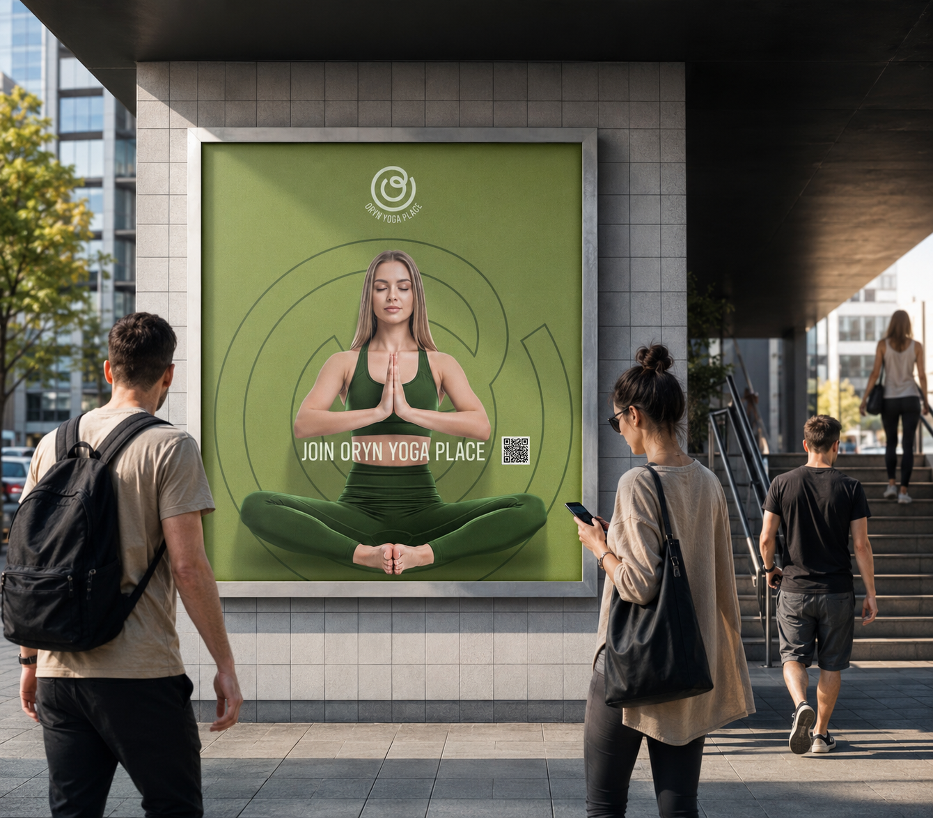
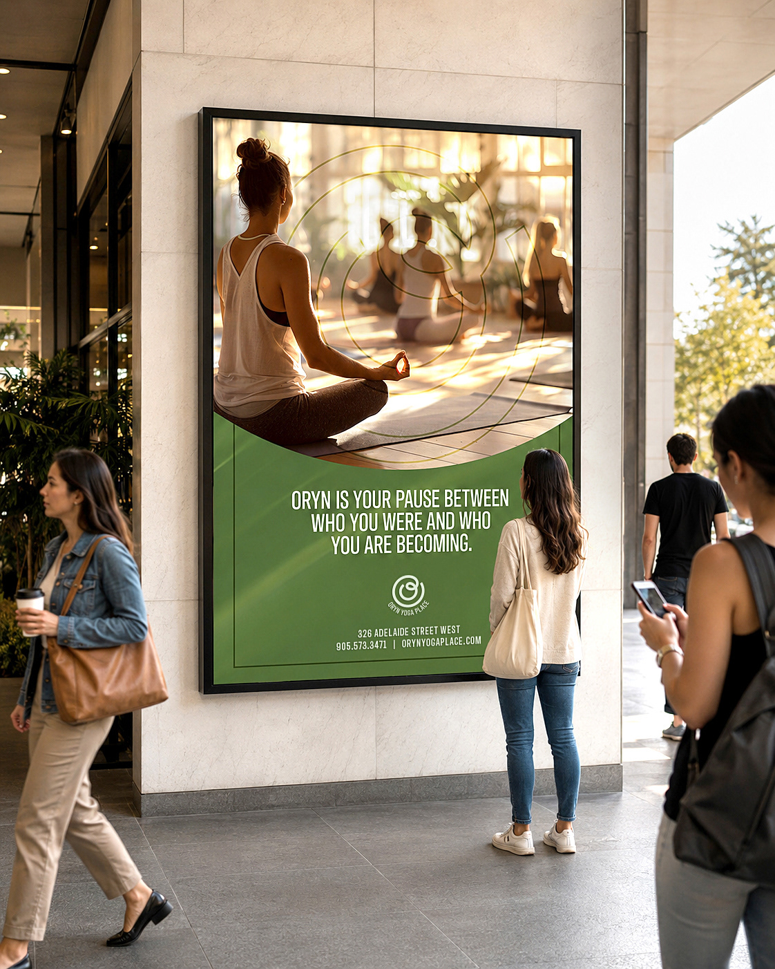
The identity was then applied across key touchpoints to ensure consistency and flexibility:
+ Brand mark and logo lockups
+ Social and digital applications
+ Print and environmental considerations
+ Brand mark and logo lockups
+ Social and digital applications
+ Print and environmental considerations
This phase ensured the brand could scale while maintaining its calm, cohesive presence.
The Outcome
ORYN Yoga Place is a brand built on clarity rather than complexity. It demonstrates how restraint, thoughtful colour use, and intentional naming can create a meaningful identity—one that doesn’t just represent yoga, but quietly reflects its essence.