OVERVIEW
Client: Royal Ontario Museum
Project: Art in a Gemstone Gala Exhibition
Exhibition Dates: November 27, 2019 – March 15, 2020
Project: Art in a Gemstone Gala Exhibition
Exhibition Dates: November 27, 2019 – March 15, 2020
EXHIBITION CONCEPT
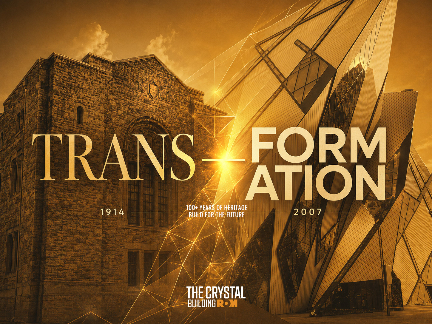
This exhibition was created in honour of Daniel Libeskind, the architect behind the Royal Ontario Museum’s iconic 2007 extension, now known as the
Michael Lee-Chin Crystal.
Michael Lee-Chin Crystal.
The project explores the relationship between architecture, geometry, and graphic abstraction through the process of Graphic Translation. Inspired by the Crystal’s dynamic structure, the architectural form was deconstructed and reinterpreted into simplified geometric compositions that express movement, light, depth, and spatial rhythm.
DESIGN METHODOLOGY
What is Graphic Translation?
Graphic Translation is the process of simplifying a complex object, shape, or subject into a clear and visually engaging graphic form. Through design abstraction, designers analyze, interpret, and reduce visual information while preserving the recognizable identity of the original subject.
Using elements such as lines, points, shapes, shadows, and abstraction, Graphic Translation transforms detailed visual references into simplified compositions that are both artistic and easy to understand.
This process is not the creation of a logo or brand identity. Instead, it is a visual exploration technique used to study form, structure, and meaning, translating complex references into expressive graphic compositions.
OBJECTIVES
The primary objective of the campaign was to develop a distinctive visual direction for the gala that connected Daniel Libeskind’s architectural language with the museum’s cultural and artistic identity.
The goal was to create a flexible visual system that could communicate the exhibition concept clearly while maintaining a sophisticated, contemporary, and architectural tone across multiple promotional applications.
TECHNICAL OBJECTIVE
The technical objective was to apply the principles of Graphic Translation to deconstruct the complex architectural form of the Michael Lee-Chin Crystal into its most essential geometric characteristics.
Through abstraction, reduction, and interpretation, the building’s dynamic structure was transformed into a simplified graphic motif that became the foundation for the campaign’s visual language.
DESIGN OBJECTIVES
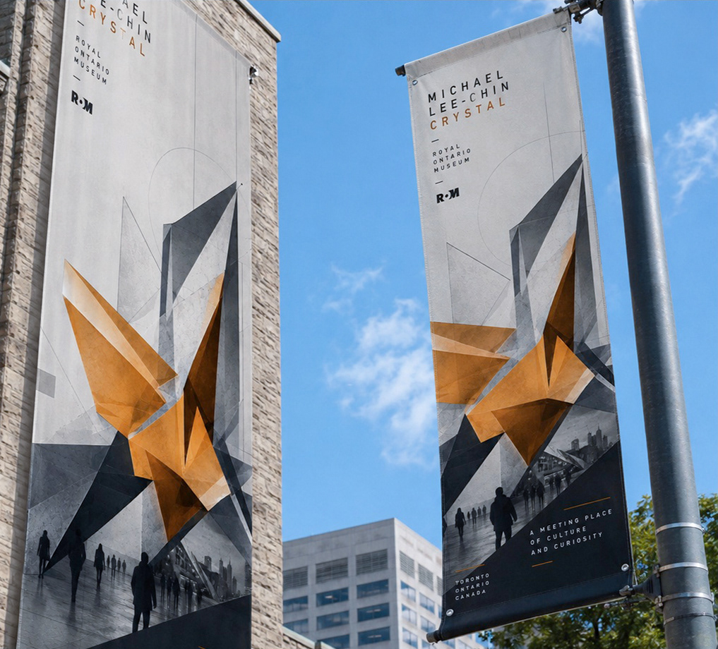
The design objective was to ensure that the translated geometric motif remained cohesive, adaptable, and immediately recognizable across the campaign.
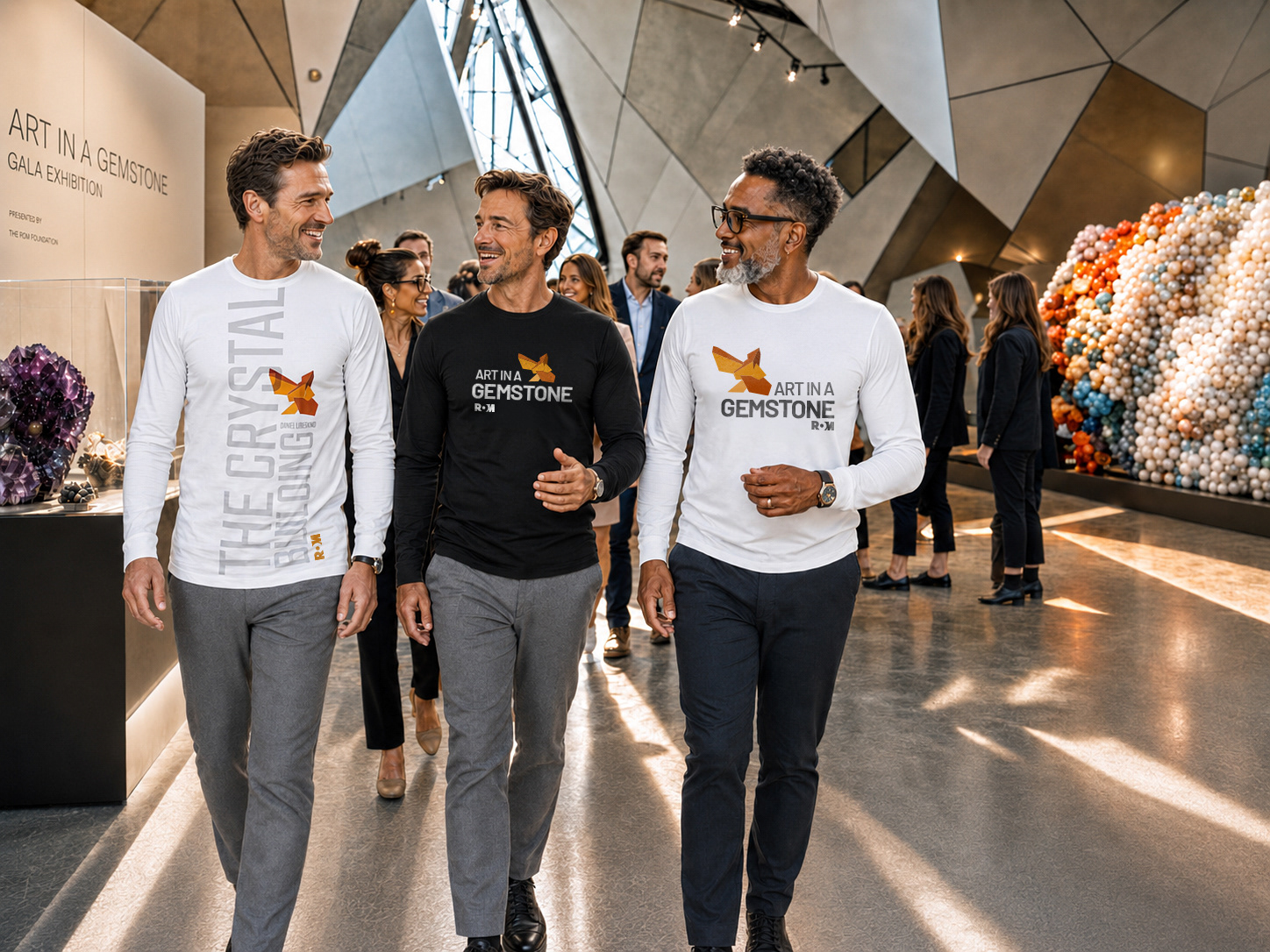
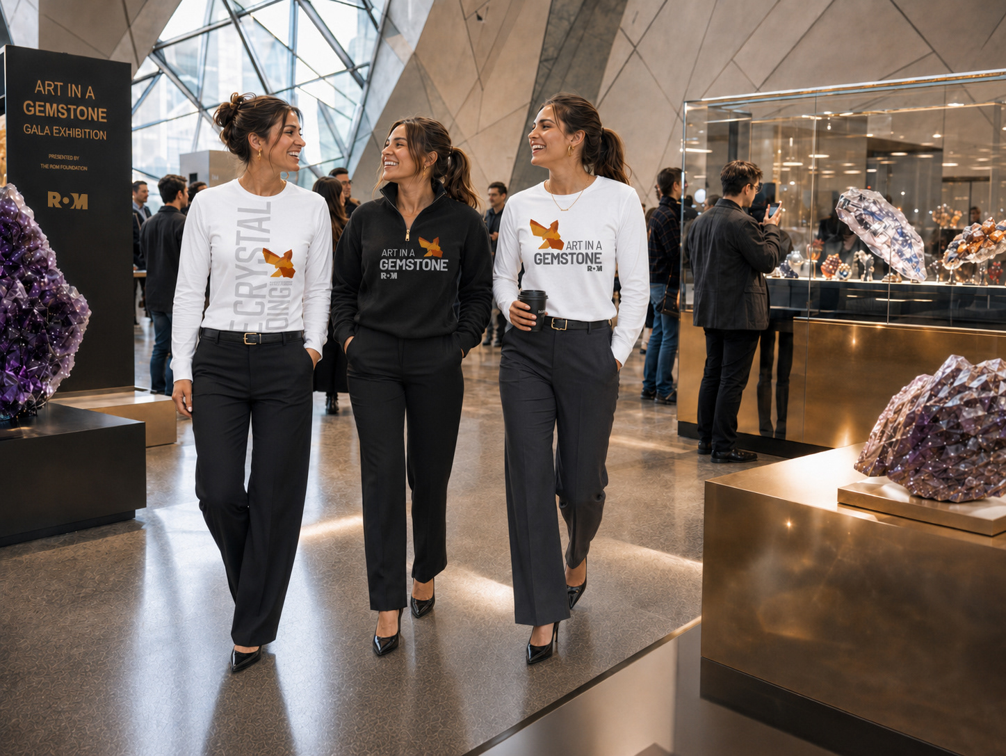
Whether used as a primary visual element, supporting graphic layer, or environmental design feature, the motif was developed to maintain strong visual continuity while allowing flexibility across posters, signage, digital promotions, merchandise, and exhibition applications.
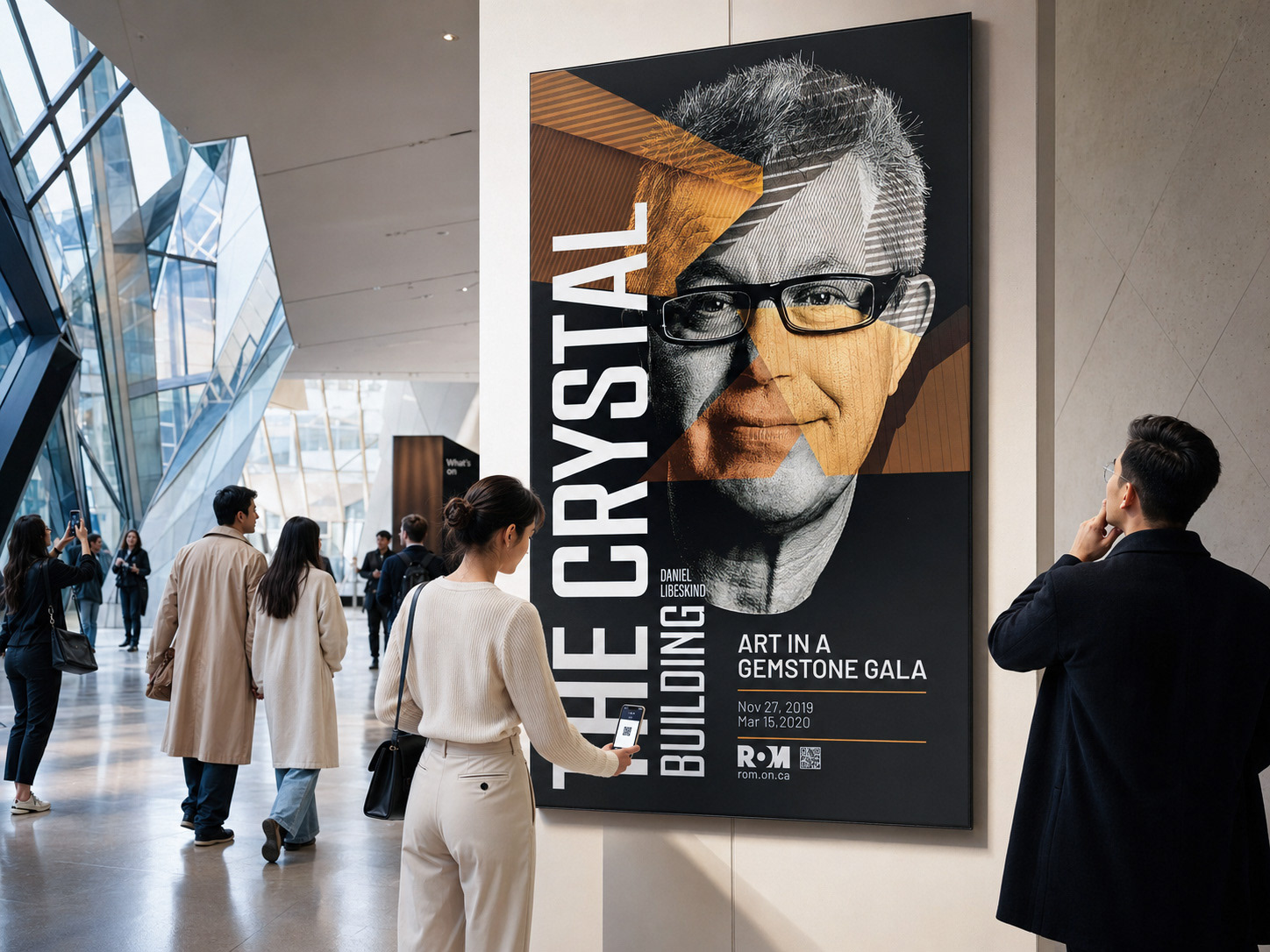
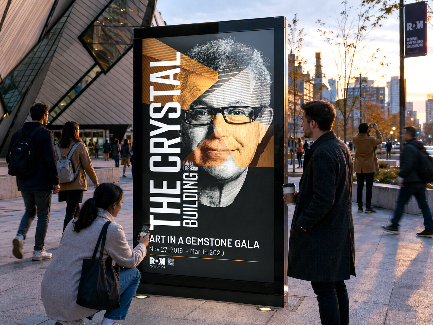
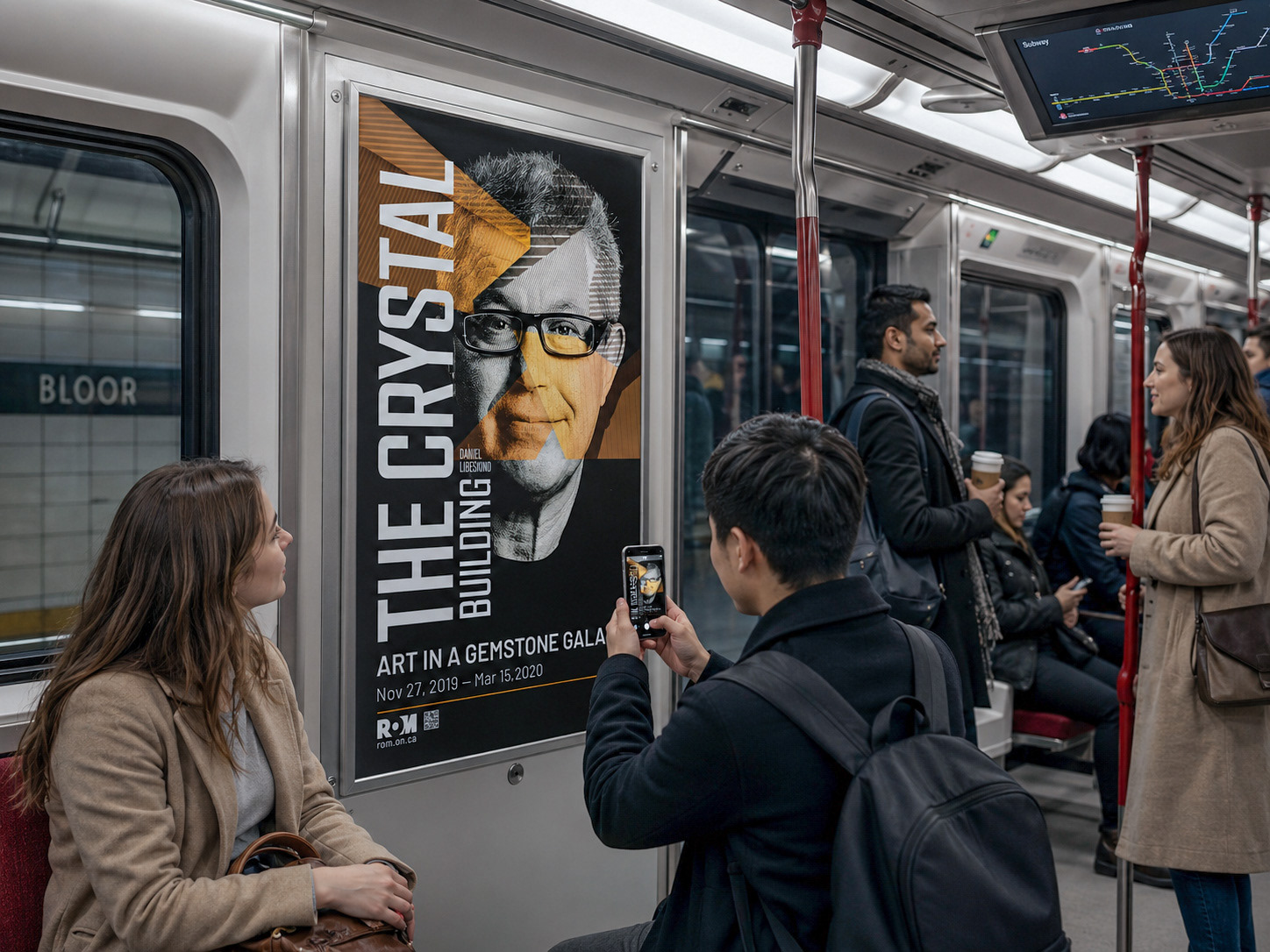
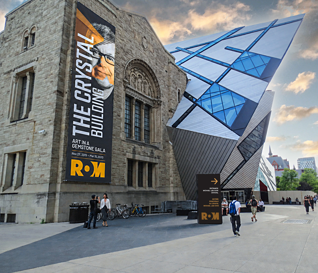
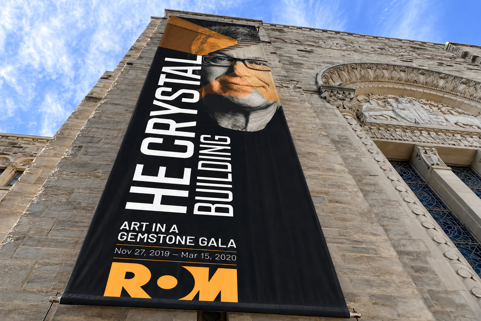
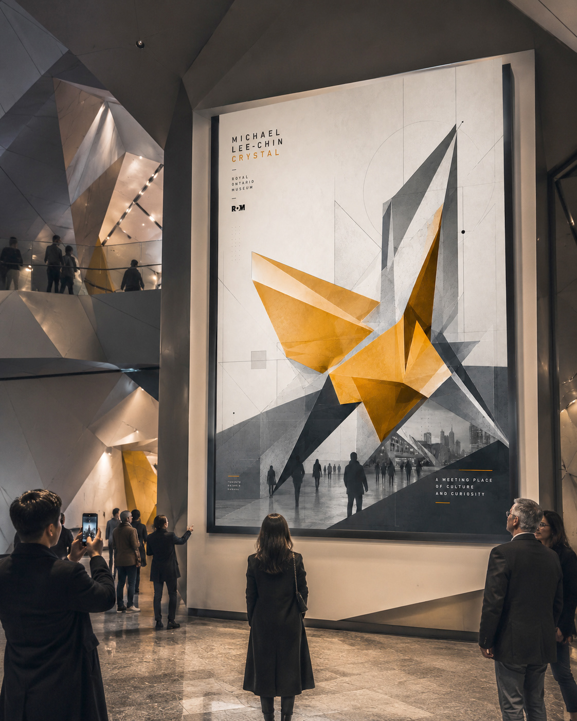
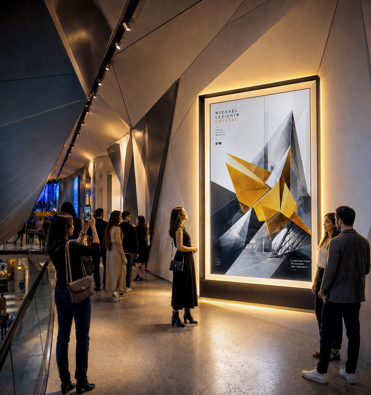
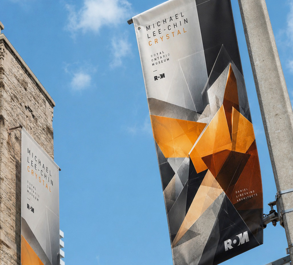
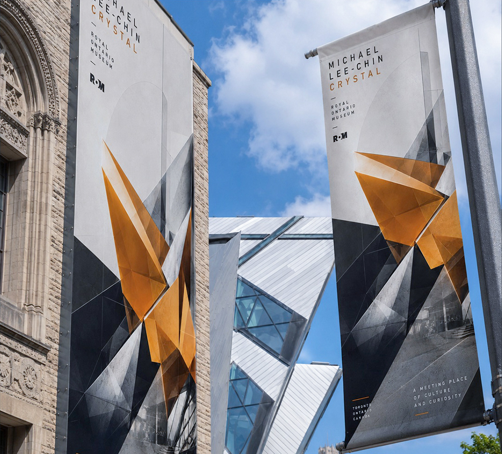
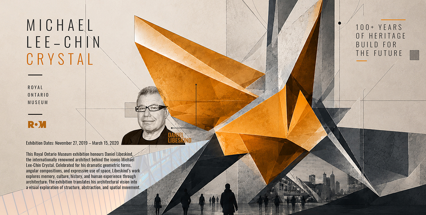
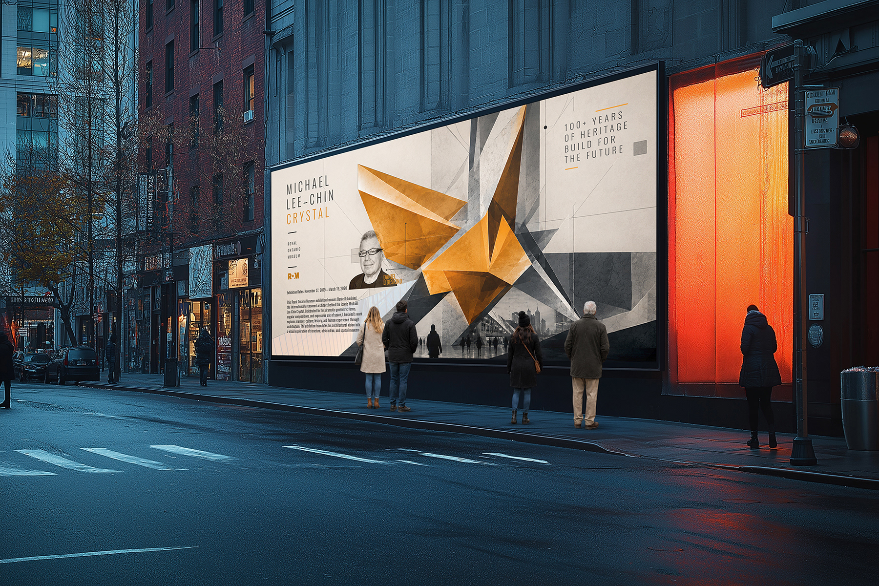
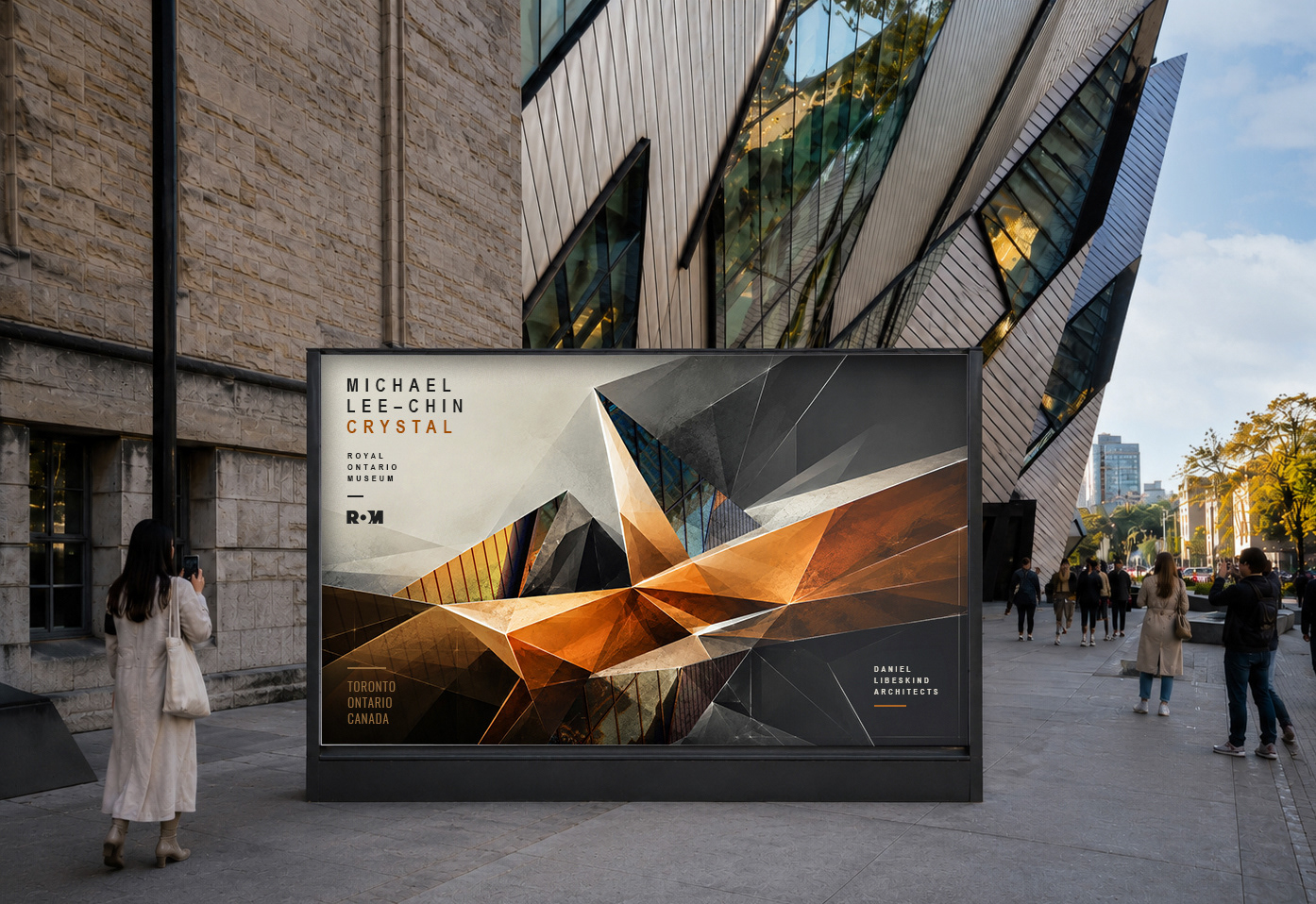
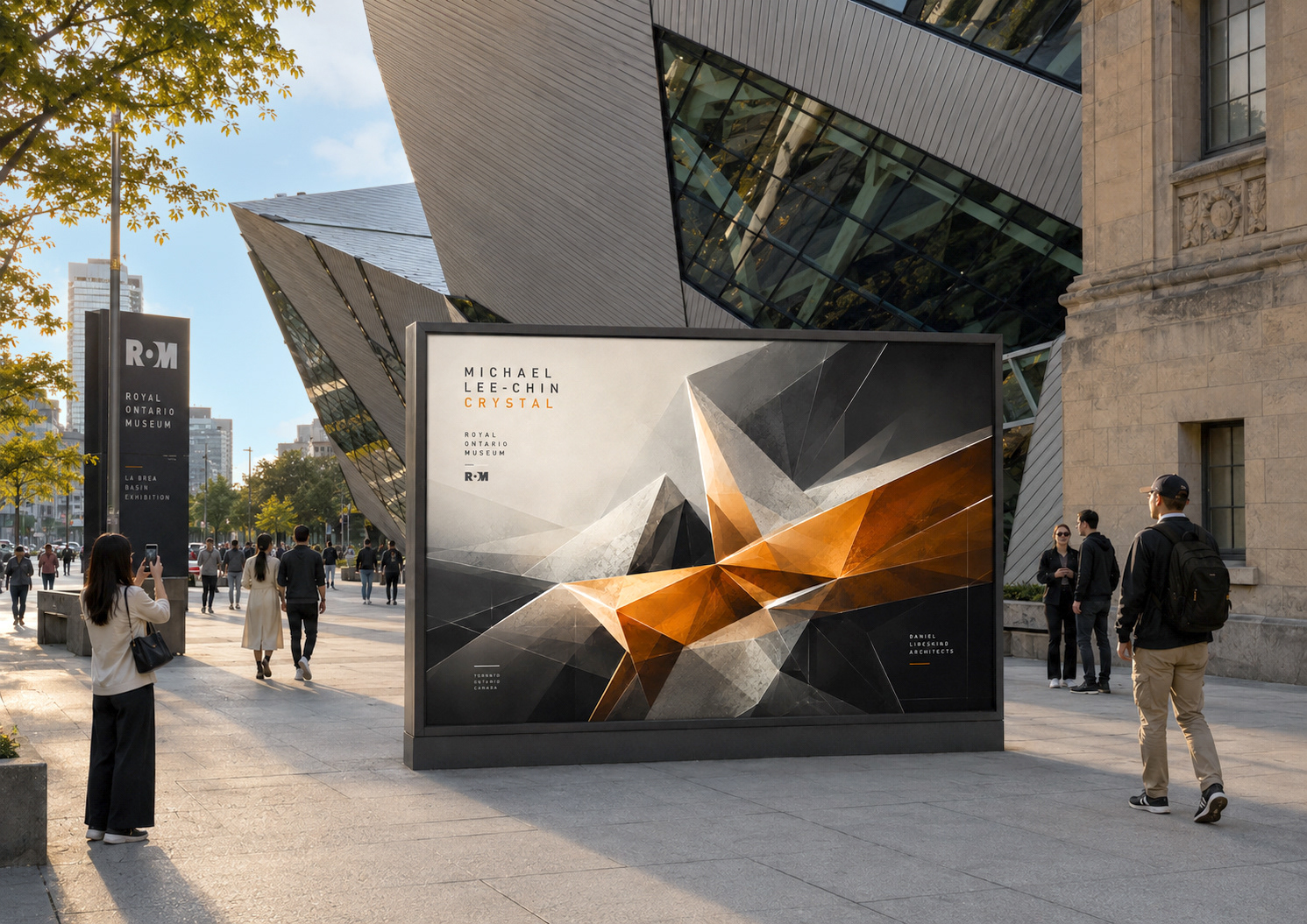
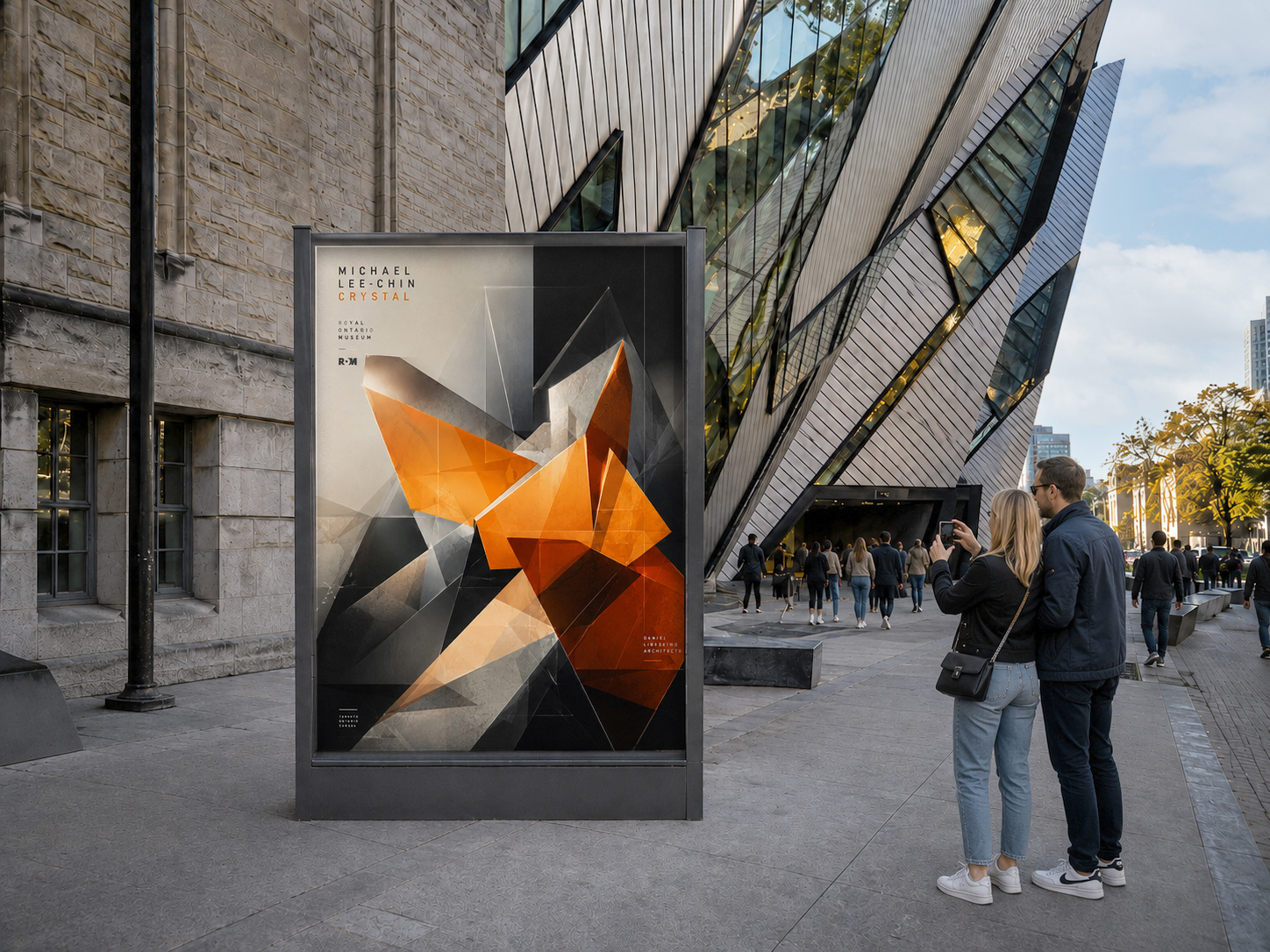
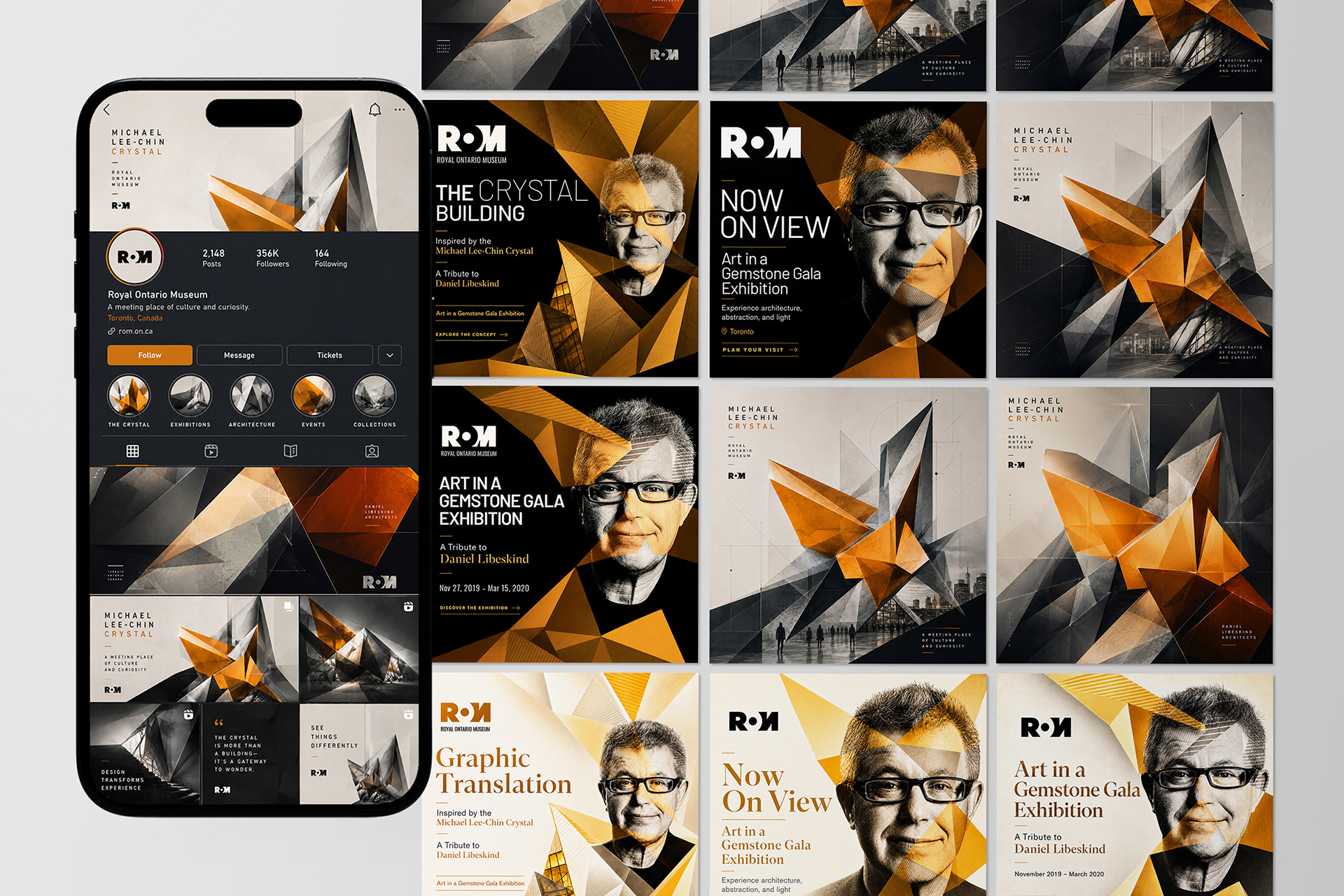
POSTER DESIGN
Inspired by architectural geometry, spatial fragmentation, and contemporary graphic abstraction, the final poster combines the translated geometric form with a photograph of Daniel Libeskind to create a layered, architecturally driven composition.
Angular structures, transparent overlays, and contrasting visual textures create a dynamic visual system that reflects the complexity, movement, and dimensional quality of the Michael Lee-Chin Crystal.
The overall design approach explores innovation, experimentation, cultural evolution, and the ongoing relationship between architecture, structure, and modern visual communication.
Architectural Source
Did you know the original concept for the Michael Lee-Chin Crystal was inspired by the Royal Ontario Museum’s gem and mineral collections? Its name, “Crystal,” was derived from the building’s dramatic crystalline forms and angular architectural geometry.
*Image credit: Studio Daniel Libeskind
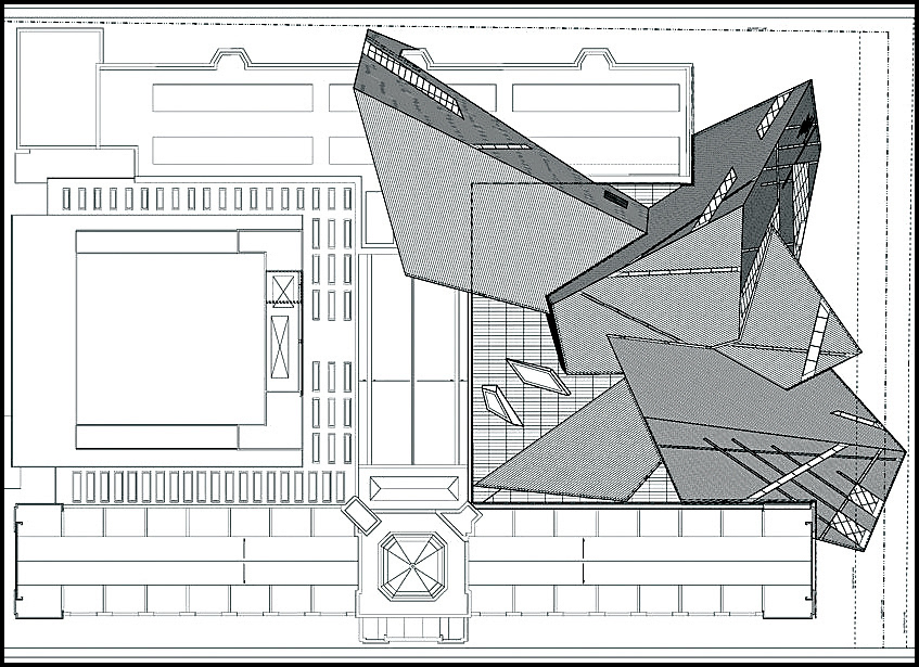
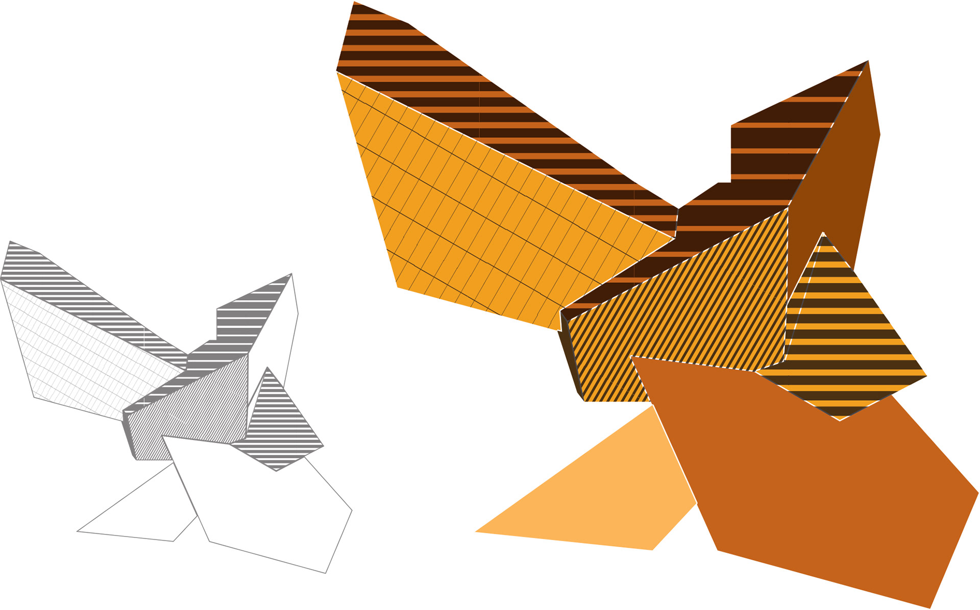
Visual Element Extraction
Using the Graphic Translation technique, I developed four distinct colour variations of the crystal illustration, each exploring unique tonal qualities and visual interpretations of the architectural form.

The combinations
The design was created by combining the translated crystal form with a photograph of Daniel Libeskind, resulting in a layered composition that visually connects the architecture to its creator.


Main Exhibition Poster design (Environmental & Experiential Design)
The combination of the crystal-inspired visual element and the photograph of Daniel Libeskind creates a bold and visually engaging composition that merges the structured elegance of Art Deco with subtle influences from Abstract Art into a single cohesive design.
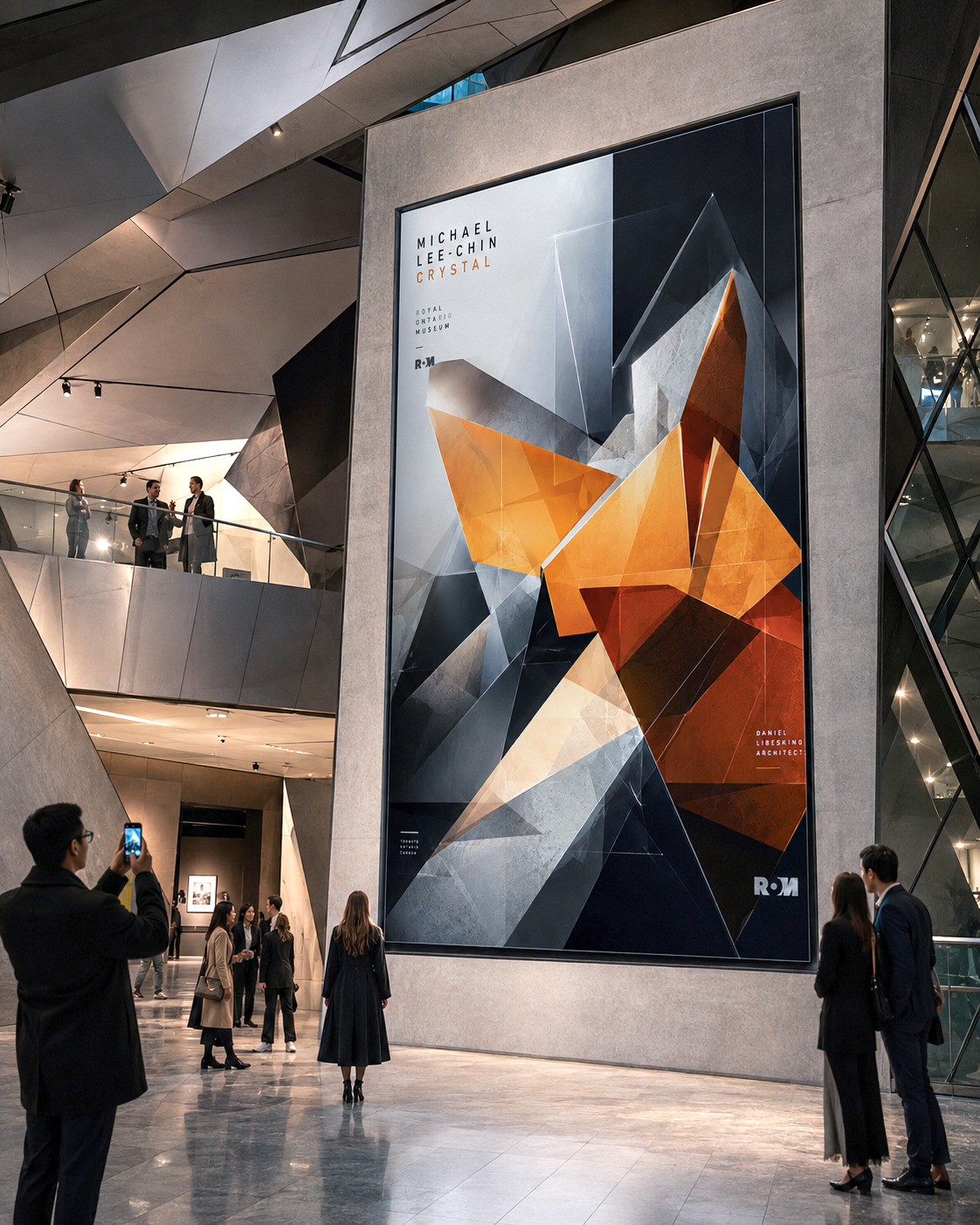
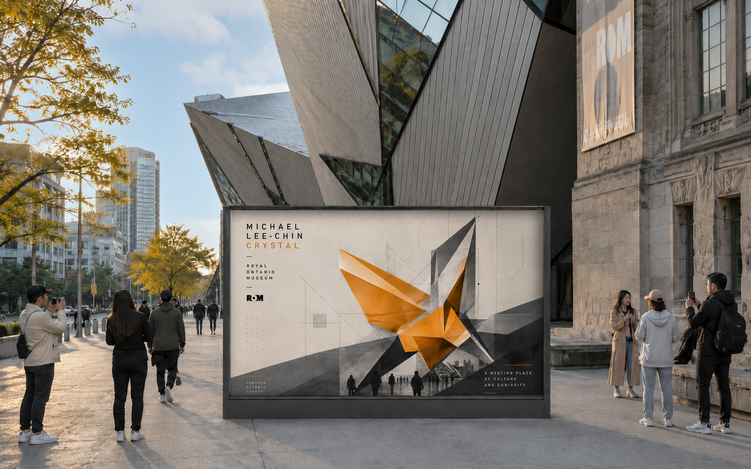
Second Exhibition Poster design
The second main poster explores an alternate composition within the same visual system, using the Graphic Translation technique to reinterpret the ROM’s architectural form through a different layout, colour treatment, and visual hierarchy. I created three different styles.

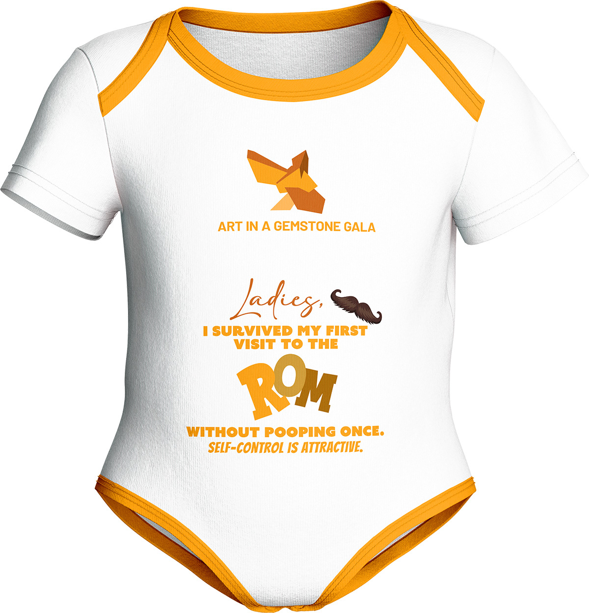
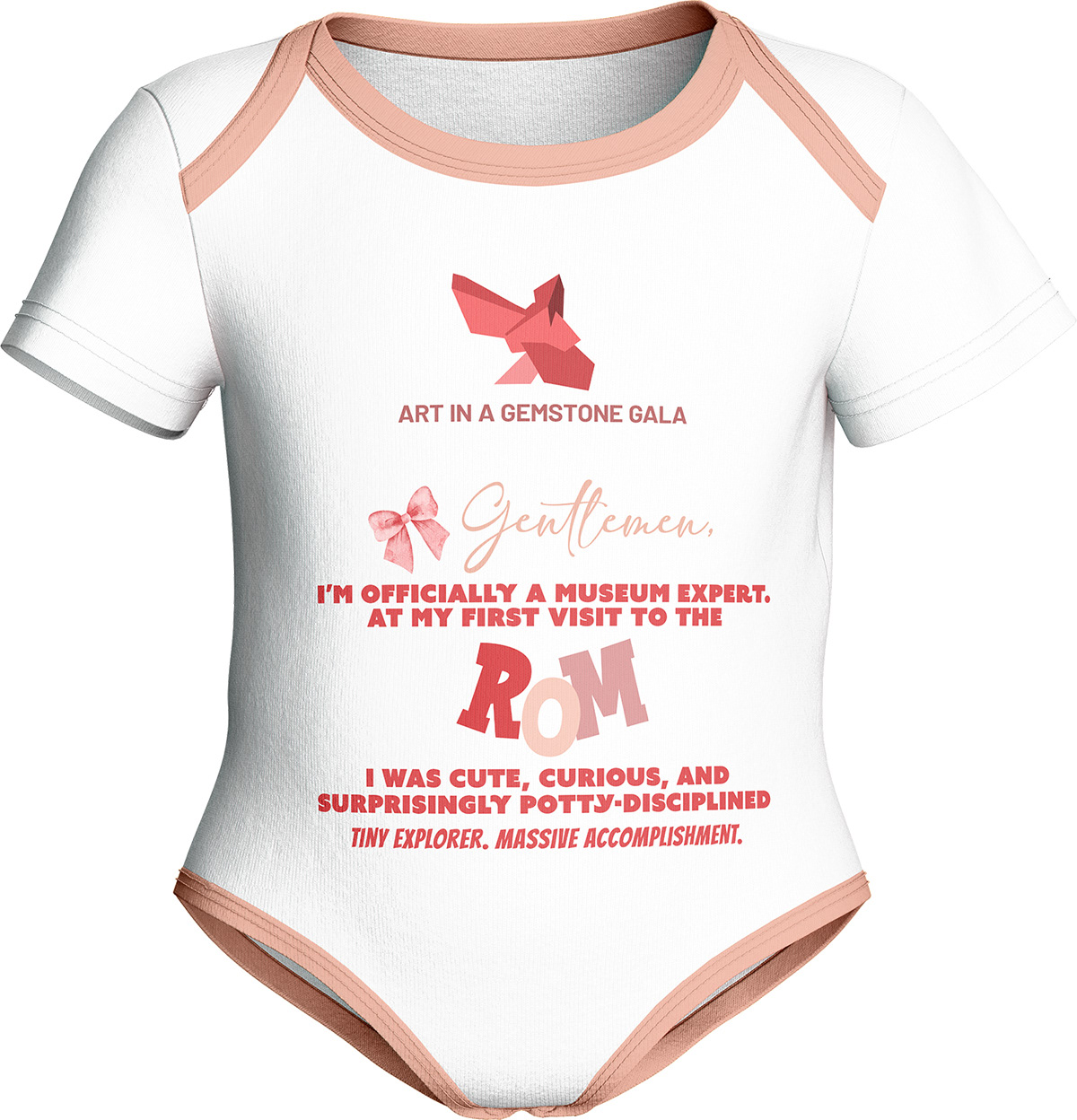
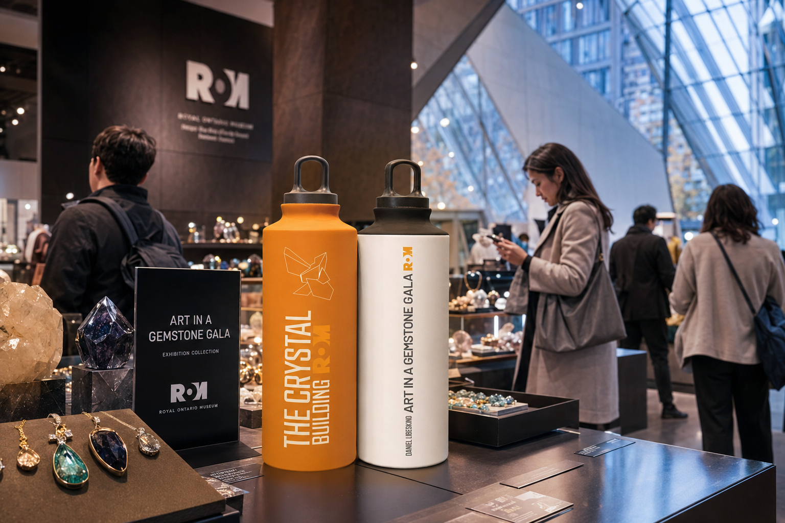
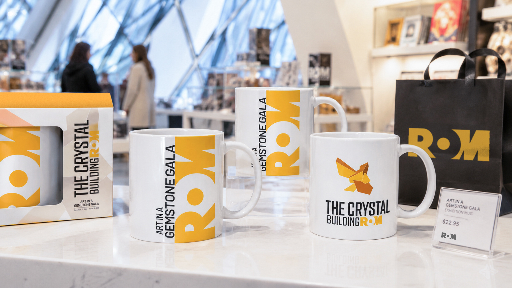
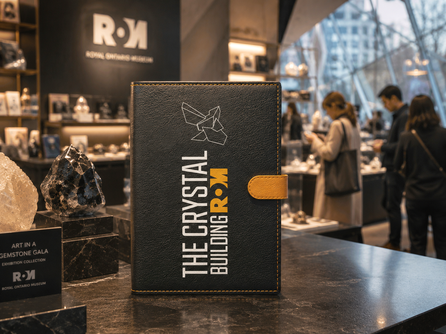
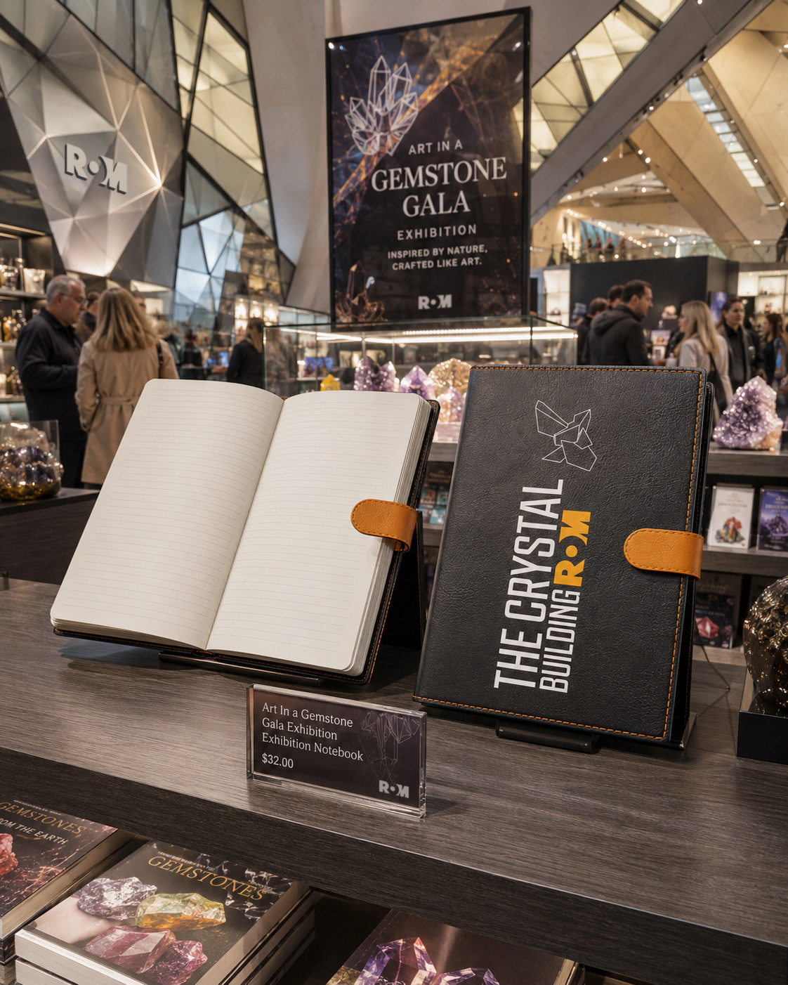
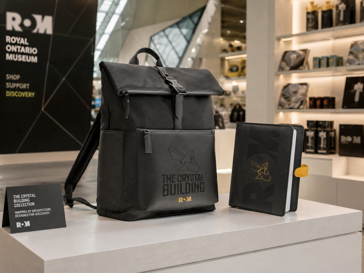
Museum Gift Shop Applications


Social Media
apparel