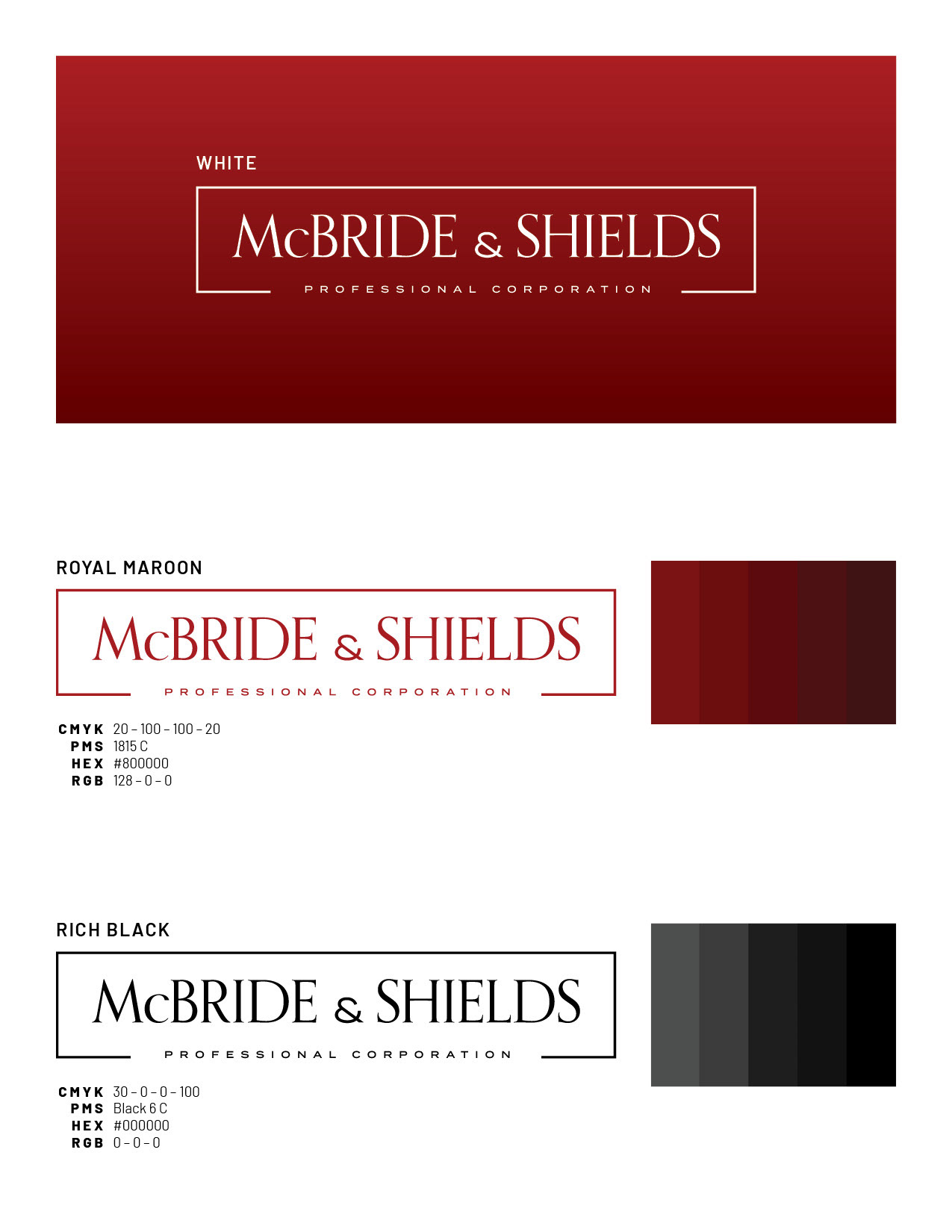
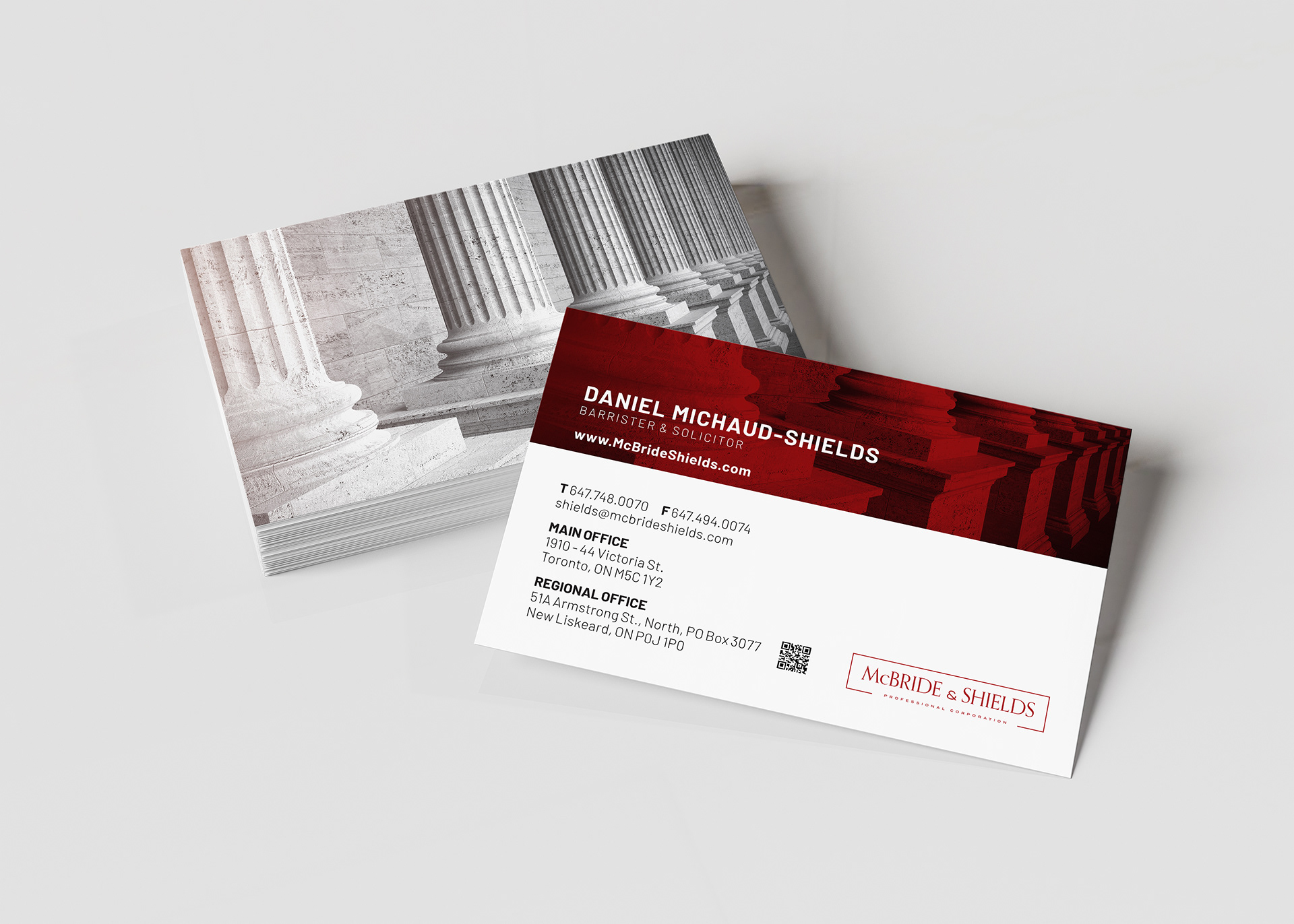
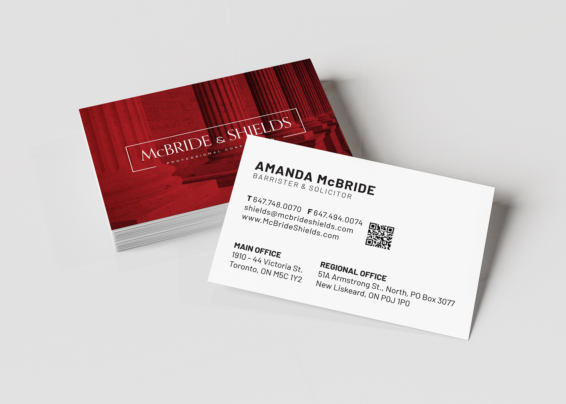
McBRIDE & SHIELDS - www.mcbrideshields.com
Logo and business card design project based on an actual client in Toronto.
Logo and business card design project based on an actual client in Toronto.
Located in the heart of Toronto, McBride & Shields Professional Corporation is a premier law firm recognized for its commitment to excellence and a client-focused approach.
Following a discussion with Daniel, Barrister and Solicitor and Managing Partner, it was identified that the firm required the development of a new logo and business cards for both himself and his partner, Amanda McBride. The firm’s name is notably derived from a combination of their surnames, reflecting a unified partnership.
Orpheus Pro typeface, case study.
The Orpheus Pro typeface, inspired by Walter Tiemann's late 1920s designs, skillfully merges classic Roman proportions with Art Deco sensibilities, resulting in a font that has become a staple in various industries such as real estate, law, packaging, and entertainment design, signifying professionalism. Retaining the refined spirit of its origins, this typeface offers a modern alternative to traditional serif styles, exuding elegance and timeless beauty, making it the preferred choice for brands aiming to convey sophistication and intellect.
The Orpheus Pro typeface, inspired by Walter Tiemann's late 1920s designs, skillfully merges classic Roman proportions with Art Deco sensibilities, resulting in a font that has become a staple in various industries such as real estate, law, packaging, and entertainment design, signifying professionalism. Retaining the refined spirit of its origins, this typeface offers a modern alternative to traditional serif styles, exuding elegance and timeless beauty, making it the preferred choice for brands aiming to convey sophistication and intellect.

BUSINESS CARDS
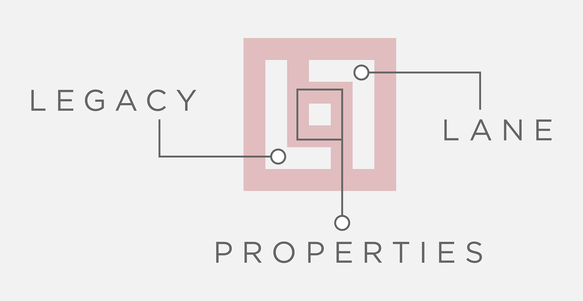
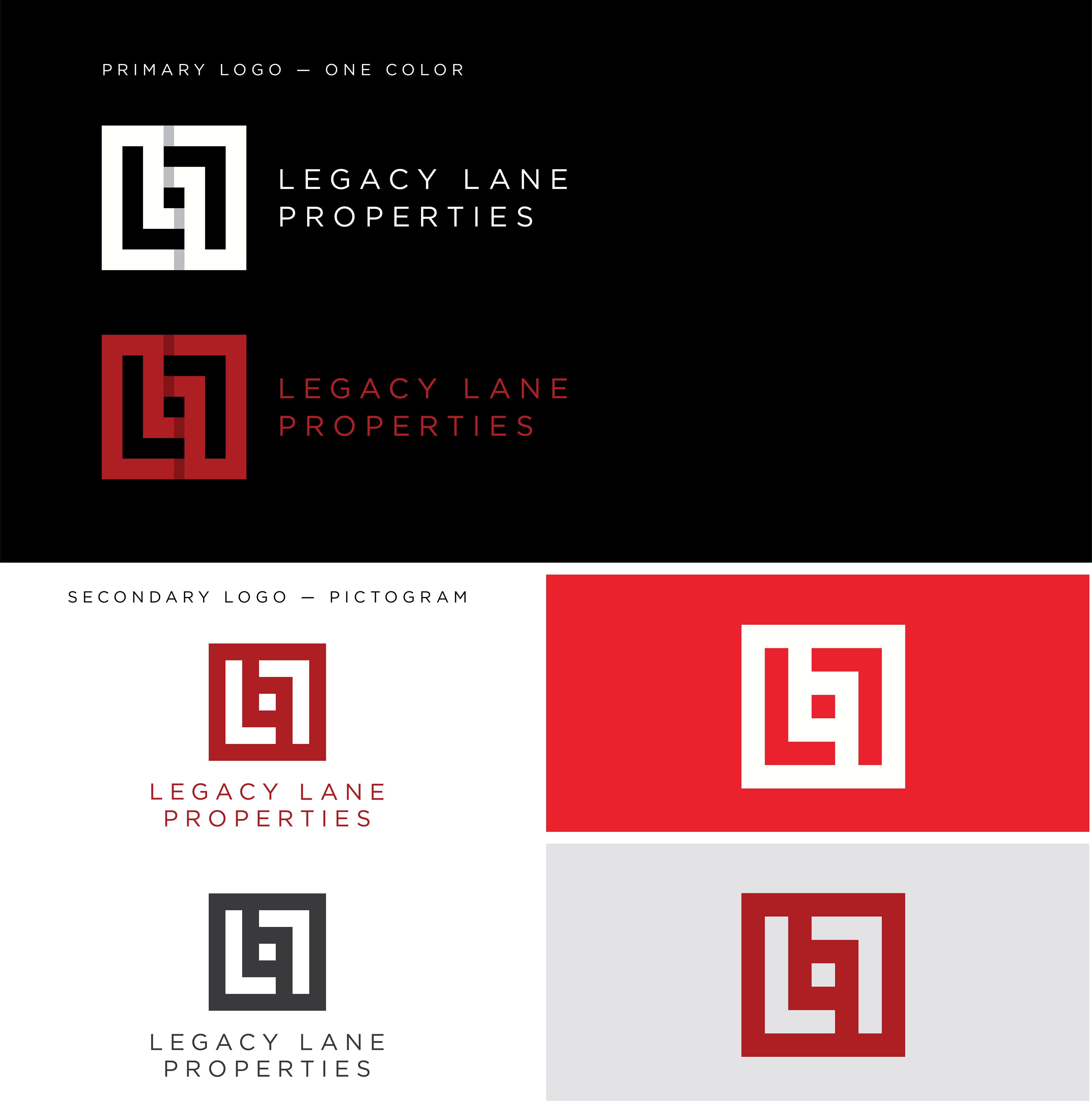
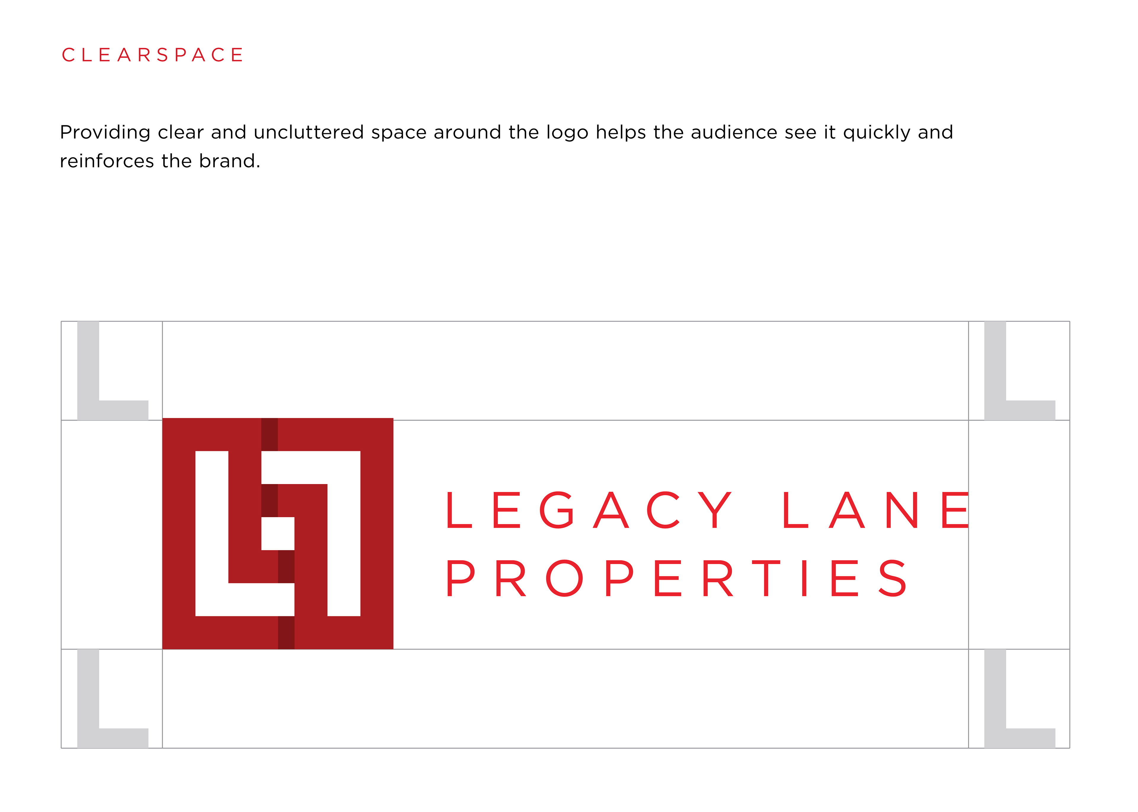
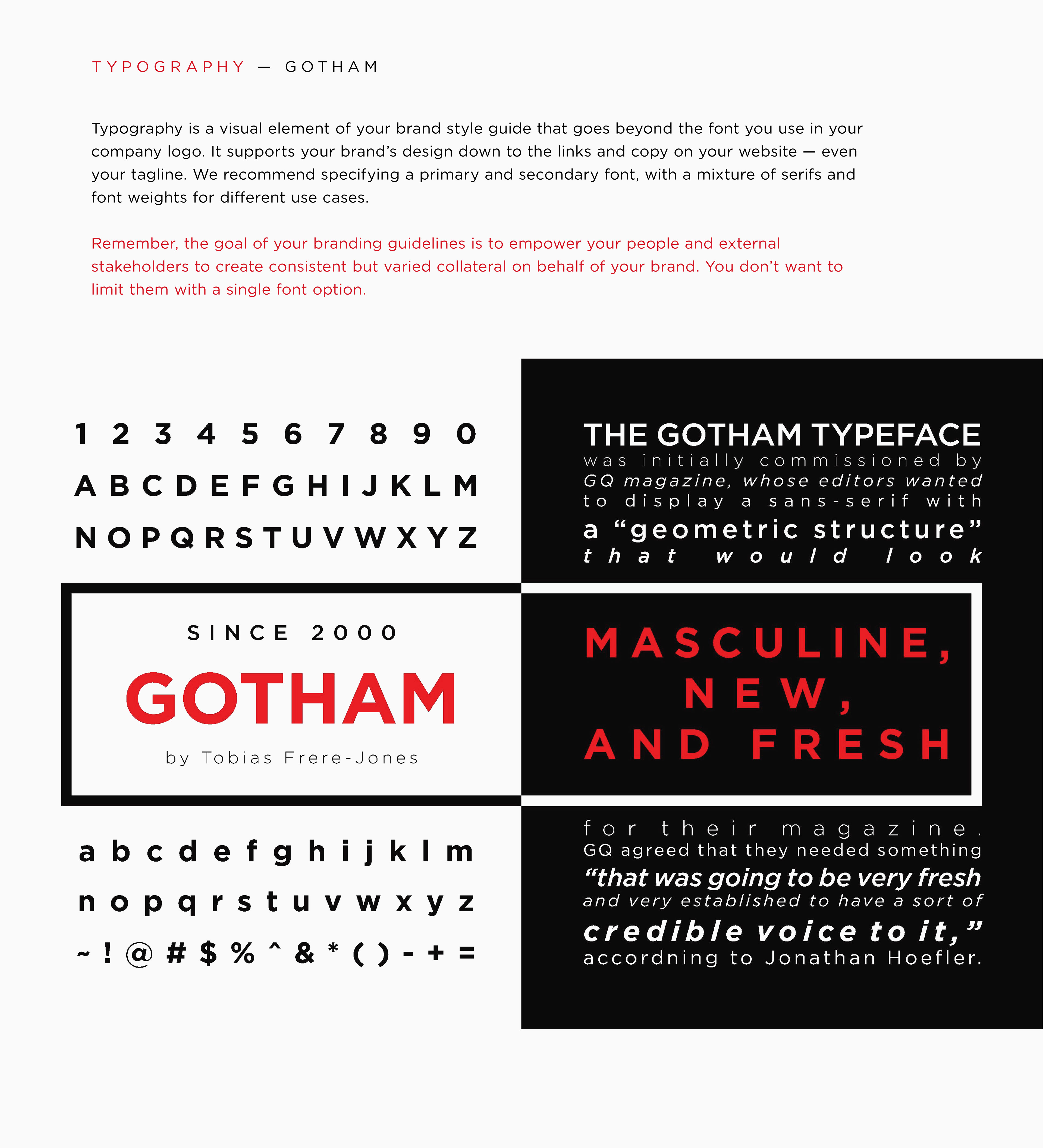
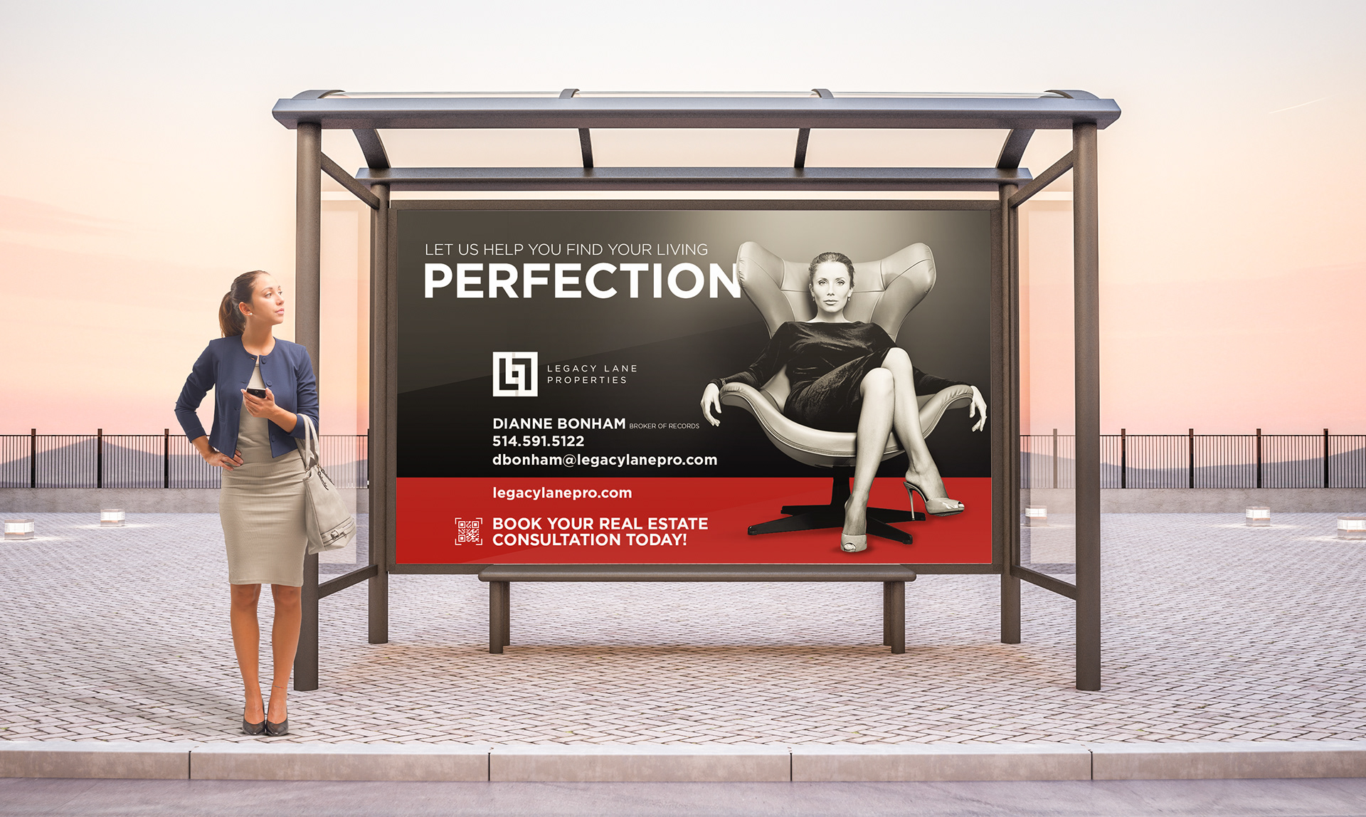
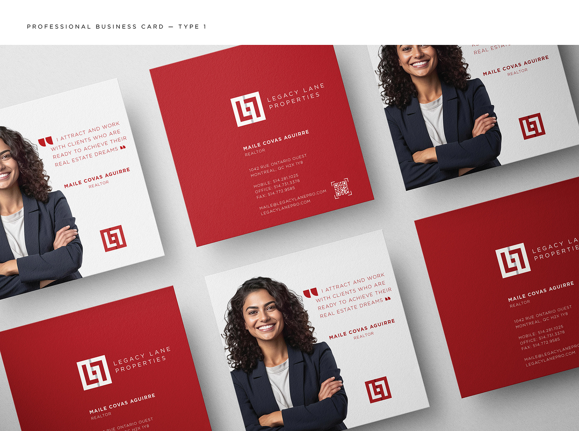
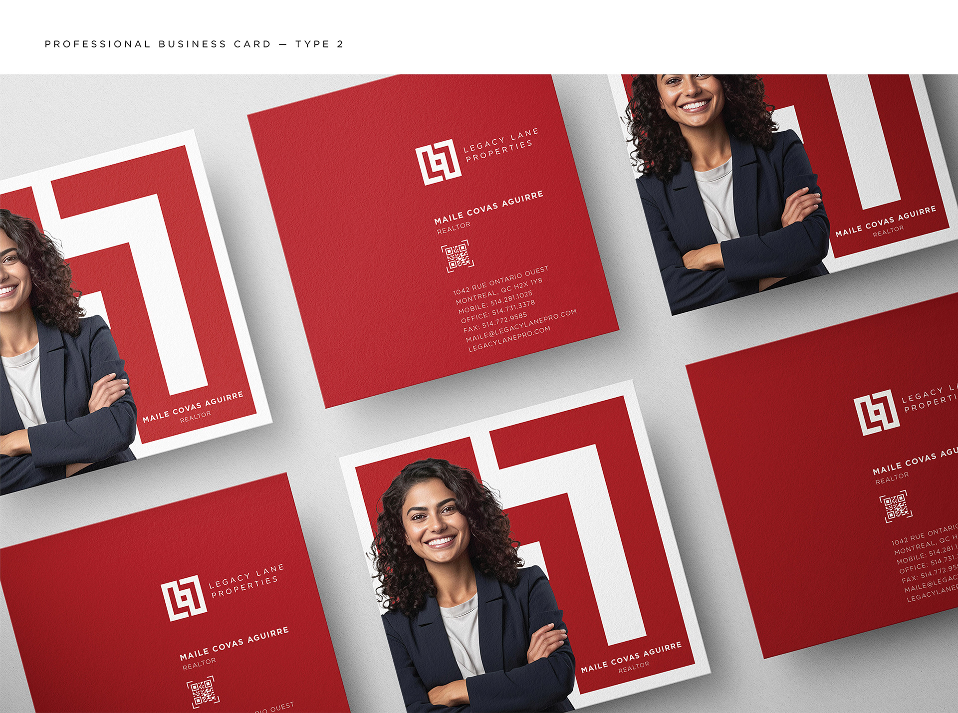
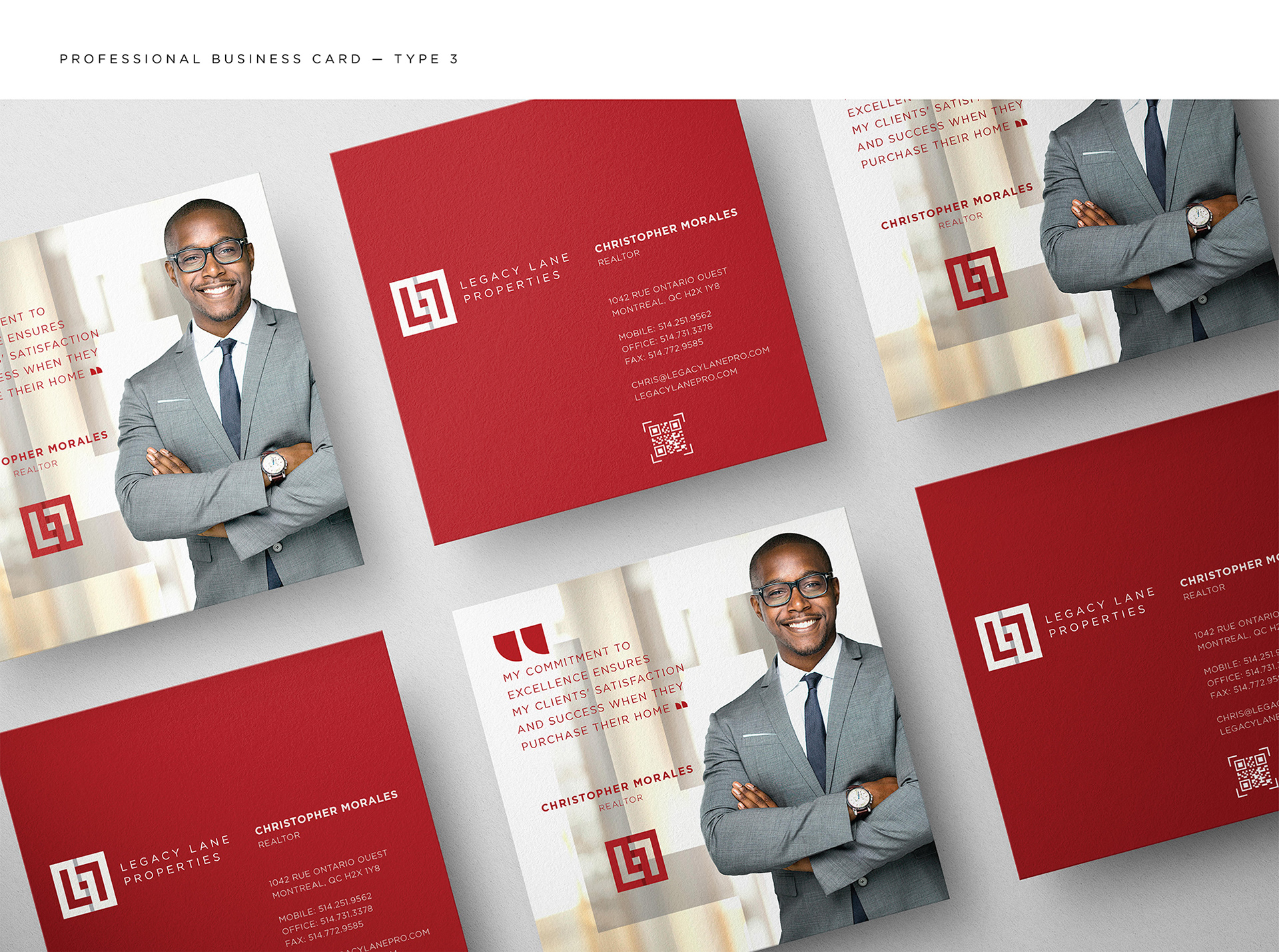
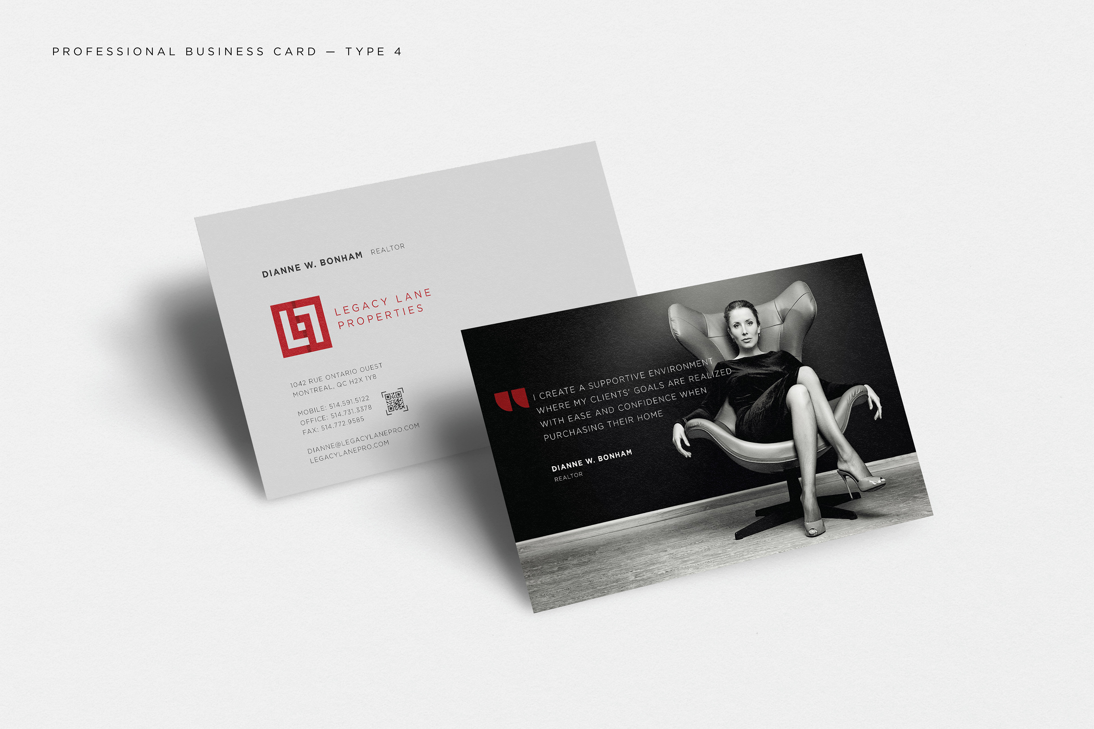
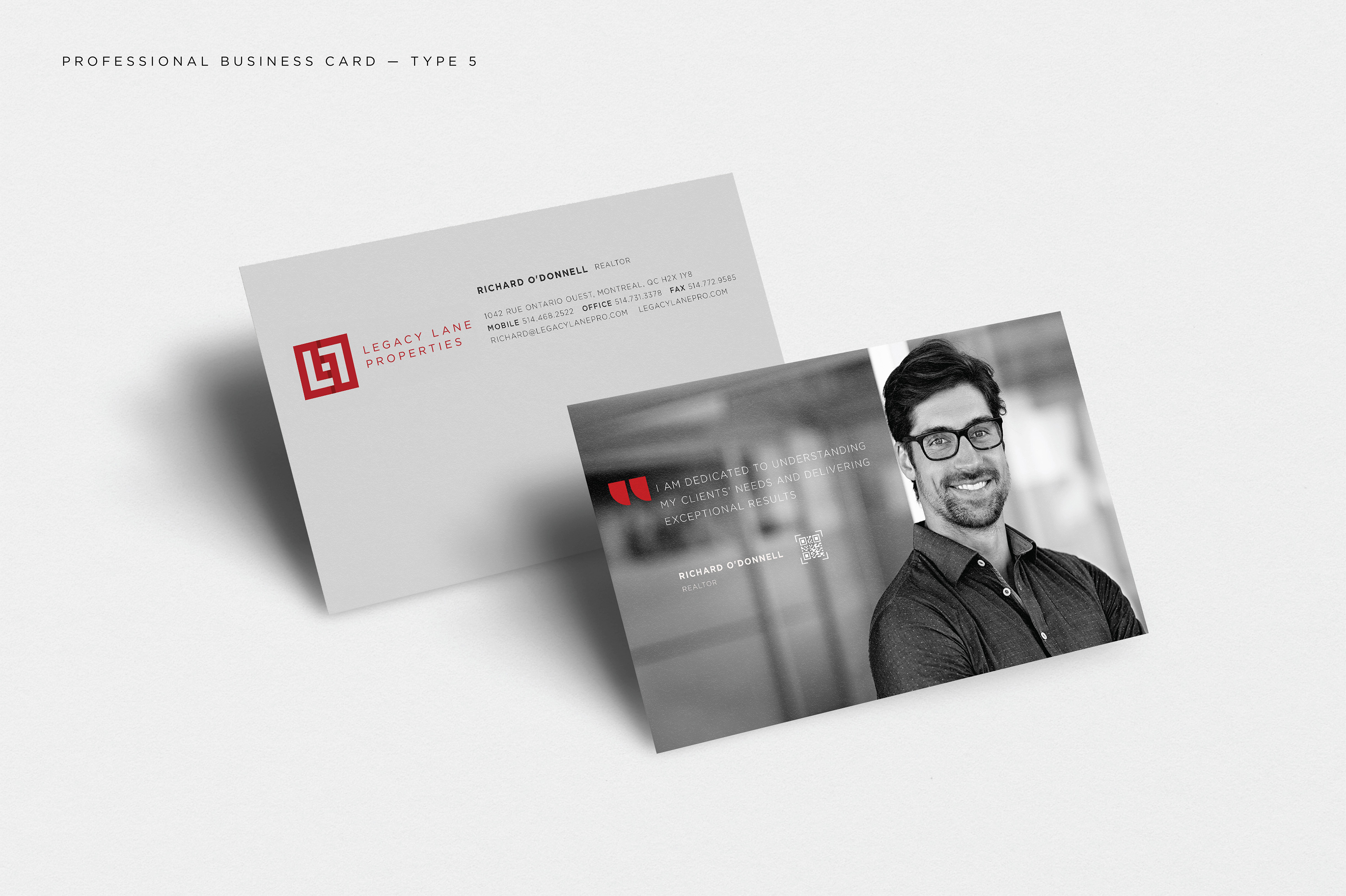
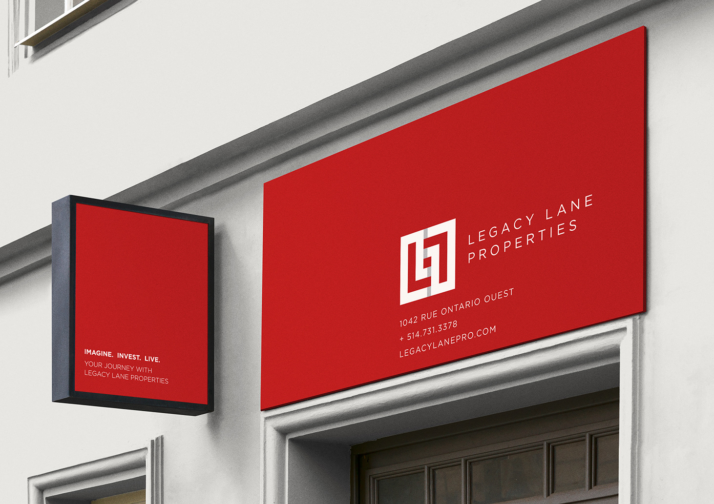
LEGACY LANE PROPERTIES
Complete branding design project for a real estate company. Inspirational project.
Complete branding design project for a real estate company. Inspirational project.

BILLBOARDS AND POSTER DESIGNS


BUSINESS CARD DESIGNS


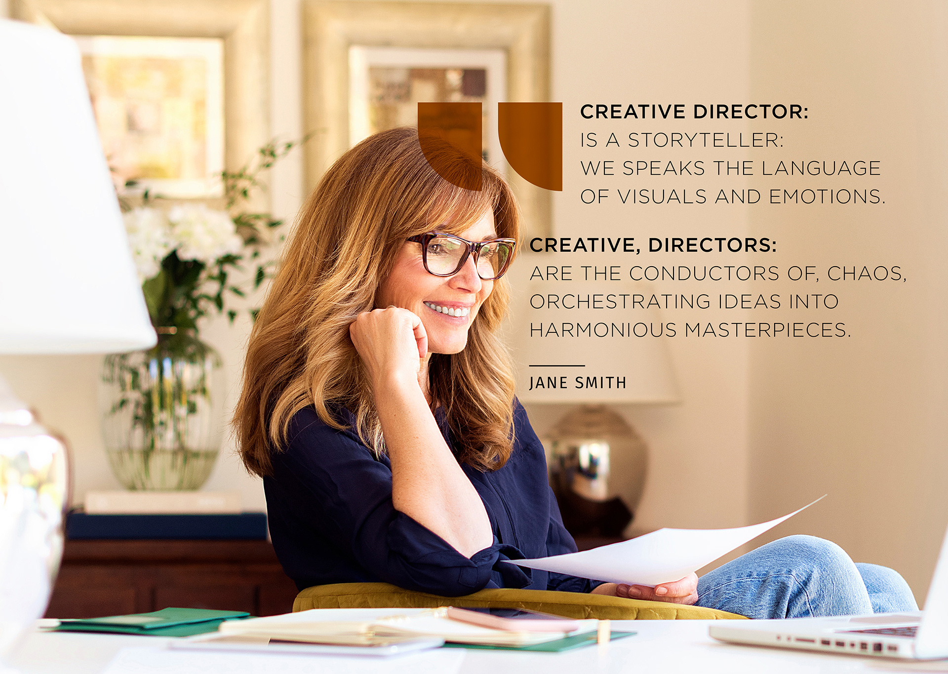
JANE SMITH DESIGN


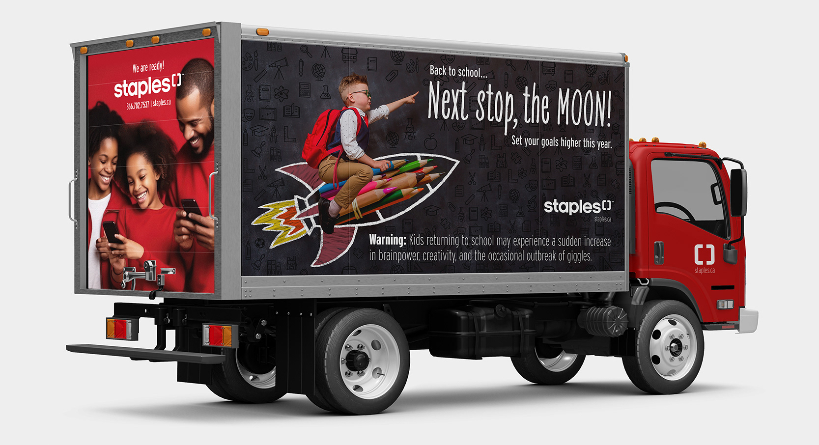
STAPLES CANADA - BACK TO SCHOOL