OVERVIEW
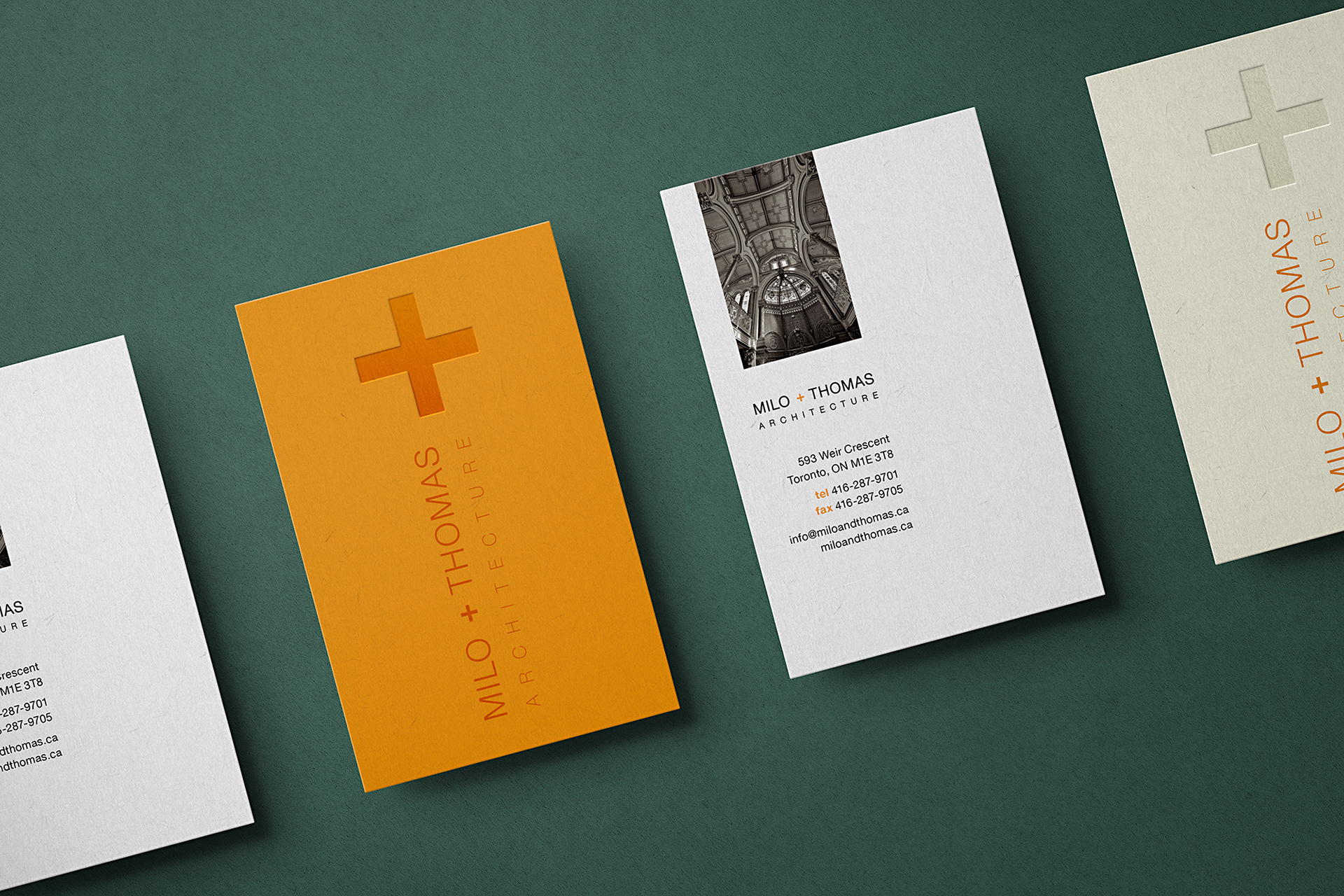
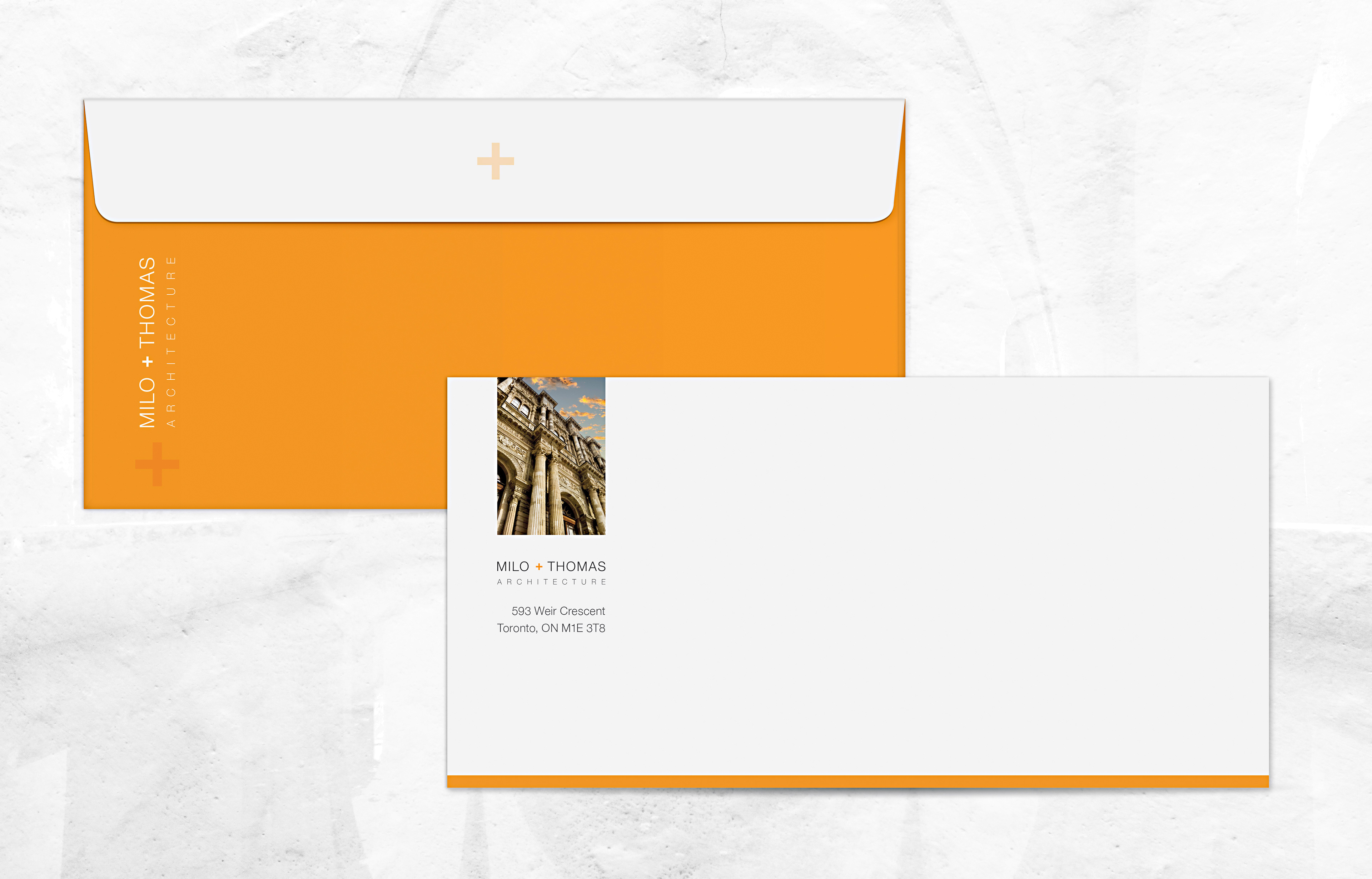
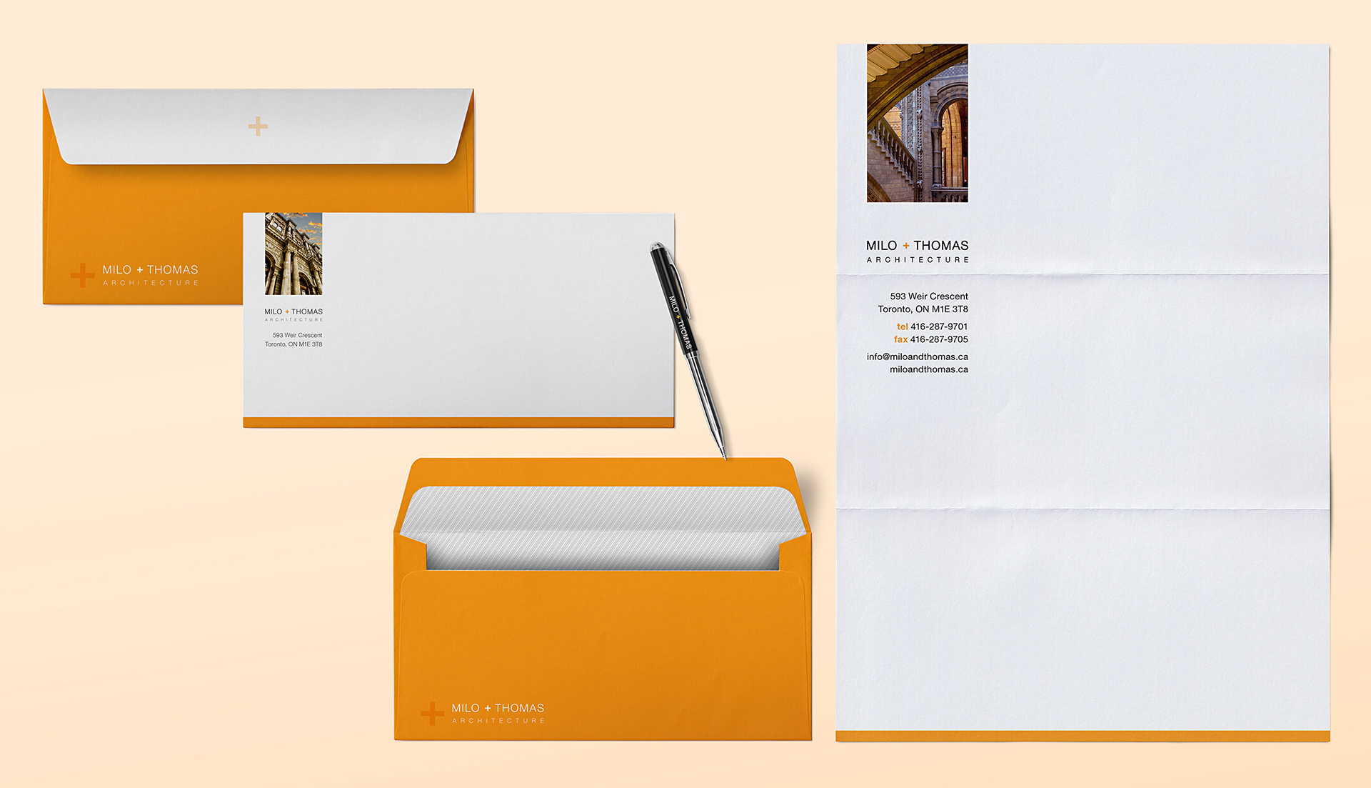
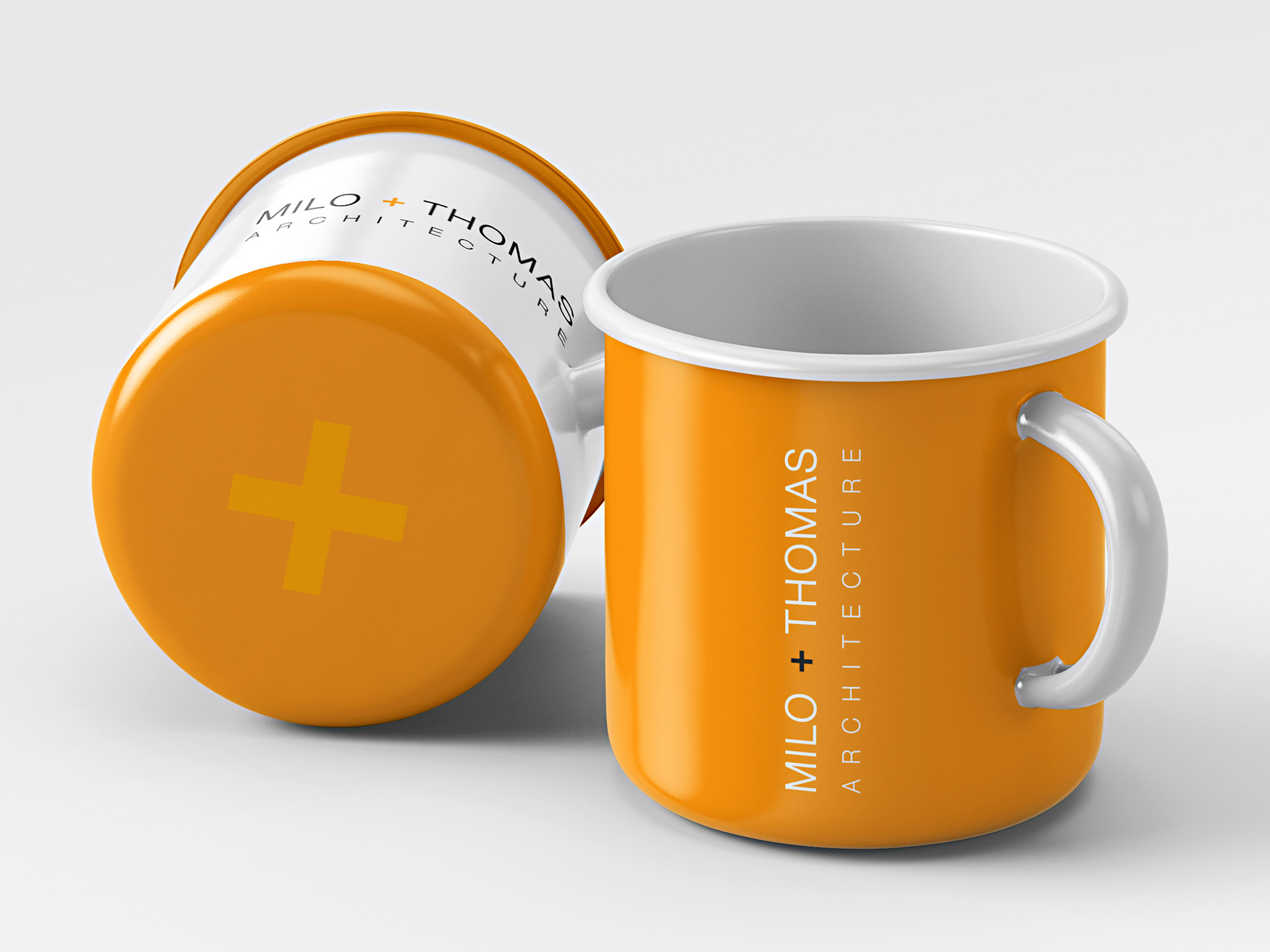
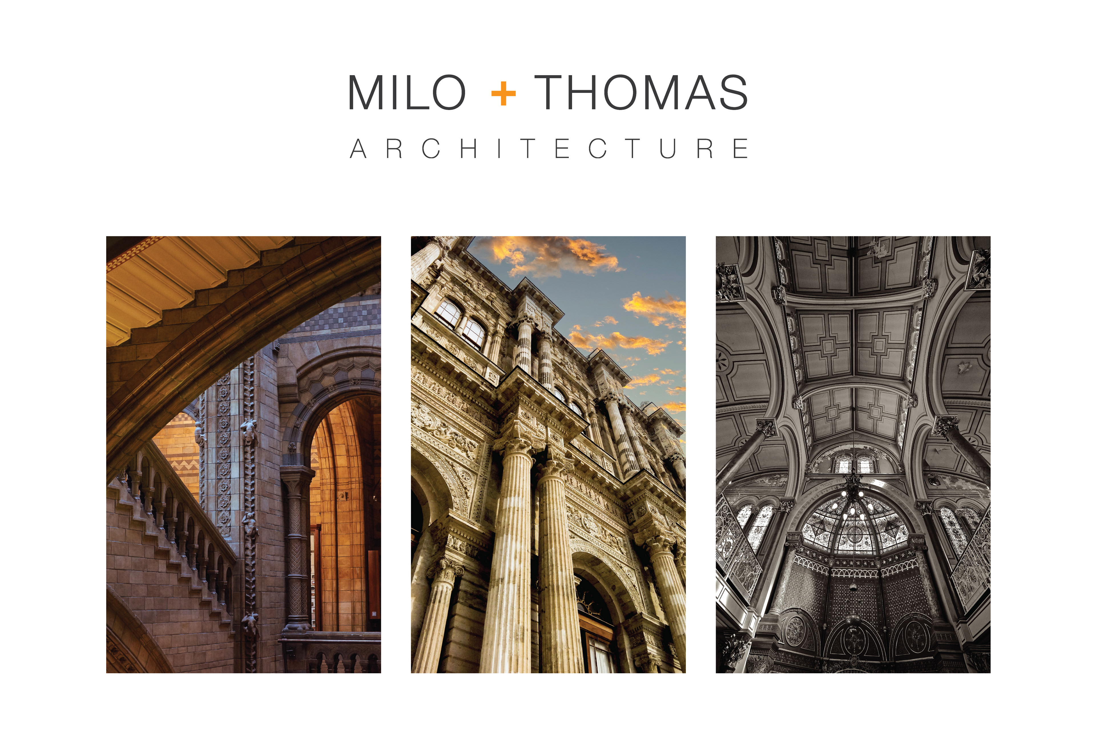
This stationery system was designed to feel distinctive, refined, and visually memorable. Rather than relying on a conventional logo-driven approach, Milo and Thomas Architecture chose to feature a curated selection of architectural imagery across the letterhead, envelope, and business card suite. The result is a more expressive and design-forward identity system that reflects the studio’s architectural aesthetic and creative philosophy.
TECHNICAL HIGHLIGHTS
Each image is intentionally offset to the right by approximately half of its width, creating a balanced visual relationship within the layout. In graphic design, this approach relates to the principle of rational distance — a proportional spacing technique that allows the eye to process visual elements more naturally and comfortably.
The stationery system also incorporates a consistent repetitive structure throughout the collection, creating a cohesive visual rhythm and a strong sense of continuity across all branded materials. This systematic approach reinforces the identity while establishing a clean, modern, and highly recognizable design language.