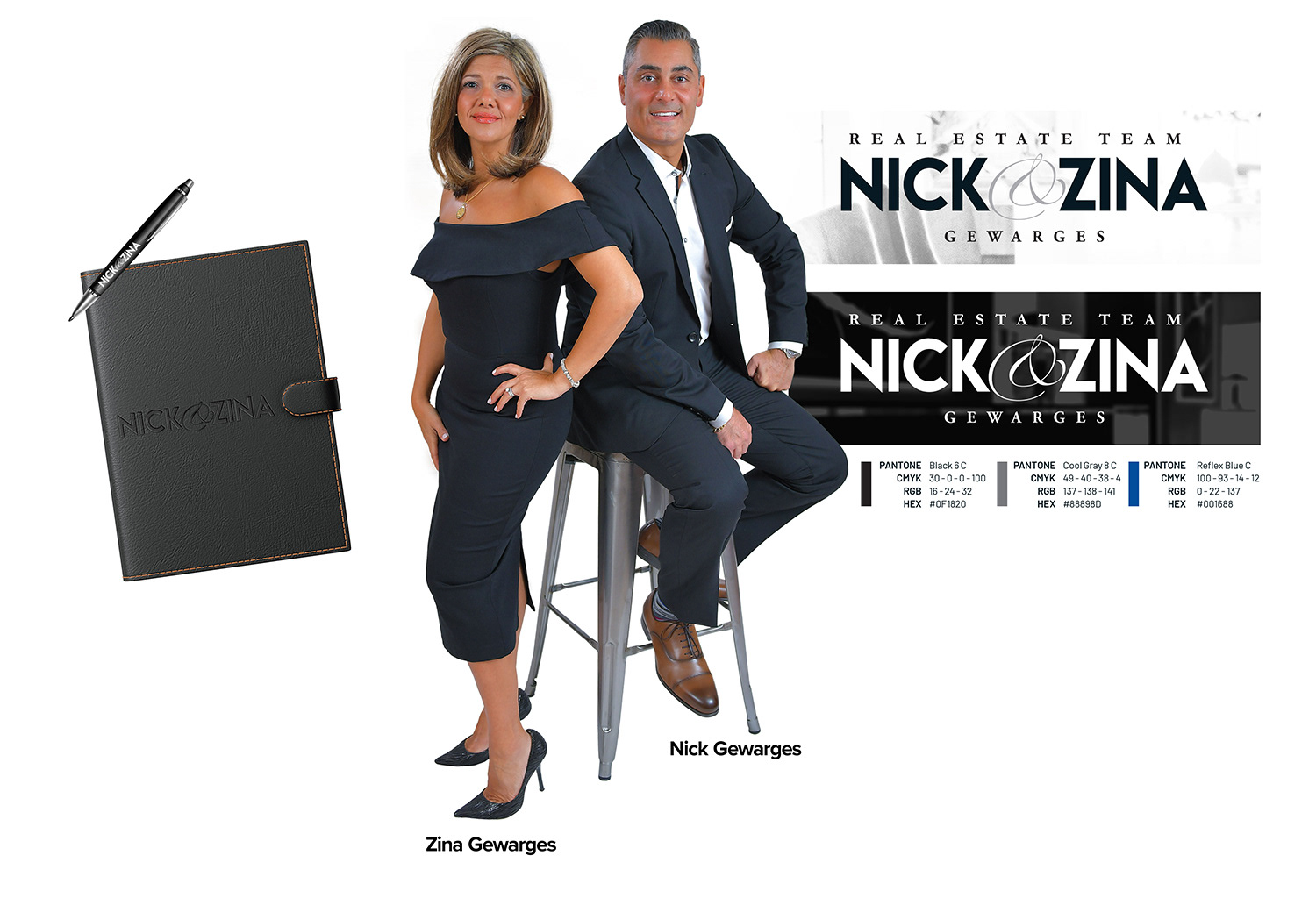
ABOUT NICK & ZINA
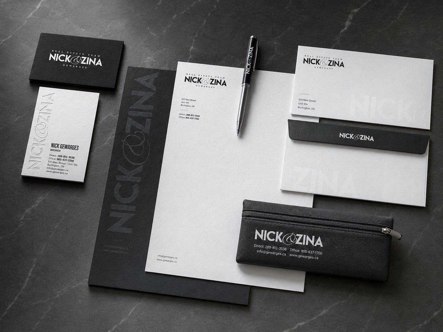
Nick and Zina are real estate brokers and staging professionals based in Burlington, Ontario, serving Burlington, Oakville, Mississauga, Toronto, and the Greater Toronto Area. Their brand needed to communicate professionalism, trust, and visibility across a wide range of applications, including real estate signage, vehicle graphics, stationery, apparel, promotional items, and digital marketing materials.
OBJECTIVE
The objective was to redesign the Nick & Zina logo into a more professional, contemporary, and adaptable identity that could work consistently across all marketing and advertising materials. The new logo needed to be bold, legible, and distinctive while reflecting the confidence and experience of the Nick & Zina real estate team.
PROBLEM & SOLUTION
During the initial consultation, Nick and Zina expressed concerns about the overall effectiveness of their existing logo and brand presentation. The previous identity lacked the refinement, consistency, and visual clarity needed for a competitive real estate market.
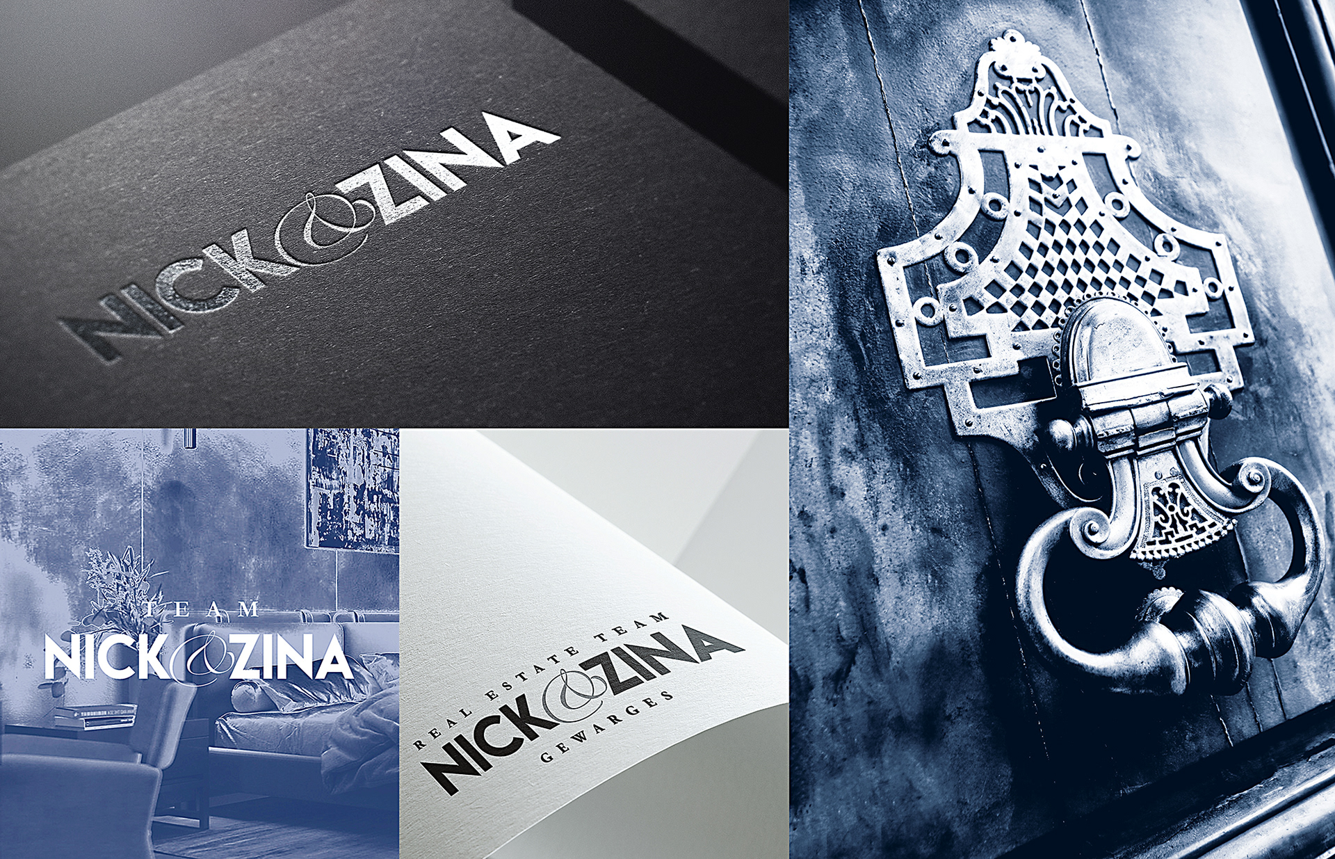
One of the main issues was the typographic treatment. Because the logo was built around their names, spacing, alignment, and visual balance were critical. The original design had noticeable kerning and alignment issues, which affected readability and made the logo feel less polished across different applications.
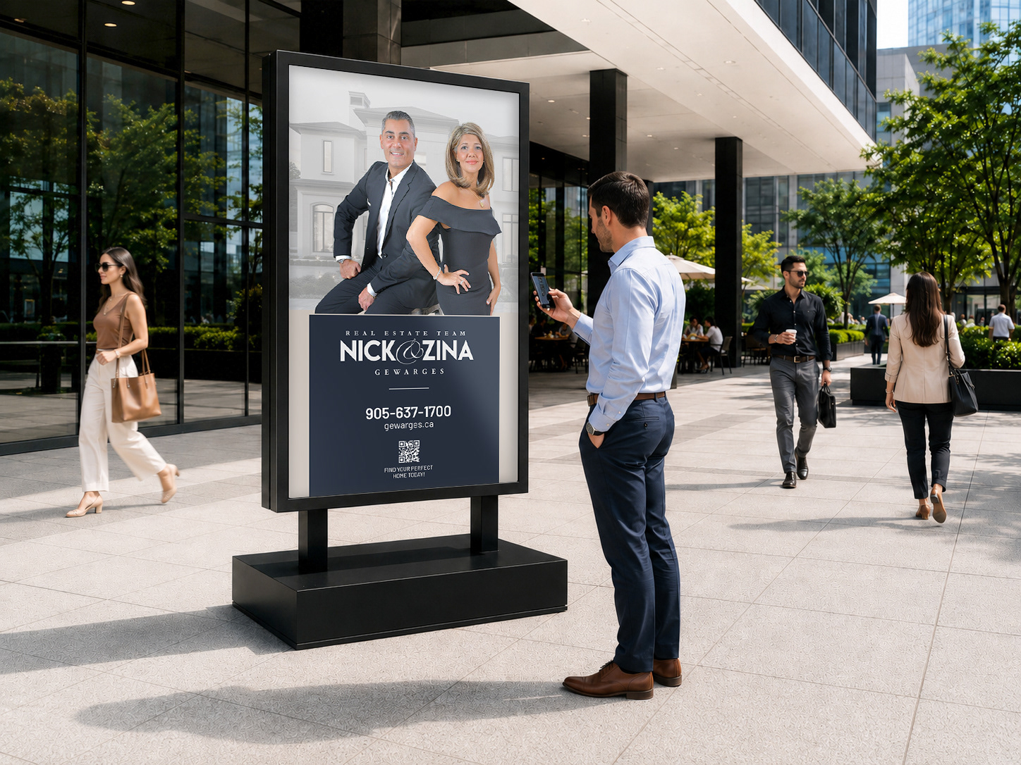
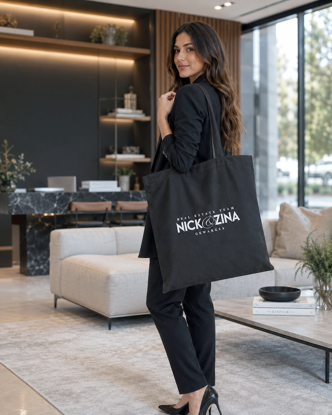
Another challenge was brand consistency. As their marketing materials expanded across print, digital, signage, vehicle wraps, apparel, and promotional merchandise, the existing logo became difficult to apply consistently. This created inconsistencies in how the brand appeared from one touchpoint to another.
The solution was to redesign the logo with a more strategic and cohesive approach. The new identity focused on improved typography, cleaner spacing, stronger alignment, and a more balanced composition. By refining the logo structure and creating an adaptable visual system, the final design helped establish a consistent, recognizable, and professional image across all marketing and advertising materials.
DESIGN THINKING PROCESS
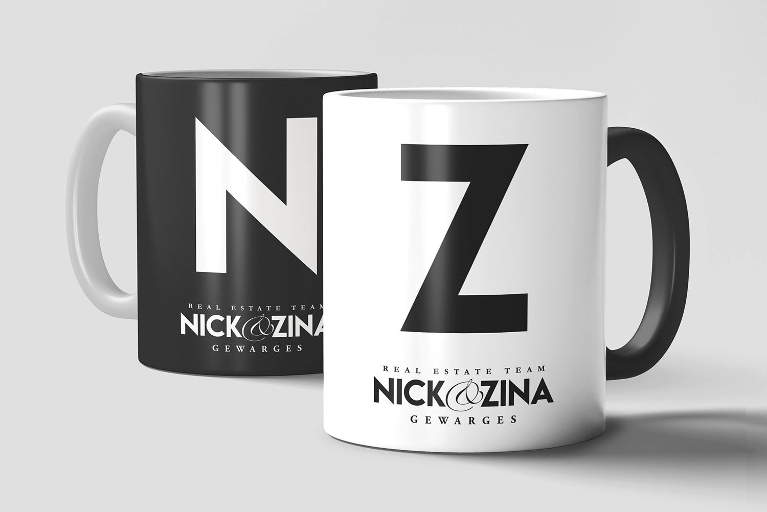
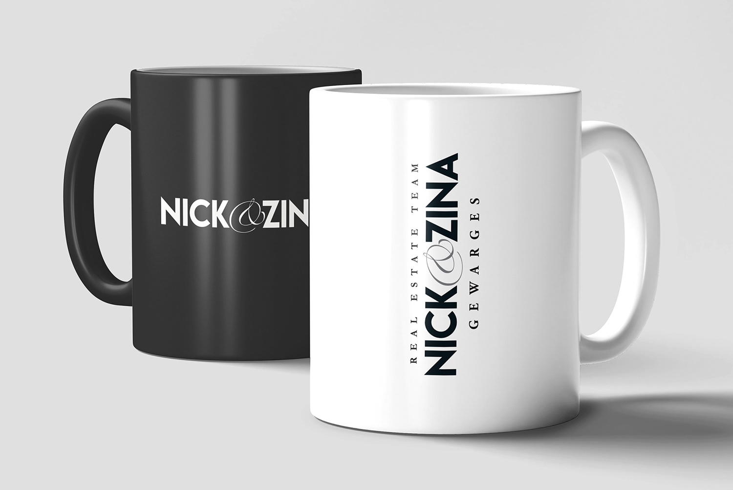
The redesign focused on typography, structure, scalability, and brand consistency. Each element was refined to improve readability, create a stronger visual impact, and ensure the logo could perform across both large-format and small-scale applications. The final identity was designed to work in horizontal, vertical, black, white, and monochrome versions, giving the brand greater flexibility across its full marketing system.
OUTCOME
Over nearly three years of collaboration, the redesigned identity has been applied across a wide range of Nick & Zina marketing materials. The final brand system helped create a more polished, consistent, and recognizable visual presence across Burlington, surrounding markets, and the Greater Toronto Area.
Vehicle wrap design + For sale sign


Signage Application


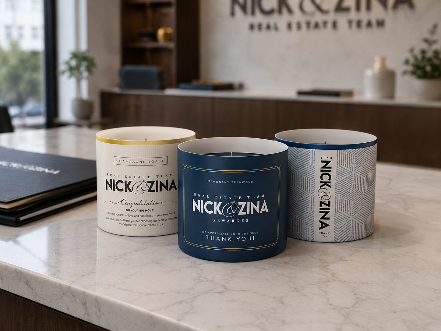
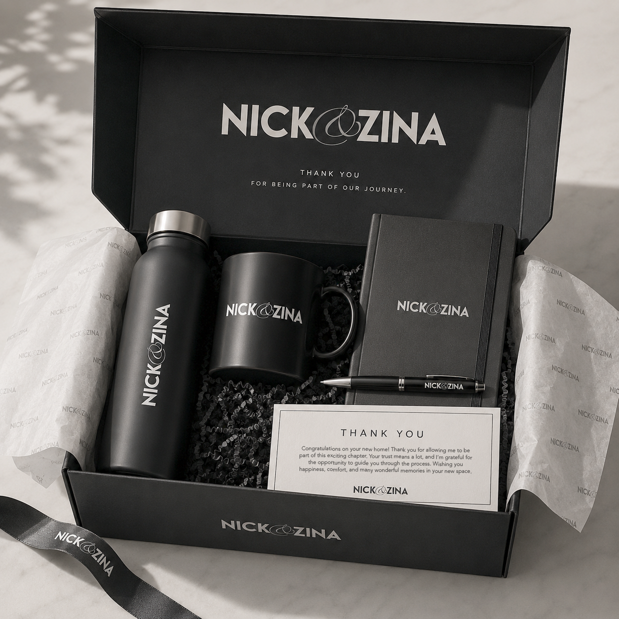
Thank you for your business


Apparel