Brand Story — Saburo & Jurou Architects
During periods between active client work, I dedicate time to exploring geometric hand drawing as a method of refining precision, structure, and visual discipline. This process involves the creation of abstract forms, symbols, and compositional studies—each driven by instinct, repetition, and curiosity.
These explorations are not merely exercises, but the foundation for conceptual branding. Selected forms are translated into logos, visual systems, and patterns, allowing me to test their scalability, adaptability, and coherence across real-world applications. Through this iterative approach, I evaluate both the technical integrity and creative potential of each concept.
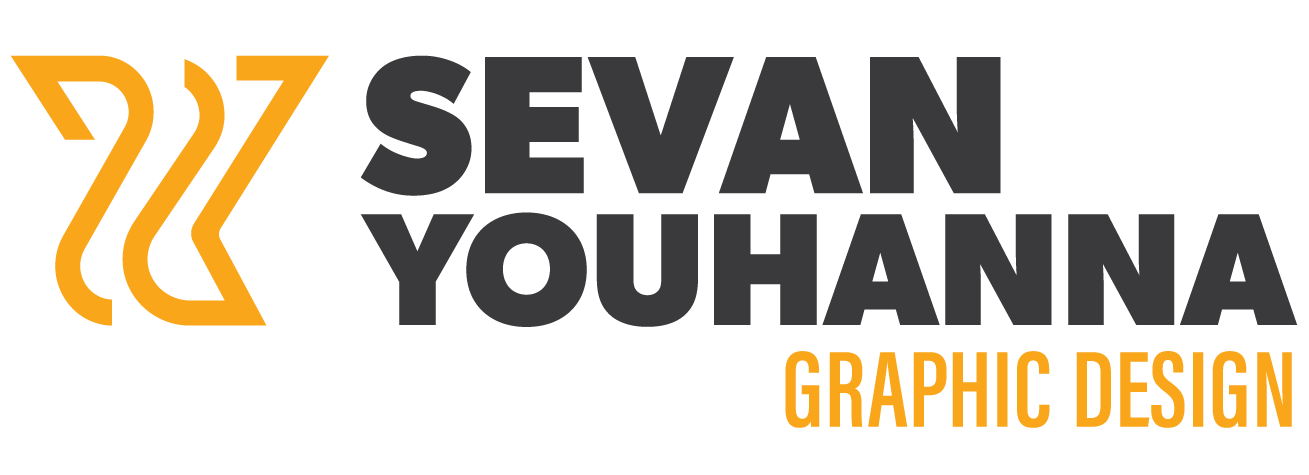
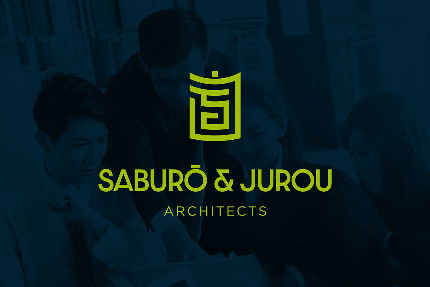
One of these explorations evolved into a fully realized fictional identity: Saburo & Jurou Architects, an architectural brand concept developed in the summer
of 2019.
of 2019.
About the Company
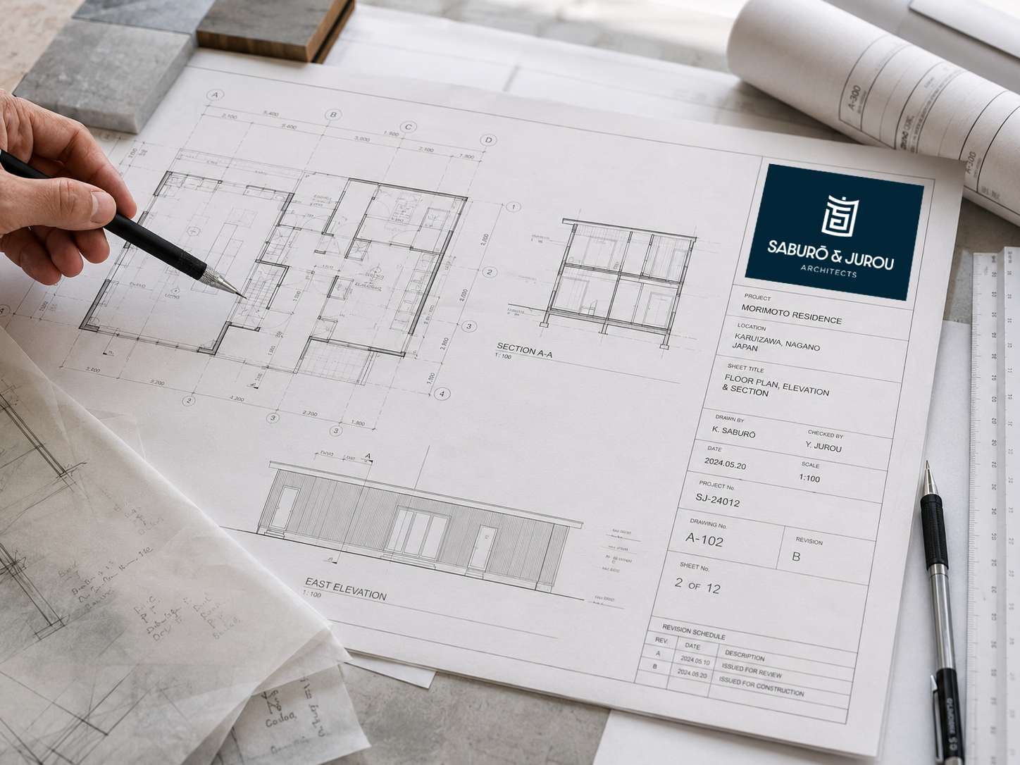
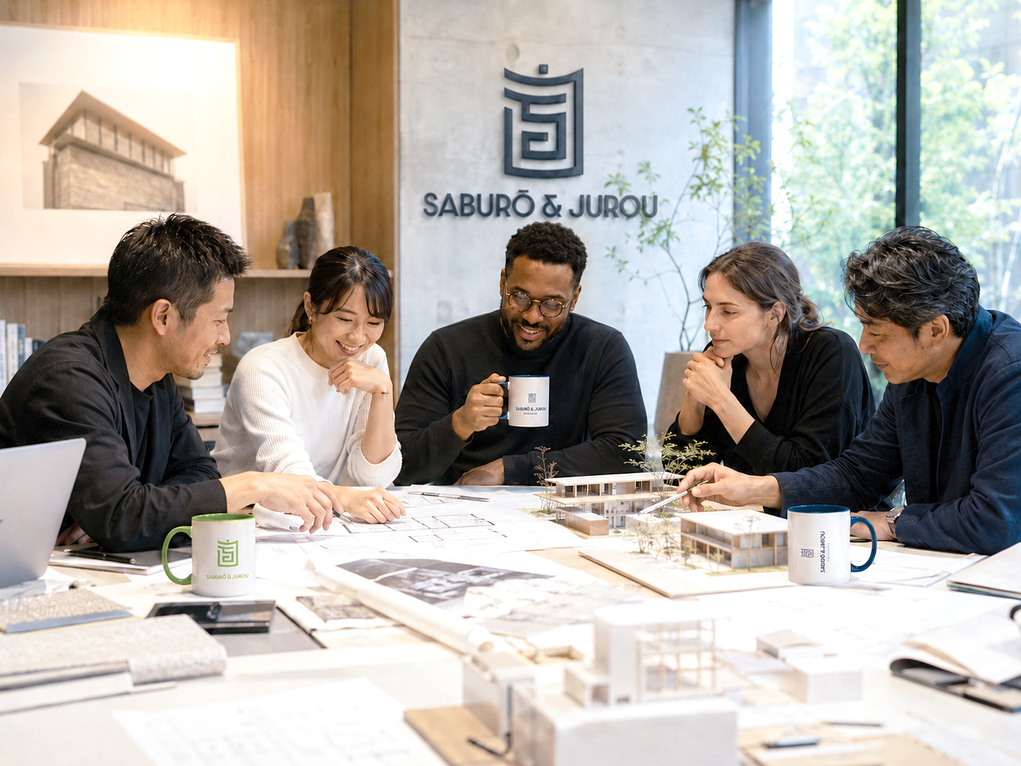
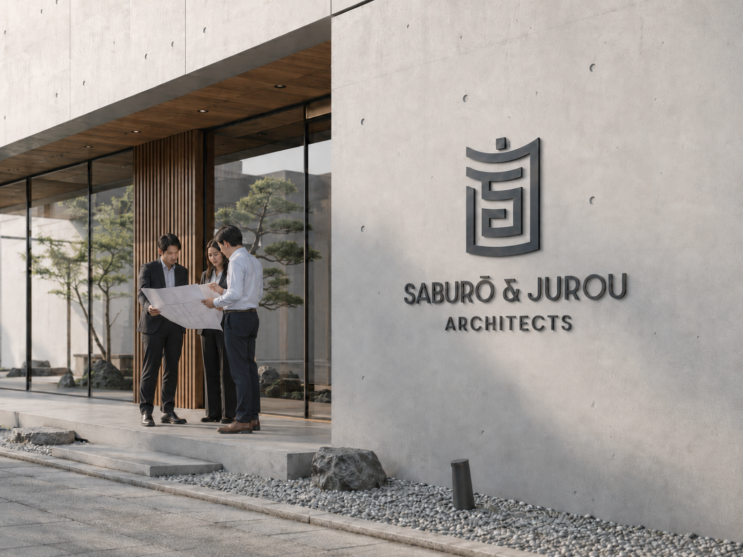
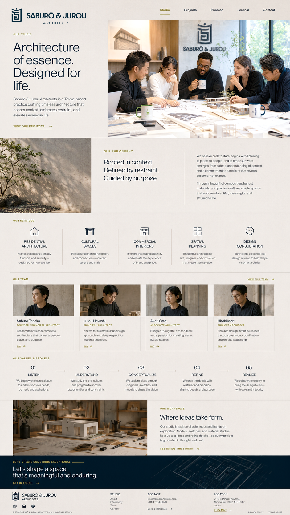
Saburo & Jurou Architects is envisioned as a prestigious architecture firm based in Tokyo, Japan. The brand reflects a balance of tradition and modernity rooted in precision, minimalism, and structural harmony, all of which are deeply associated with Japanese architectural philosophy.
Logo Concept
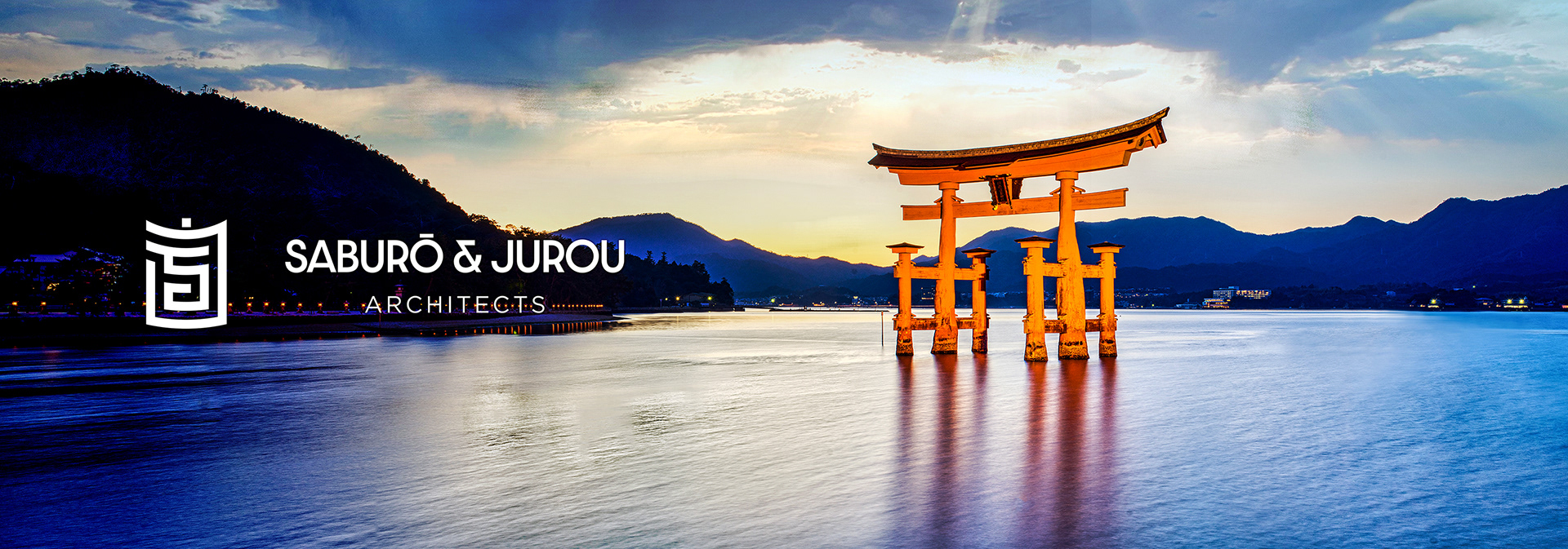
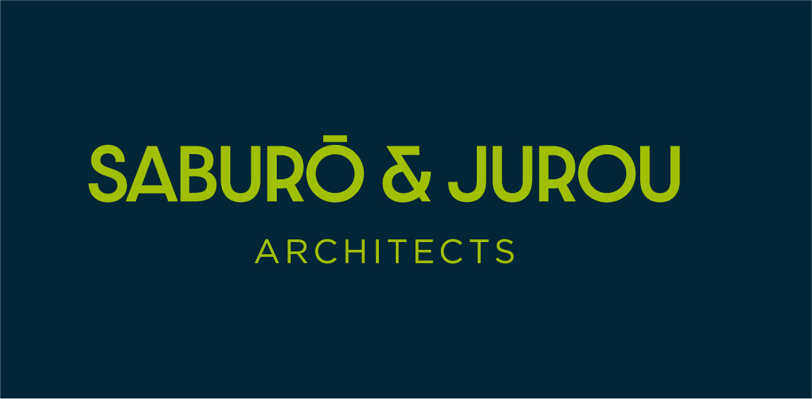
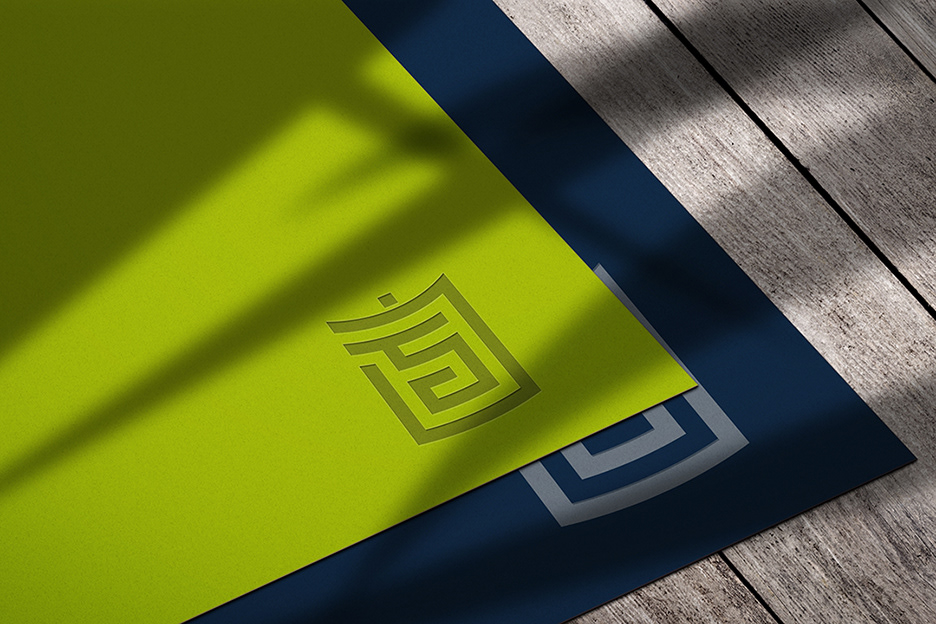
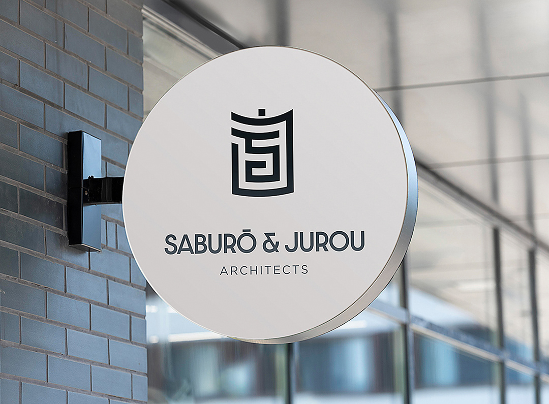
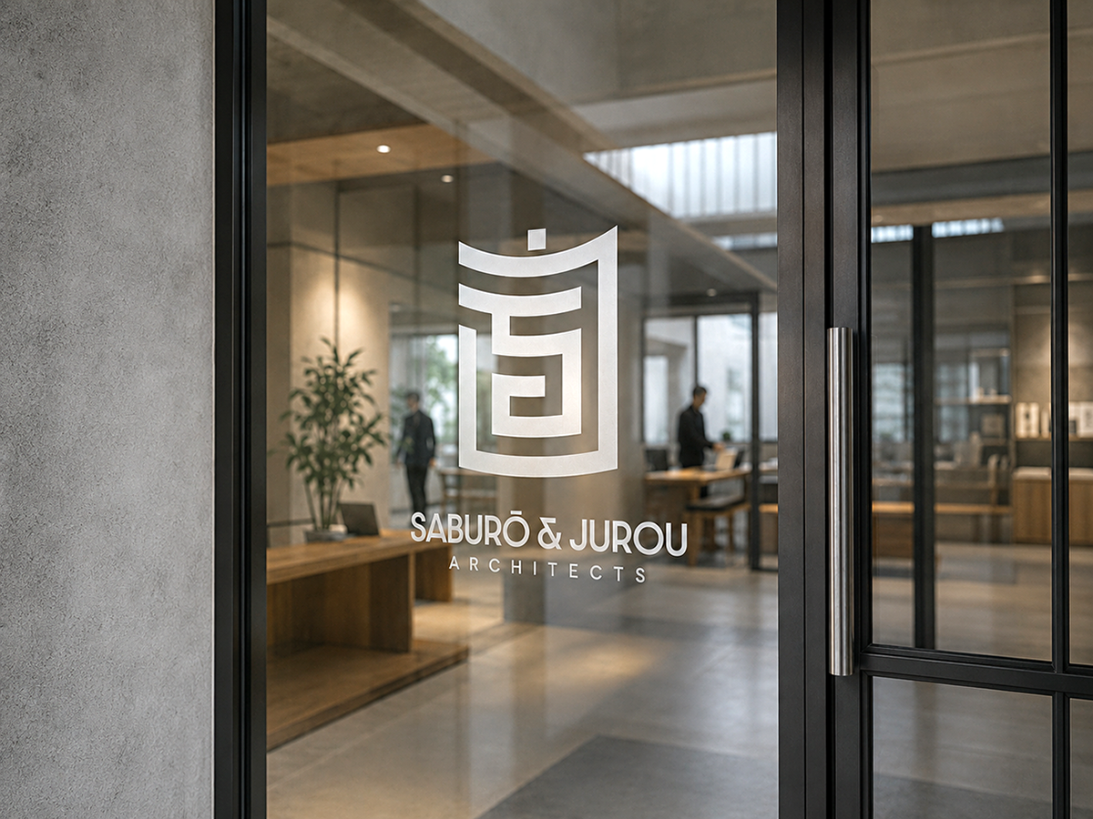
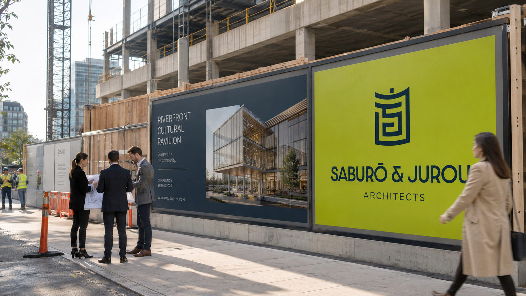
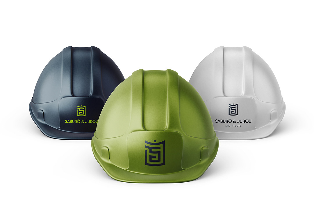
The identity is built around a refined geometric mark derived from the initials S and J. These letterforms are abstracted and constructed into a unified symbol, forming a distinctive architectural motif. The result is a logo that feels intentional, structured, and culturally aligned evoking the clarity and discipline found in architectural design.
Design Approach
The core idea was to create a simple, intelligent geometric form that serves as the foundation of the entire visual system.
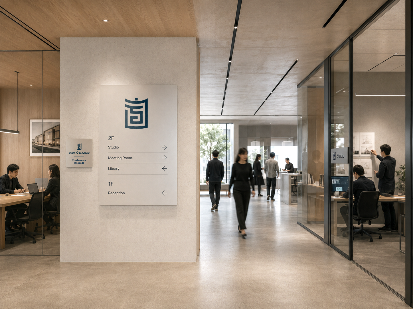
+ The mark is highly scalable, maintaining clarity from small applications to large-format environments
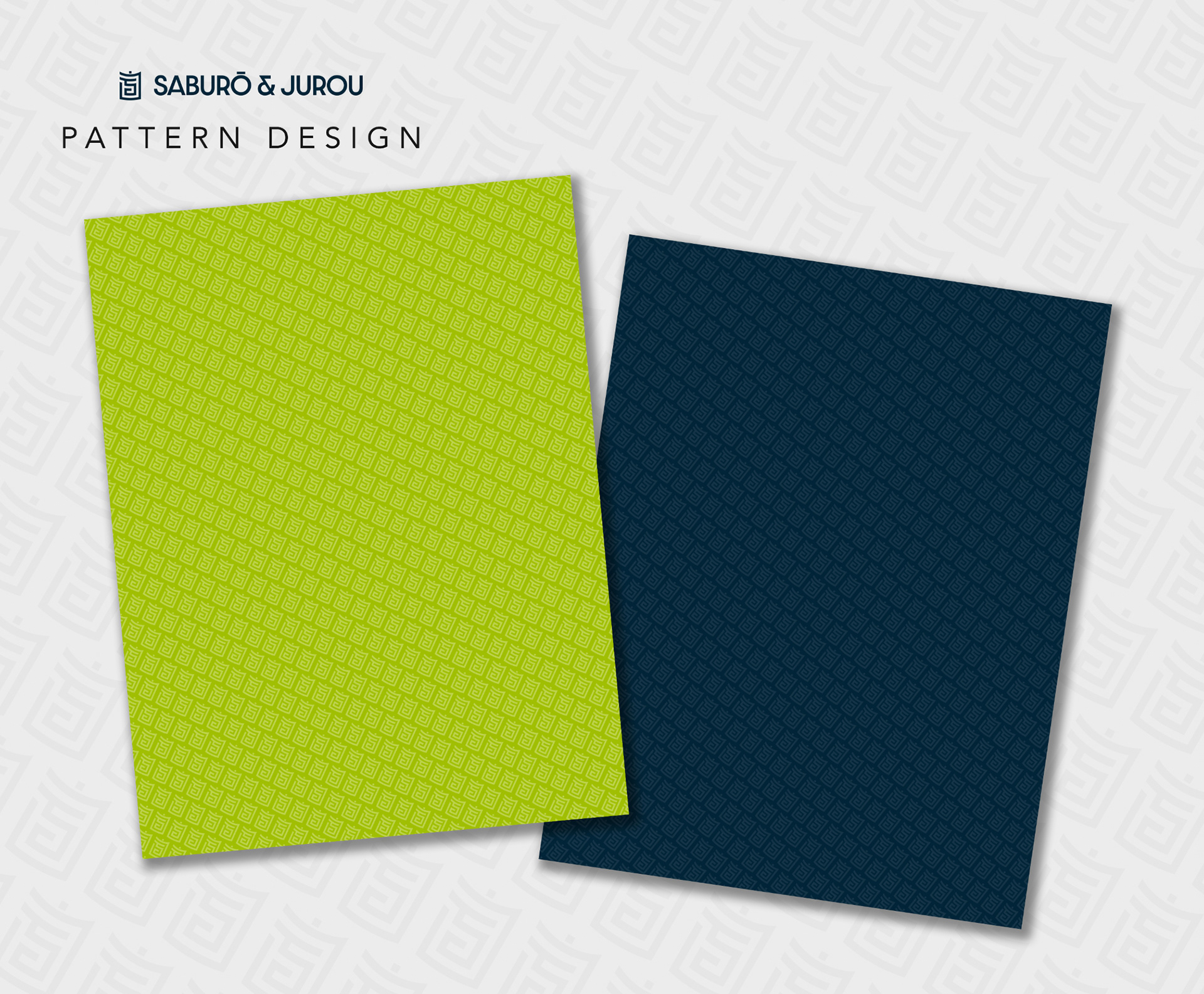
+ Its structure allows for seamless extension into patterns, textures, and branded elements
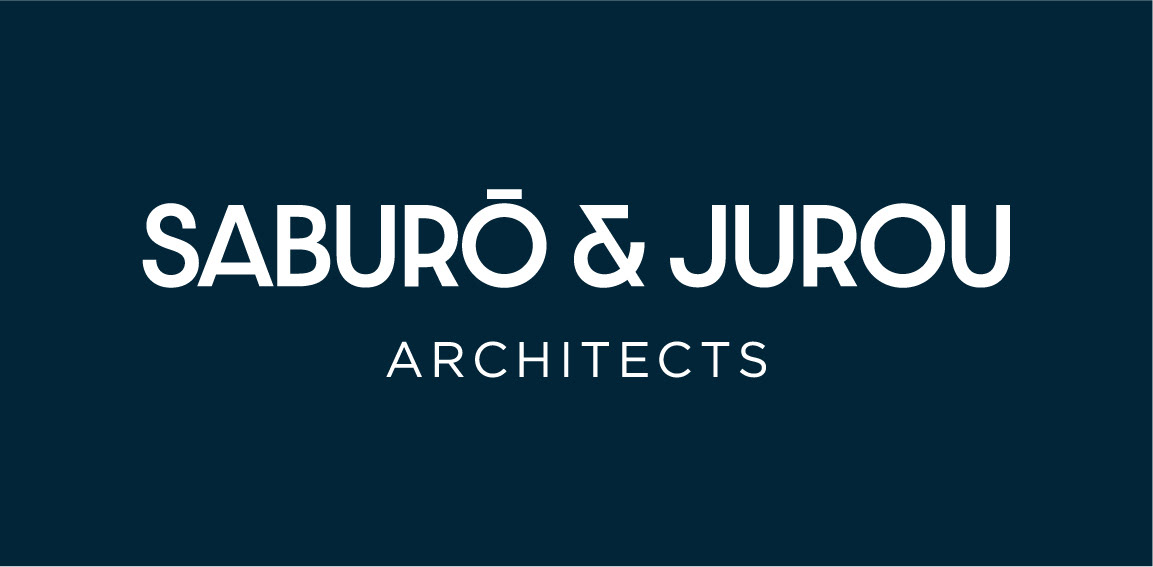
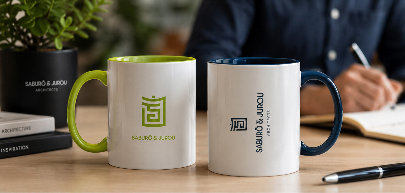
+ The design adapts effortlessly across multiple touchpoints, including print, digital, and environmental applications
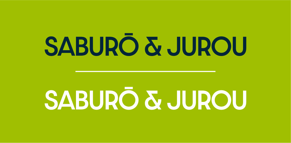
+ The visual language remains consistent, balanced, and recognizable at all times
+ Its structure allows for seamless extension into patterns, textures, and branded elements
+ The design adapts effortlessly across multiple touchpoints, including print, digital, and environmental applications
+ The visual language remains consistent, balanced, and recognizable at all times
Outcome
What began as a personal geometric study evolved into a cohesive branding system—demonstrating how disciplined form-making can translate into meaningful identity design. The project stands as an exploration of structure, simplicity, and the power of geometry in brand creation.
Logo Design
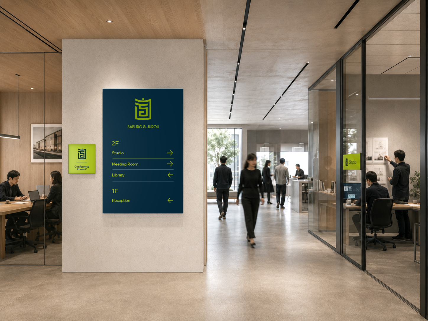
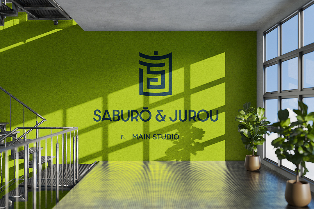
Colour theory
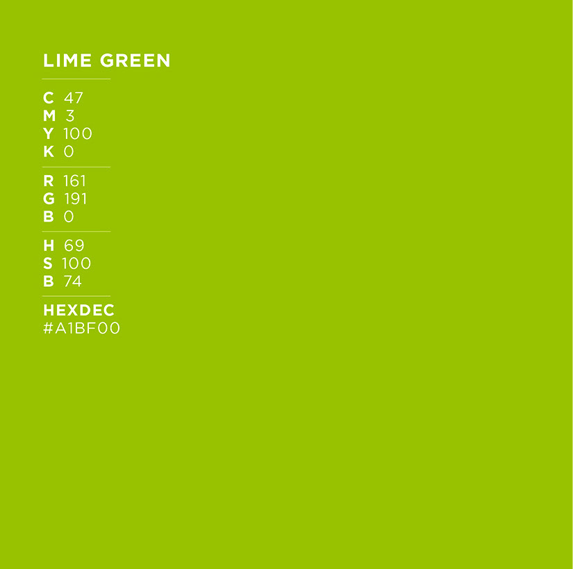
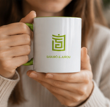
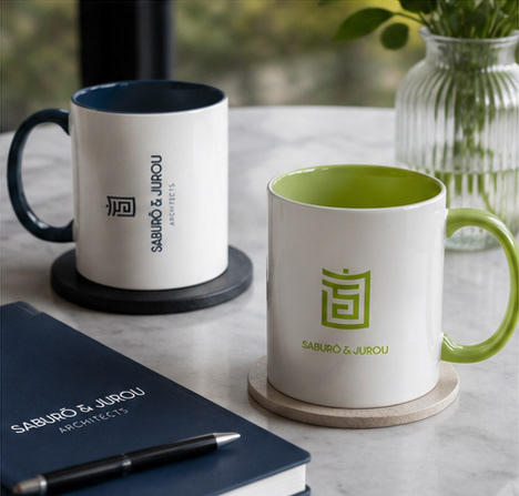
Lime Green. Lime Green is a colour closely associated with nature, confidence, and high energy. Also, it promotes feelings of liveliness, freshness,
and creativity.
and creativity.
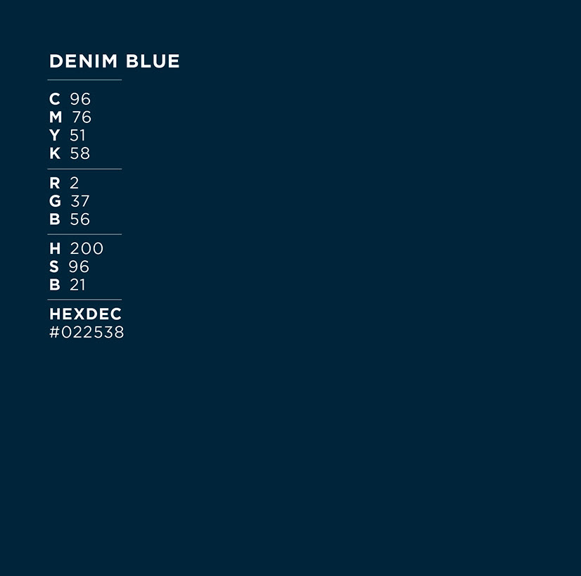
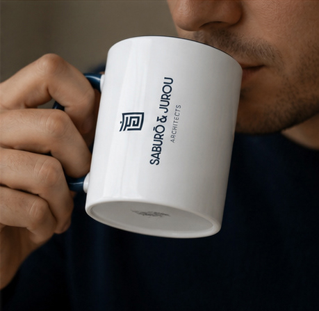
Denim Blue. In general, blue represents the sky and the sea and is associated with open spaces, freedom, intuition, imagination, inspiration, and sensitivity. Blue also symbolizes depth, trust, loyalty, sincerity, wisdom, confidence, stability, faith, and intelligence.
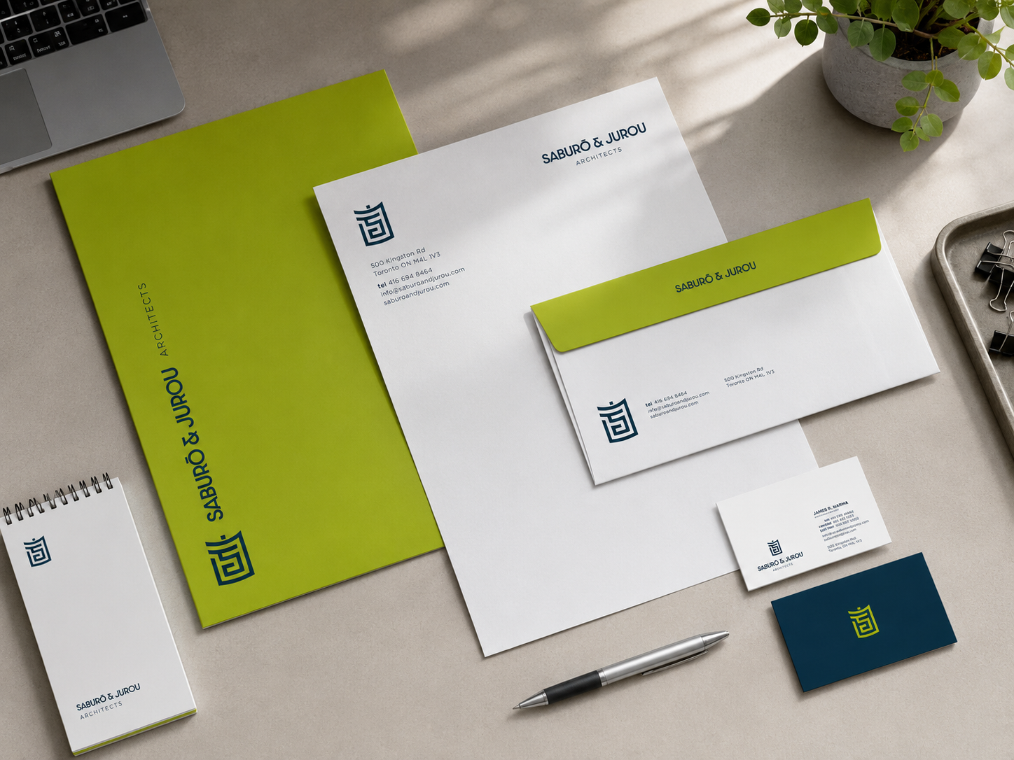
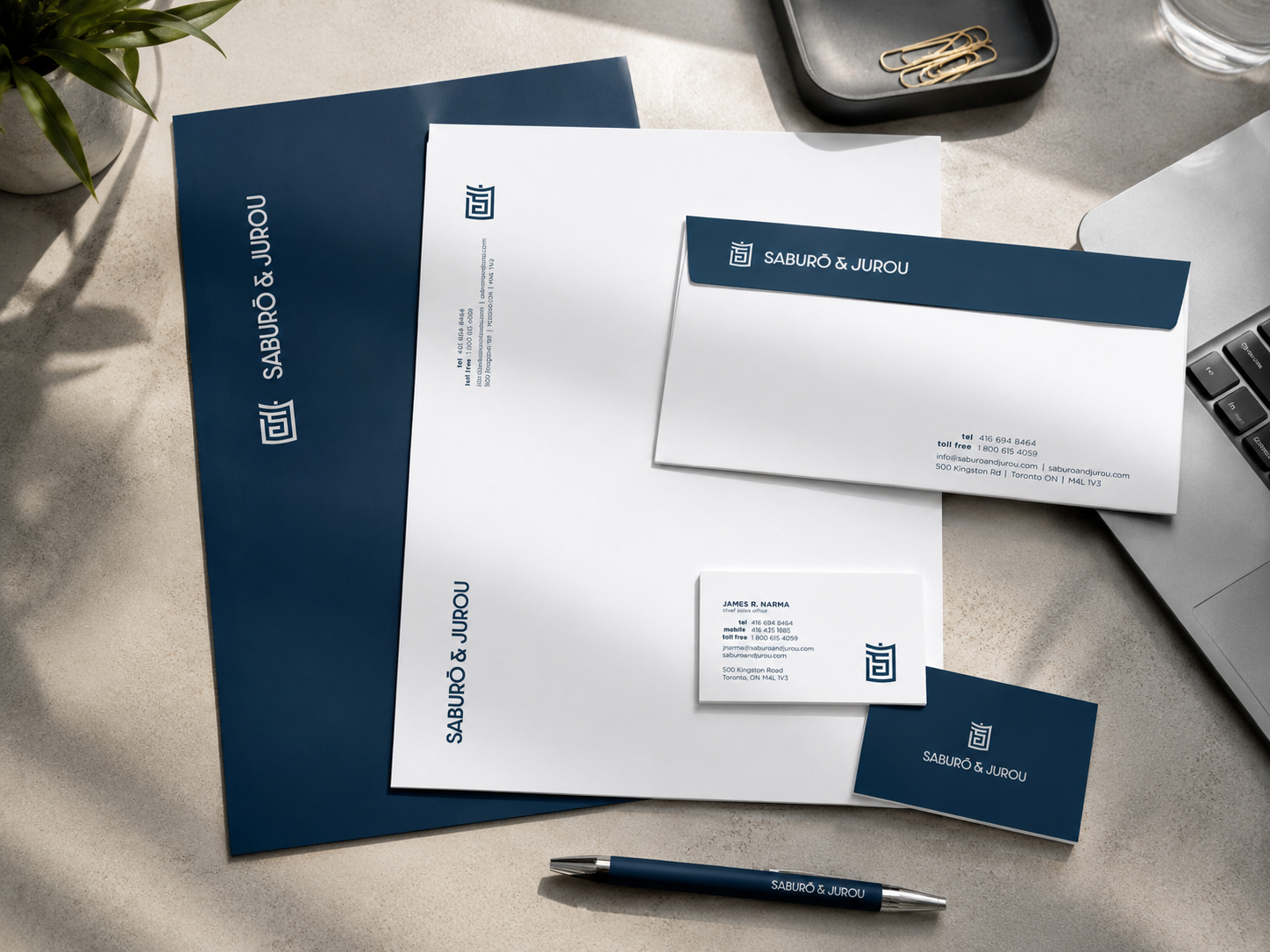
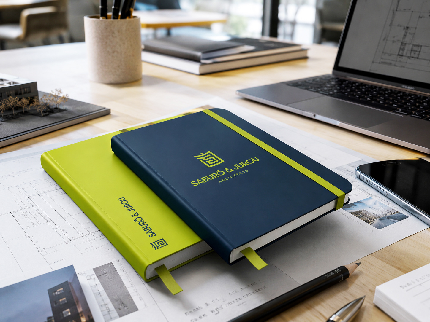
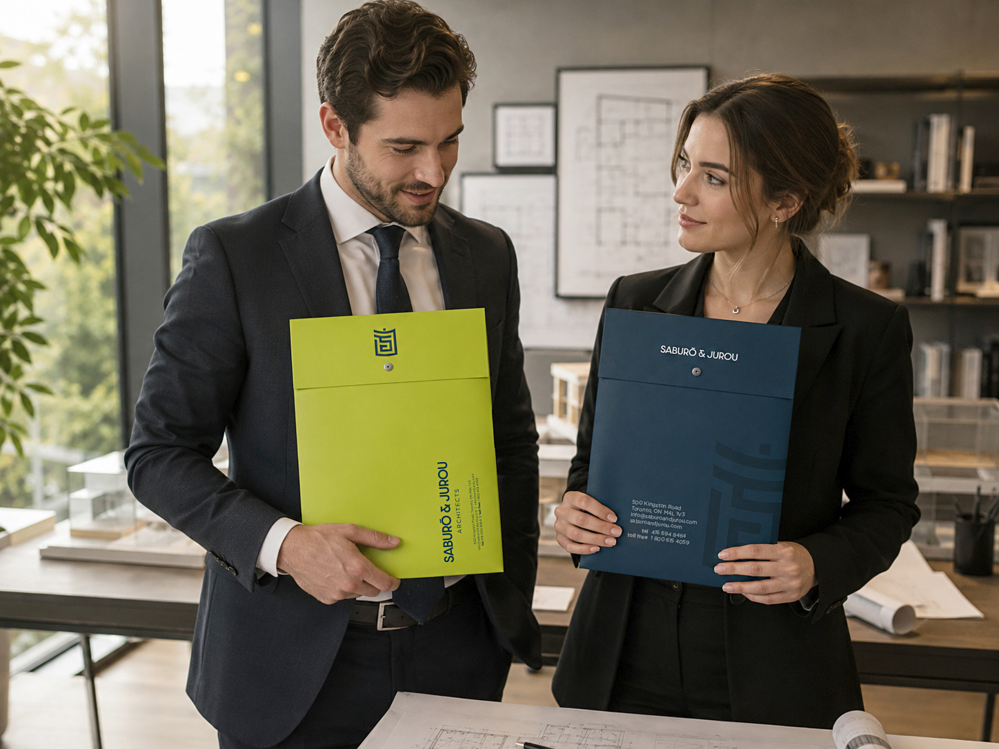
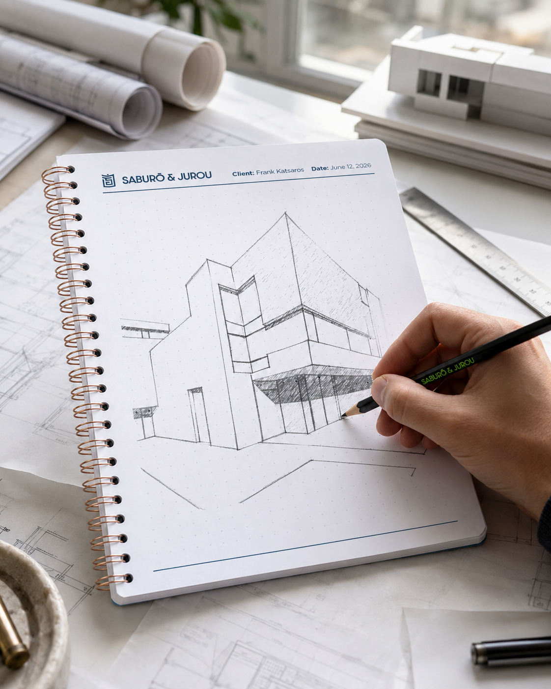
business stationery


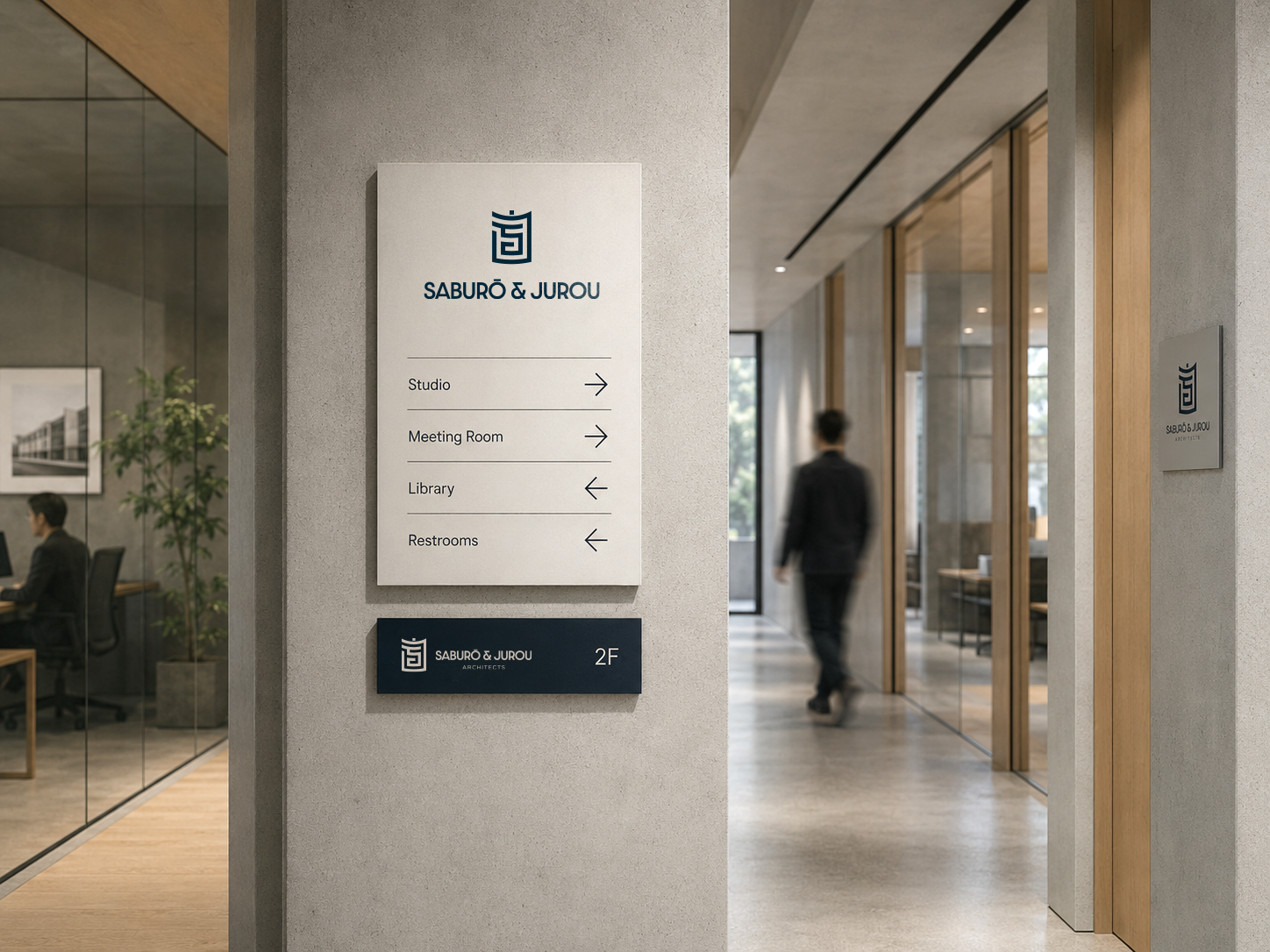
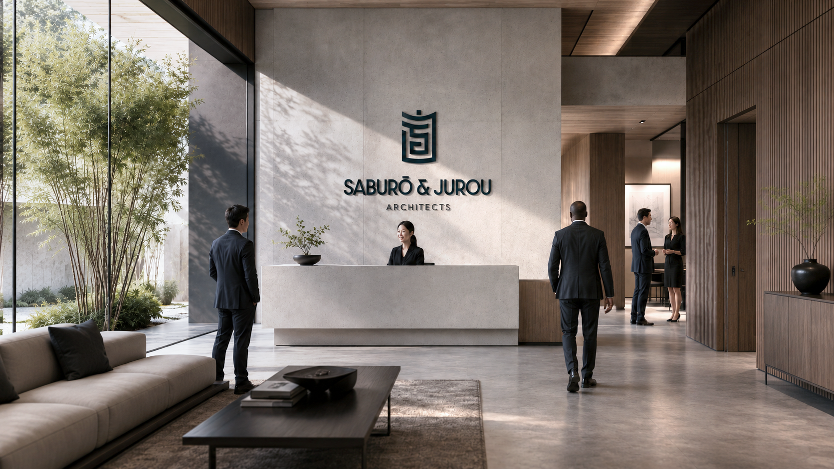
External & Internal Signage
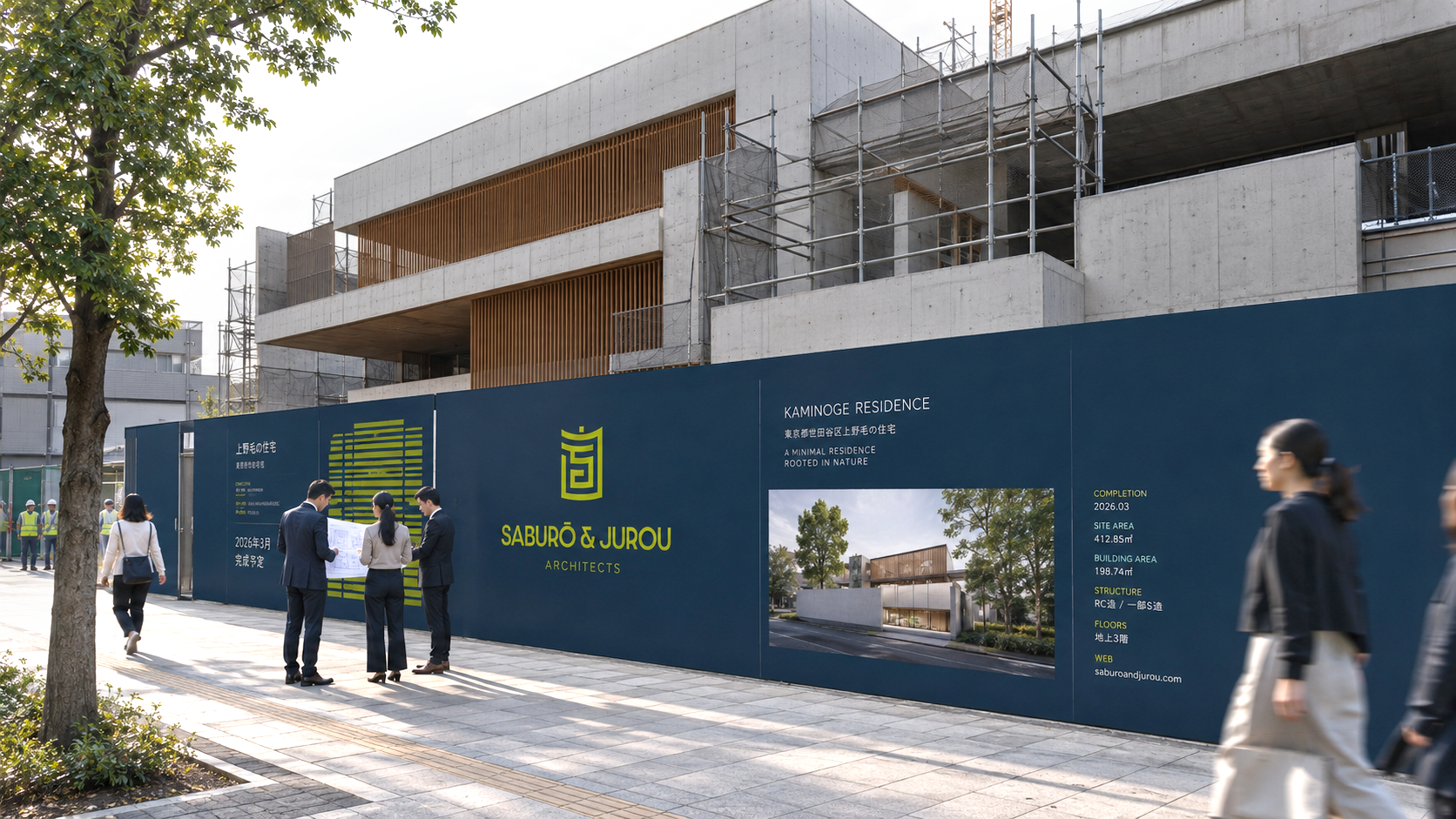
hoarding signage

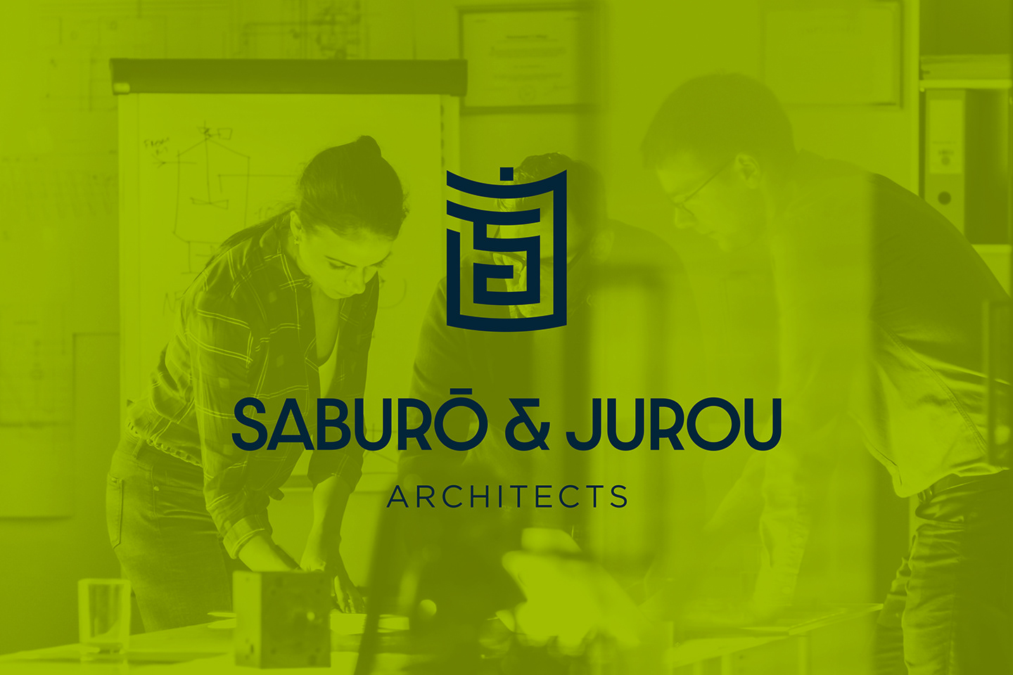
Website Design
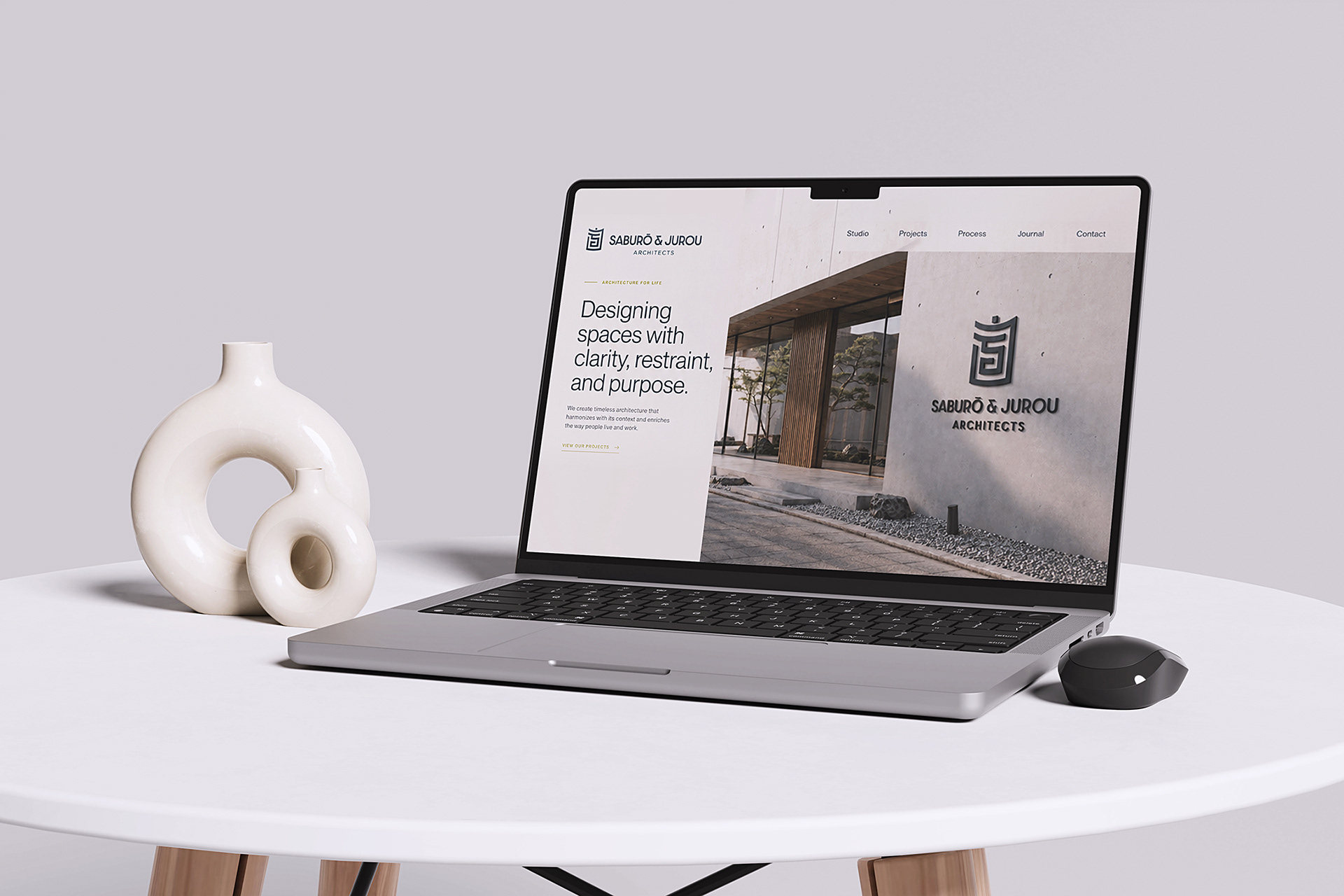
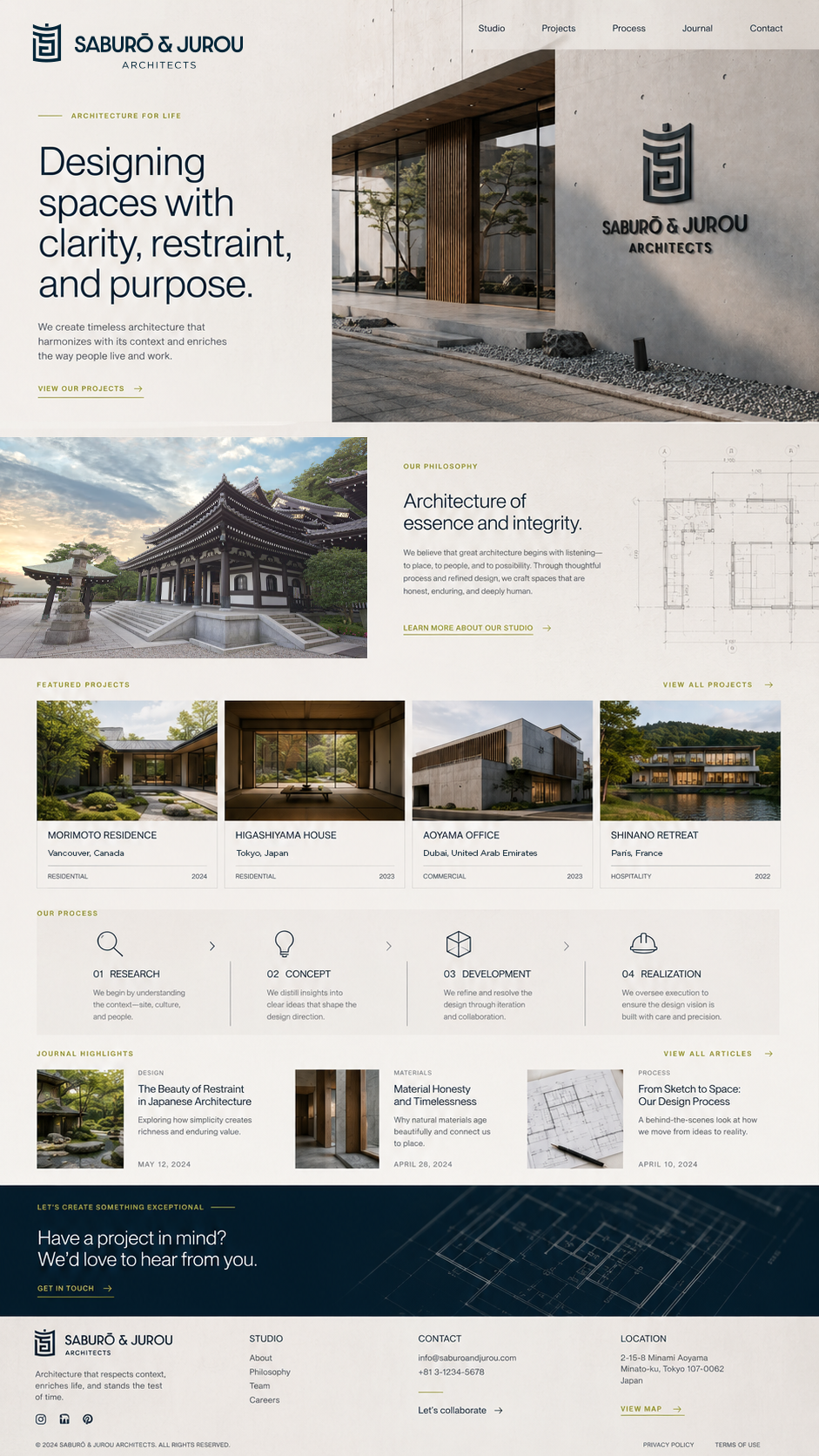
Home Page
Studio
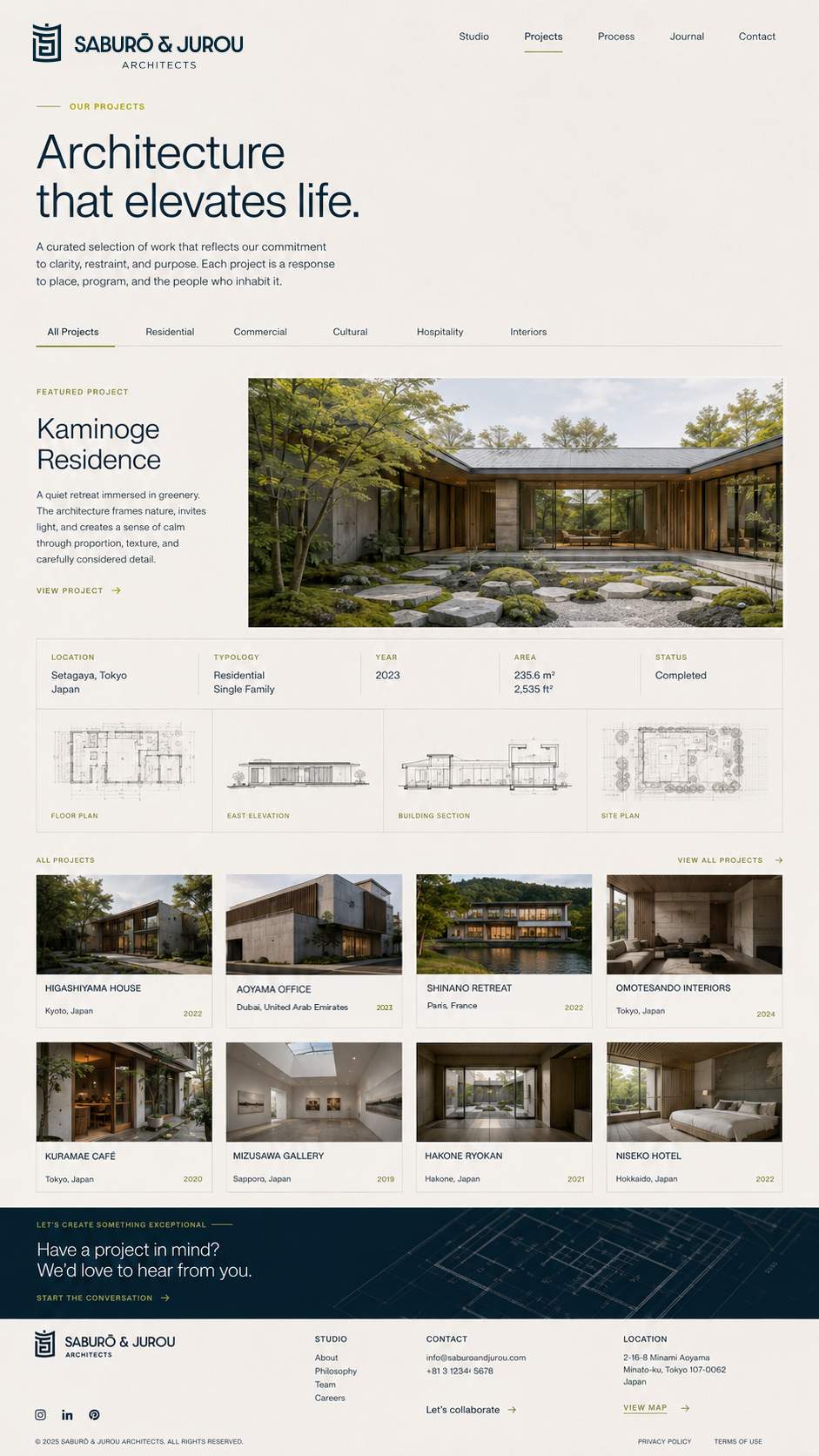
Projects
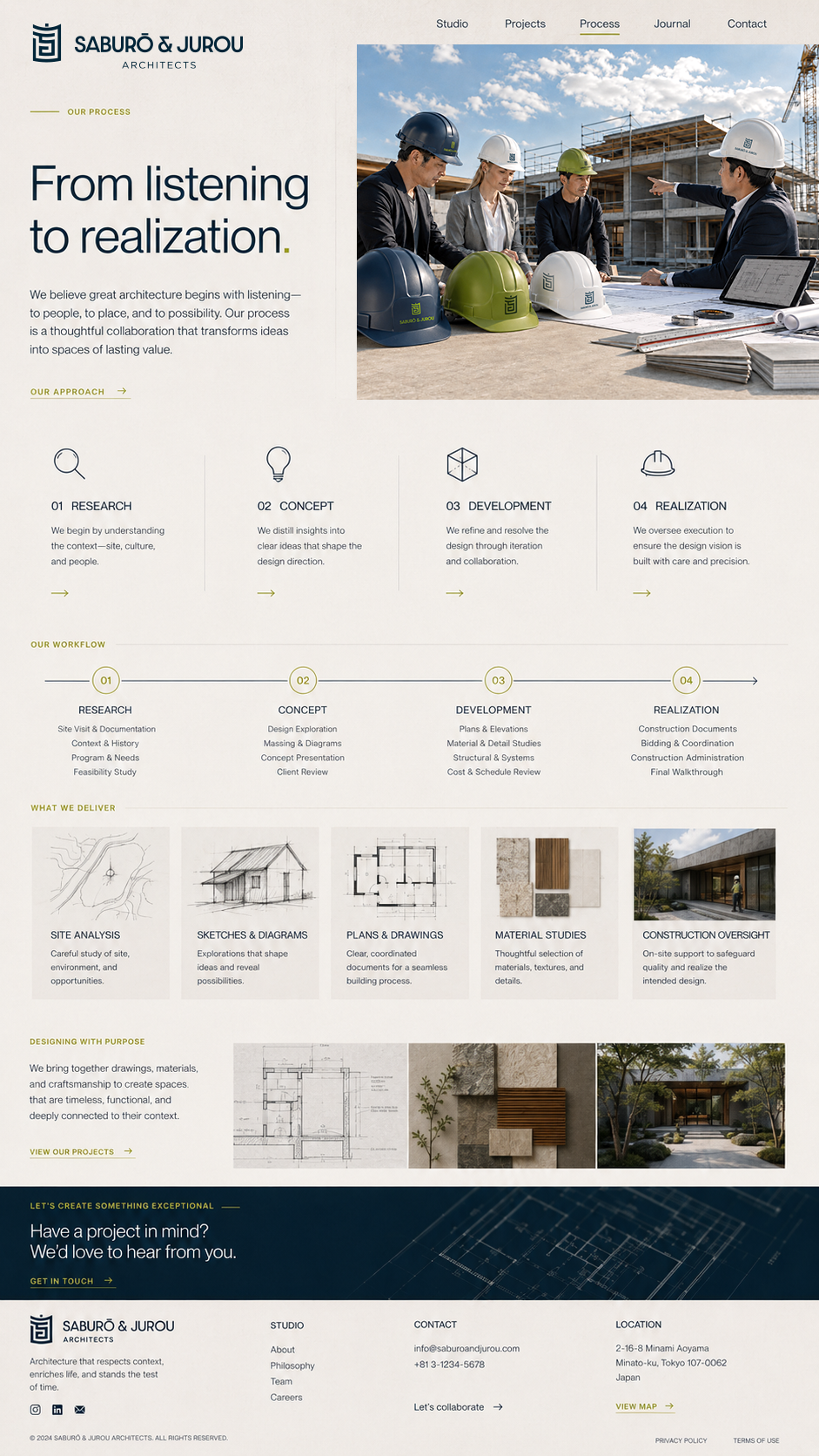
Process
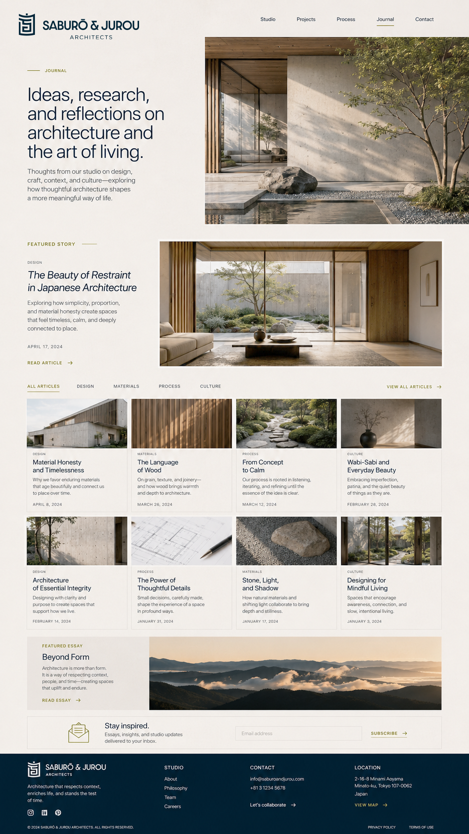
Journal