An Inspirational Project
Book cover design requires a thoughtful balance between visual communication and storytelling. The objective of this project was to translate the book's narrative, themes, and emotional tone into a compelling visual identity that resonates with readers while creating a strong and recognizable presence in both physical and digital environments.
For this redesign project, I chose The Alice Network by Kate Quinn. This historical fiction novel spans different moments in European history, with a strong focus on espionage, memory, courage, and the impact of war. The subject matter offered a rich visual language to explore: history, secrecy, identity, place,
and time.
and time.
WHY THE ALICE NETWORK
Set against the backdrop of wartime Europe, The Alice Network explores themes of courage, espionage, sacrifice, and resilience. The historical richness of the narrative provided a strong foundation for the visual concept, inspiring a design approach that balances elegance and sophistication with a sense of intrigue and emotional depth. The resulting cover was developed to capture the spirit of the story while creating a compelling and memorable visual identity.
The novel’s historical fiction genre allowed me to create a cover that felt both literary and cinematic. Rather than designing something overly modern, I wanted the cover to feel aged, layered, and connected to the past, as if it belonged to the world of the story itself.
Design Approach: Historical Atmosphere, Symbolism, and Visual Storytelling
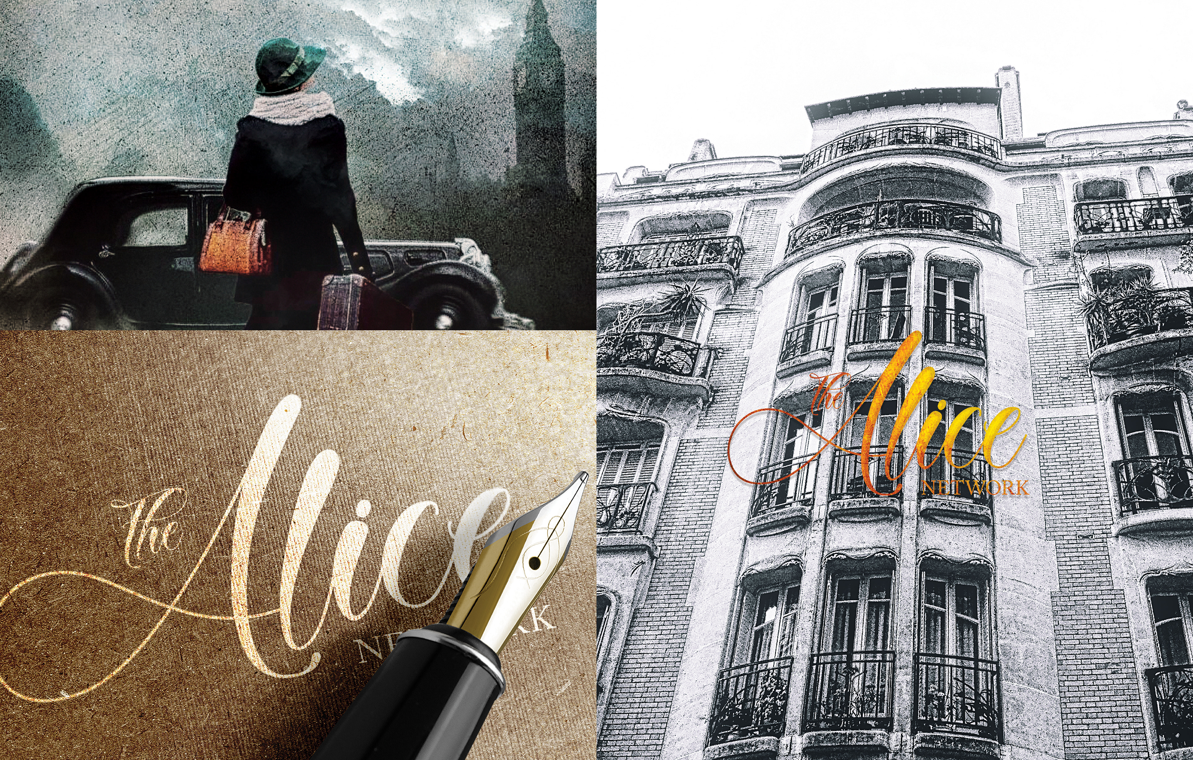
To explore the visual direction of The Alice Network, two cover concepts were developed as part of an experimental design study. The objective was to examine different ways of visually communicating the novel’s historical atmosphere, wartime setting, and themes of espionage, resilience, and courage.
The iconic London clock tower serves as the central visual element in both concepts, reinforcing themes of history, time, and place. Its presence establishes a strong connection to the novel’s British setting while helping to convey the mystery and intrigue associated with wartime espionage. Through the use of imagery, typography, and composition, each design offers a unique interpretation of the story while remaining true to its historical character.
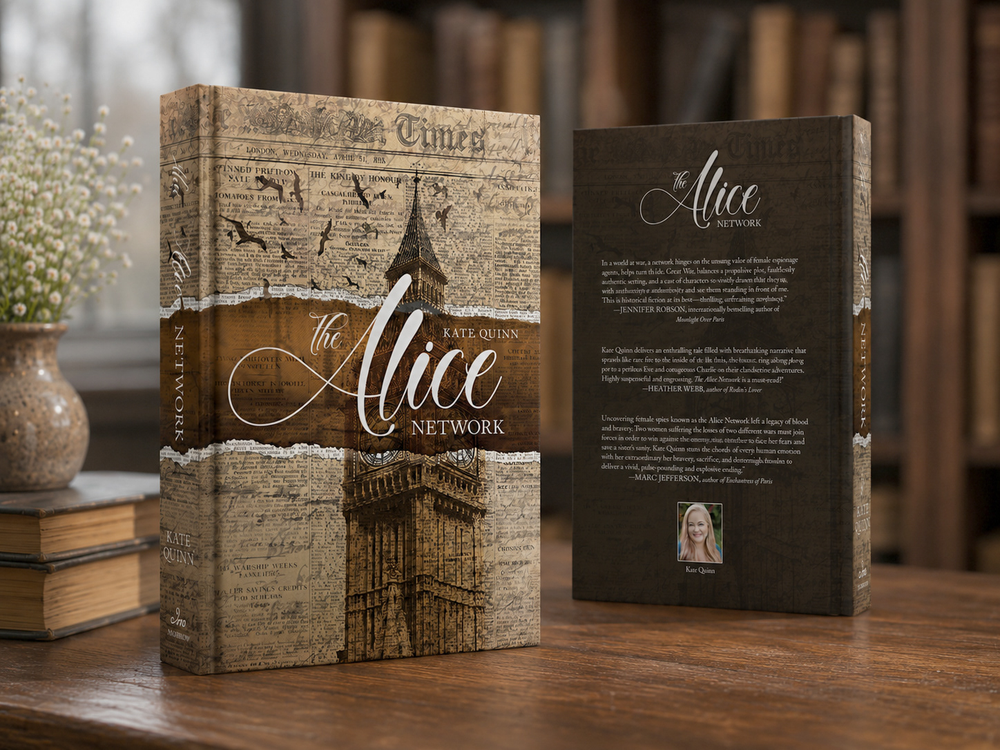
First Cover Design
The muted sepia and aged yellow-brown palette give the cover an archival quality, evoking themes of memory, history, secrecy, and nostalgia. Layered newspaper textures reinforce the historical setting while referencing communication, intelligence work, and the covert exchange of information central to the novel’s espionage narrative.
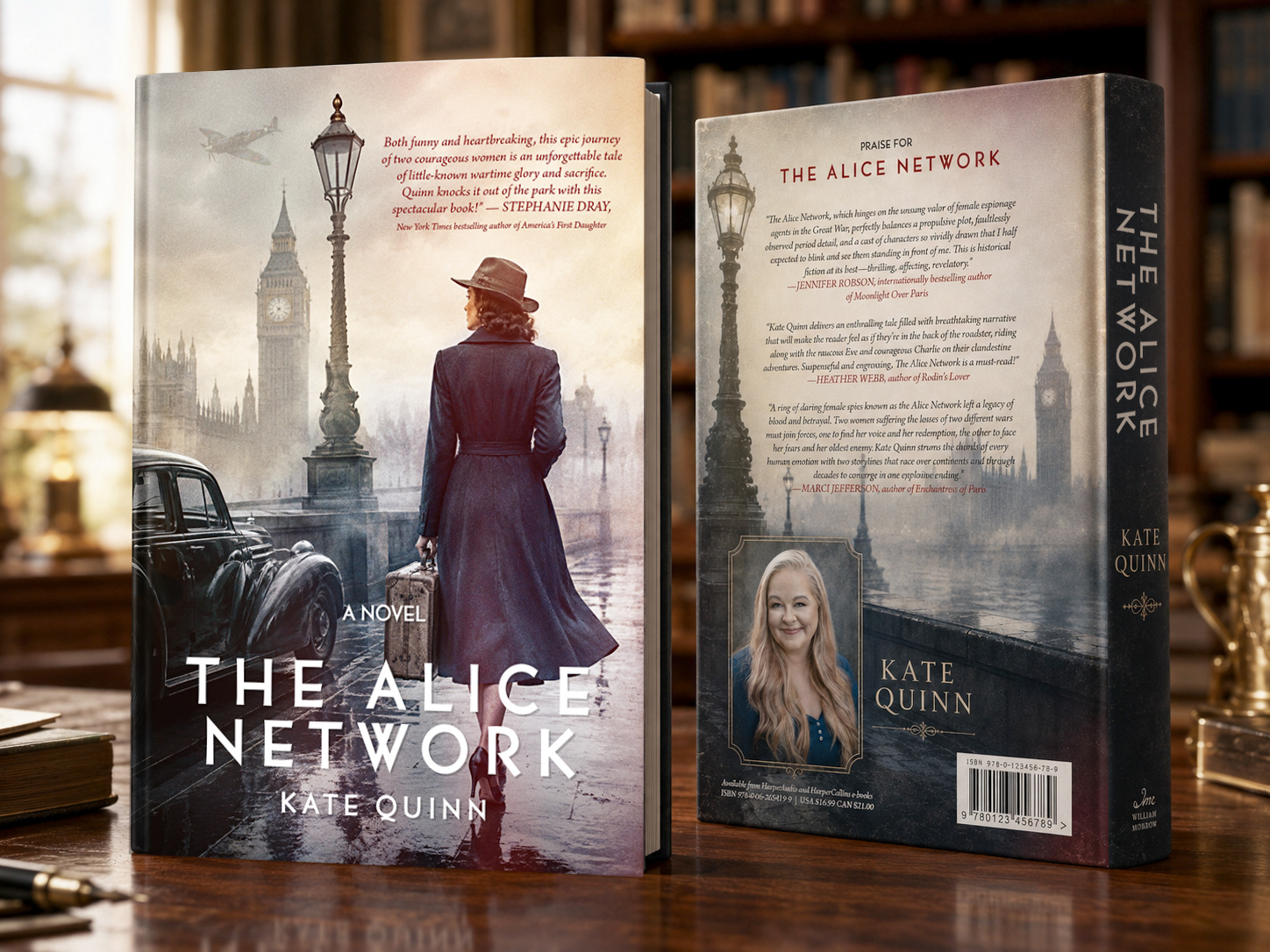
Second Cover Design
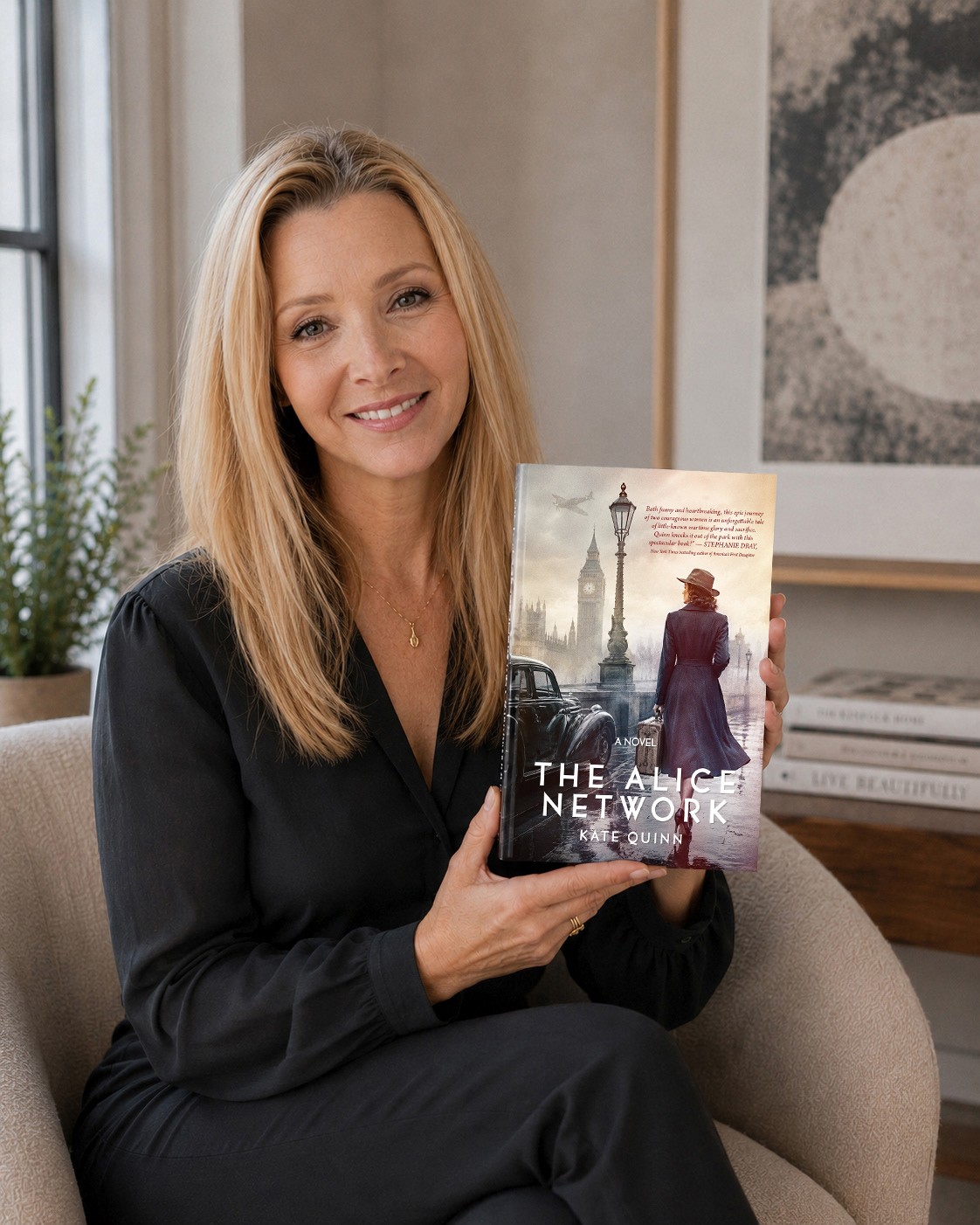
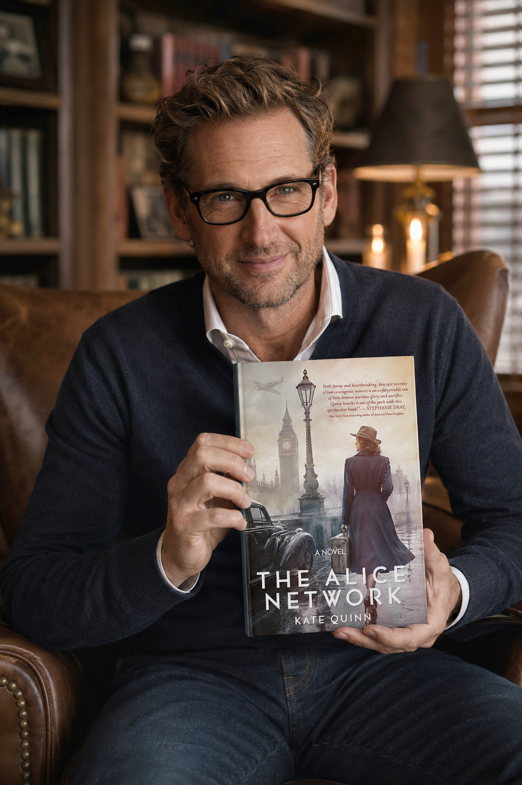
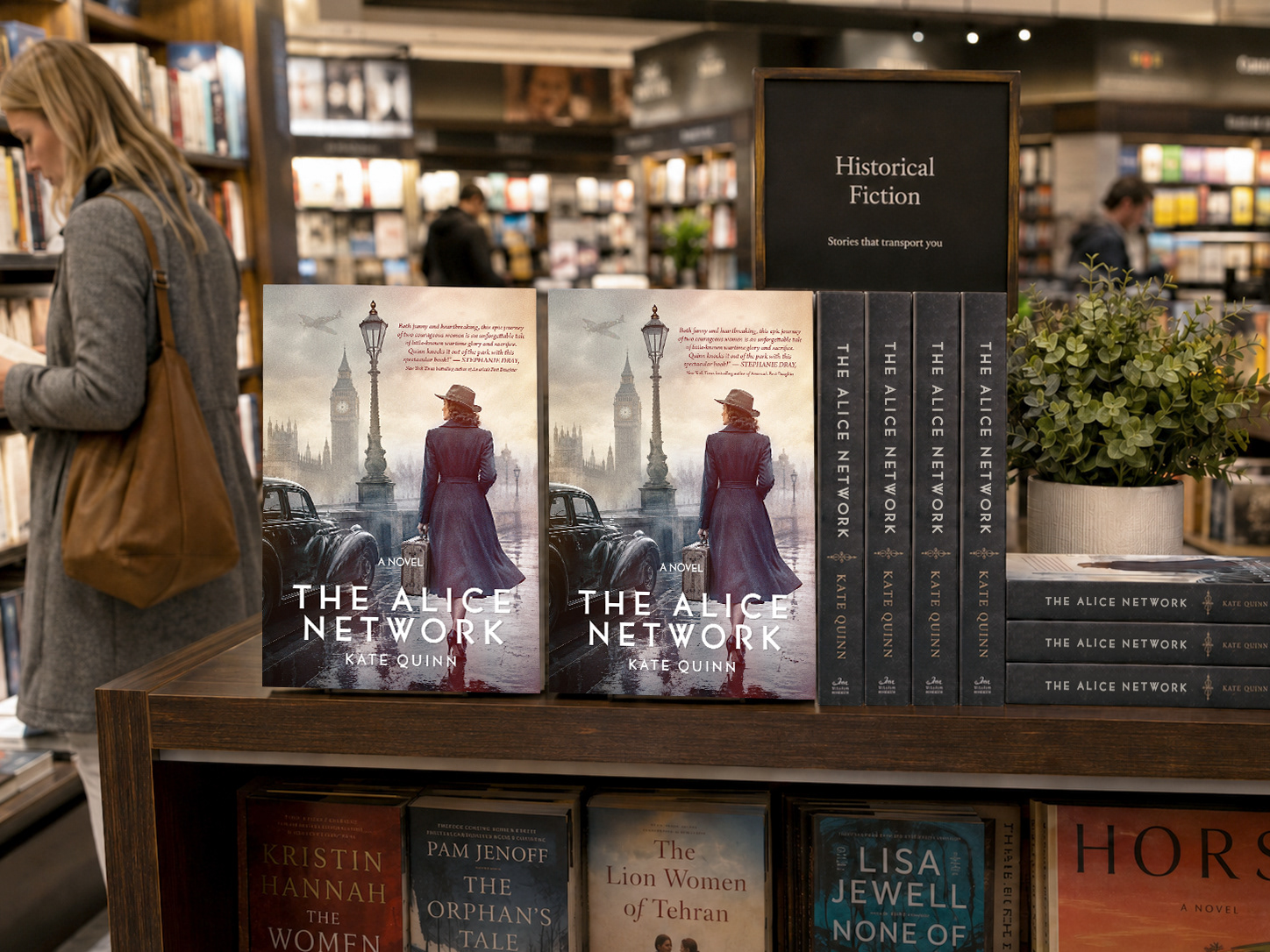
The second concept explores a more cinematic, character-driven approach. A central female figure, inspired by Eve Gardiner, becomes the focal point, conveying mystery, movement, and emotional tension. The London setting, vintage automobile, foggy atmosphere, and wartime aircraft reinforce the historical context while creating a strong sense of narrative. Compared to the first concept, this direction feels more dramatic and immersive, emphasizing the courage, secrecy, and personal journeys at the heart of the story.
Front and back cover design

App Design
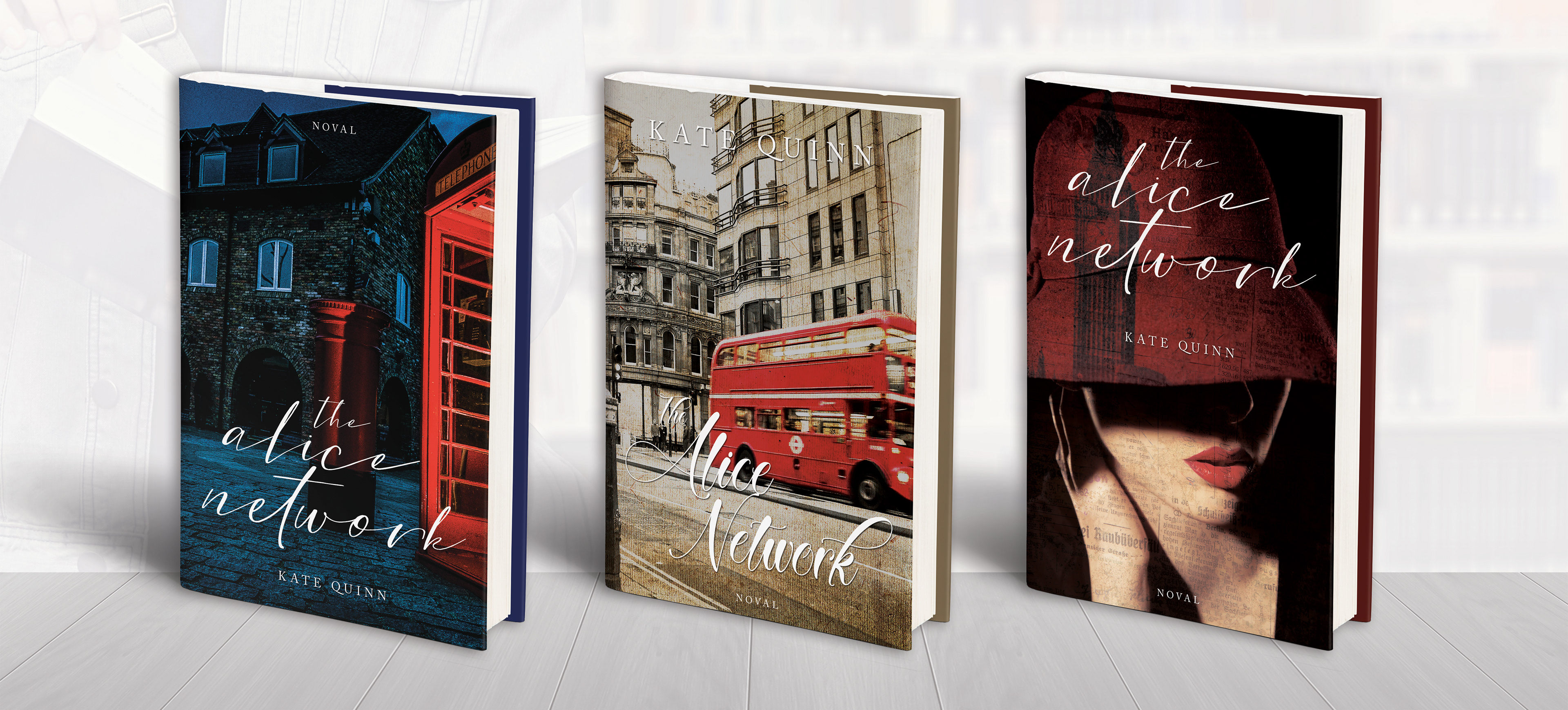
Three different cover designs